Saturday, February 25, 2017

Papertrey February Blog Hop Challenge

Every month, I intend to play along with the Papertrey Blog Challenge, but rarely find the time. Now that I'm all settled in my new house (i.e NEW craft room!!) I have more space and time though, so I am hoping to start participating monthly.

Because this month's fell on a Saturday, I knew I had no excuse! This month's image is so pretty. I love the regal tones. Once the inspiration piece was posted, I brainstormed the elements and PTI colours that popped out.

Inspiration photo comes from here

Here's what my brainstorm list looked like:
For Colours- Smokey Shadow, Plum Pudding, Autumn Rose, Scarlet Jewel, Saffron Spice, Terracotta Tile, Gold, and Black.

For Themes- Laurel Leaves, Handwritten Script, Gems, Banner, Grape and Figs

I took that list and pulled out all the colours that I had written down and decided on my palette. Next I sought out stamps that felt like they fit the themes, at least somewhat.


I decided on Meadow Greens and Wet Paint III.

I stamped the leaves using Royal Velvet, Saffron Spice, Autumn Rose, and Scarlet Jewel onto white cardstock. Once that was completed, I slightly inked up the corresponding leaf stamps with gold ink and gently stamped over each image. I just wanted a touch of gold on each of the leaves.

I added a Royal Velvet frame and put the whole panel onto Saffron Spice.

The final touch was the sentiment. I die cut the "sending" image from Smokey Shadow card stock and embossed the "well wishes" greeting onto a vellum strip using gold embossing powder.


Supplies (all by Papertrey Ink unless otherwise noted):
Stamps: Meadow Greens, Wet Pain III
Ink: Royal Velvet, Scarlet Jewel, Autumn Rose, Saffron Spice, Gold
Paper: White, Royal Velvet, Saffron Spice, Smokey Shadow, Vellum

Thanks for stopping by! Happy blog hopping!

Monday, February 20, 2017

A look back... part 3

Here are my final projects for the last few days of the Papertrey Ink anniversary festivities/challenges.

2013:
I surprisingly don't have many stamp sets released from this year. I don't own any of the featured sets, so I went with an inspiration challenge instead. I took the colours from this lovely card by Cristina Kowalczyk and used them with one of the 2013 sets I own- Sketched Shapes. I thought the circle graphic combined with the somewhat masculine colour scheme made a great clean and simple birthday card!


Supplies:
Stamps: Sketched Shapes
Ink: Dark Indigo, Ripe Avocado, Terracotta Tile, Ocean Tides
Paper:White

2014:
I have a lot of favorites from this year. I actually only recently purchased Embellished Elegance and haven't used it much. I started by die-cutting out the word happy. I wanted to do some ombre stamping, but I wasn't sure yet where I was going with it. So I stamped a blue version and then a purple version. I liked them both so much that I had to make two cards!

To make the background I placed several of the leaf and floral images on one block and then stamped it in tone on tone all over the main background panel. For the blue one, I made it a wedding card by white embossing the "wedding day" sentiment onto Dark Indigo. For the purple one, I made it an anniversary card by white embossing the "anniversary" sentiment onto Royal Velvet. I have to say, I really like how simple, yet intricate these two turned out. Definitely could see myself making a whole big batch in other colours!


Supplies:
Stamps: Embellished Elegance
Ink: Dark Indigo, Blueberry Sky, Spring Rain,  Royal Velvet, Winter Wisteria, Lavender Moon, Fresh Snow
Paper: Dark Indigo, Spring Rain, Royal Velvet, Lavender Moon, White
Accessories: White embossing powder, Embellished Elegance dies

2015:

This was another year where I don't have that many sets. The ones I do have are more Christmas-themed. I was going to just make a Christmas card, but once I started I realized that I could make it into a masculine birthday card. I used this card by Laurie Willison as my inspiration. Because of the curved stitched die that I have, I flipped it.

I started this card with the Spring Moss panel. I die cut the edge and then stamped one of the sprig images from Spruce and Sprigs on there. Next I stamped several other sprigs onto white cardstock and starting the task of fussy cutting them out (why didn't I get these coordinating dies???). Once that was all done and I finally settled on an arrangement, I added a little wooden button with some baker's twine. The sentiment is a combination of 2 other 2015 sets- Scribbled Sentiments and Keep It Simple: Birthday II.


Supplies:
Stamps: Spruce and Sprigs, Scribbled Sentiments, Keep It Simple: Birthday II
Paper: White, Cocoa Bean, Spring Moss
Ink: Spring Moss, Spiced Saffron, Ripe Avocado, Terracotta Tile, Vintage Cream, Cocoa Bean
Accessories: stitched edge die (Mama Elephant), wooden button, baker's twine, clear embossing powder

2016:

I actually have quite a few 2016 sets, but none of the ones that I own were featured today. So what started out as inspiration challenge from this card by Laurie Willison...turned into inspiration from a 2017 project by Lizzie Jones. I guess that's how inspiration works though, I was going to use the layout from Laurie's card, but I really wanted to use the Tropics set and I remembered loving the colours from Lizzie's Palm Prints card. I added a sentiment from 2015's Good Times set. I got the dies for this set a long time ago and only finally got the coordinating stamps. Sure glad I did though!

For the leaves, I did lots of rocking and rolling with my inks. For this technique, I ink up the lighter colour first, then ink up the edges of the dark colour, but to ensure there's a smooth transition of colours, I gently tap the lighter ink over the whole thing right before stamping it. If you find that some of the darker ink transfers to the ink pad, just stamp the ink pad directly to paper a few times once you're done to get any of the darker ink off.

Supplies:
Stamps: Tropics, Good Times
Ink: Hibiscus Burst, Raspberry Fizz, Terracotta Tile, Summer Sunrise, Royal Velvet, Winter Wisteria, Black
Paper: Winter Wisteria, Hawaiian Shores, White, Tropical Teal, Vellum

And finally, here are all the projects from the last 10 days!  18 cards total- not to shabby!


Friday, February 17, 2017

A Look Back... part 2

I've been playing along with the Papertrey Ink anniversary challenges all week, but didn't have a chance to photograph/blog the projects until today.

For 2008, I decided to use Garden of Life. This remains to be one of my favorite floral sets. I love that it's whimsical and fun!

For the first card, I used the scribbled rose image- how ahead of their time was this image? I think a  few years later, scribbles became a hot item.

Anyway, I stamped the line image only on vellum and embossed it in white. On the reverse I coloured each flower with Copic markers. I put that on a white card base and added a Spring Moss sentiment strip with a cut out flower embellishment. The flower was stamped with Raspberry Fizz, Lovely Lady, and Spring Moss. The greeting was Simply Chartreuse on Spring Moss.


I decided to make a second card featuring 2008 product. This time I also featured two other 2008 sets- Polka Dot Basics and Birthday Basics. This card is pretty straight forward. I stamped my polka dot background on Spring Moss and placed that on a scalloped piece of Harvest Gold. The card base is Dark Chocolate. I added a floral embellishment again. Although this time, I jazzed it up with a button. I don't remember what these ones were called, but PTI used to carry them- they are a wooden button. I have always loved them and typically hoard them, but thought I ought to start using them more!


Onwards to 2009- I was happy to see Fruitful featured! I tend to have a soft spot for food themed stamps. I just find them super cute for whatever reason.

For the first card, I went with a simple layout. I stamped the citrus image three times- once in grapefruit colours, once in lemon, and once in orange. I was still finding the layout too simple, so I pulled out the Diamond impression plate and added that to my Berry Sorbet background. Just a note about the sentiment- if you intend to have a greeting on an impressed piece of paper, stamp it first!!!

 The greeting comes from Cupcake Collection- another one of my favorite 2009 sets.
Colours- Grapefruit consists of Berry Sorbet and Summer Sunrise, Lemon is Bright Buttercup and Harvest Gold, Orange is Orange Zest and Summer Sunrise.

I used Basic Gray (SU), white, and Berry Sorbet. Each of the fruits was finished off with a touch of Wink of Stella (you can see the shimmer in the close-up)


With all these looking back through the years, I also have been looking through my blogs. I came across one where I had used the cupcake image with a raspberry. I decided since I had Fruitful and Cupcake Collection out, I would revisit that idea, and used a strawberry instead. I also finally used Cocoa Bean. I'm not sure that it will become as used as Dark Chocolate, but I quite like it as a brown/neutral. The stamped pattern on the Green Parakeet card stock is from the Background Basics retro set.


For 2010, I was going to try and use one of the other sets, but Beautiful Blooms II remains to be one of my most used sets. I was inspired by Lizzie's subtle sponging on her card.


I stamped the three sizes of flowers in Orange Zest, Harvest Gold, and Pure Poppy. The centres of each were Summer Sunrise and the leaves were Spring Moss. I played around quite a bit before settling on this layout. I brought out one my MFT scalloped stitched edge dies and also decided to incorporate some Pool Party paper and ribbon (SU!). The yellow panel is Lemon Tart. I have to say, I really love all of the yellows that PTI offers! I think this was my favorite card of the night!


For 2011- the only set featured that I own is the Year of Flowers Collection, and although I've stamped with it, I don't know that I've ever completed a card with it. I still struggled with this set. I tried a few things Wednesday night and it was just NOT happening. So I set it aside and came back to it Thursday.


I saw a layout on that I thought would work with this set and sure enough it did! I think the daffodil image is one of my favorites of the small version. I stamped that on white and coloured it in with Copics and fussy cut it out... even had to pull out the x-acto for part of it. I really like the Scatter seeds of kindess sentiment in this set, so I made sure that my scalloped feature panel could fit that plus the flower. I pulled out another older product- the long scalloped rectangle nestabilities. I don't think I've used these in years, but they are quite nice and still trendy enough (despite not having stitches). I didn't want my background to be too plain, so I added background stamping from Petal Power. There are so many of the background sets from PTI that I love and use a lot!

Colours featured- Green Parakeet, Harvest Gold, Summer Sunrise, White


And finally, a card from 2012- I had to use Hello Sunshine. It's one of my favorites. I love all of the ray options included and the various sentiments that can be built with the word sunshine. I'm sure I've made something like this before, but it was approaching the end of my Thursday night, so something quick and simple was needed. I stamped the rays with Bright Buttercup. The circle line image is also stamped on the Bright Buttercup circle centre, but it's a bit hard to see in the photo. I wasn't planning on added sequins, but there was an unfortunate water/ink spot that appeared to the left of the greeting, so I decided, why not add several! The panel was placed on Orange Zest and then on a Hawaiian Shores card base.


Sunday, February 12, 2017

A look back- part 1

It's the beginning of the Papertrey Ink 10th year anniversary festivities. Today's challenge was to look back at the sets released in their first year- 2007. I brought out some sets that had not seen ink in some time.
First up: Beautiful Blooms
I went with the colours: Kraft, Vintage Vanilla, Melon Berry, Canyon Clay, and Dark Chocolate


I wanted to try something else with a different floral image from the set. I inked up the flower with Hawaiian Shores and then Tropical Teal to get an ombre floral effect.

The leaves were embossed with clear on Limeade Ice. I pulled out an old sketch from the clean and simple stamping blog, since I started that up in 2008. Thought it'd be fun to revisit.


The next set I brought out was Text Boxed. I made a background with the burst-y image. I decided to bring a more updated set with it- the Shakers and Sprinkles dies and stamps.


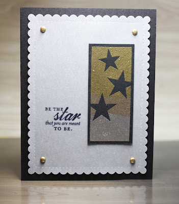
 I decided to make one more card with Text Boxed. I remember that one of the reasons that I originally purchased this set was for those stars! I stamped the image on black cardstock with versamark. Then I sprinkled the top part with gold powder, the middle part with platinum, and the bottom with silver to create a metallic ombre look. I die cut a scallop stitched panel out of vellum and stamped a greeting from Superstars. I attached that onto black cardstock with another "retro" supply- gold brads. I really like how this one turned out. The ombre metallic turned out exactly as I hoped and I will definitely be trying this again!


Lastly, I brought out Green Thumb. I made two simple 4.25 square cards. They are pretty straightforward. I love the spring vibe of this set and thought bright colours would be ideal.