Sunday, July 29, 2018

Fall to Layout #82- Take Two


Happy Sunday!

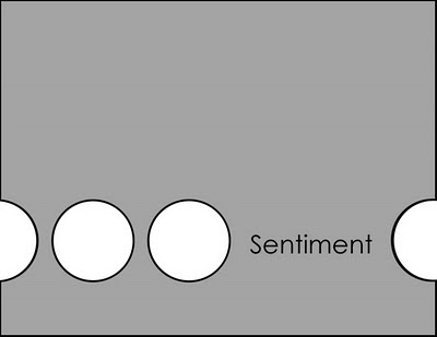
So, this week is a bit different. Below I have the original sketch 82 that was featured. You are more than welcome to take a stab at it, although I don't have confirmed measurements. Eyeballing it I would say that the scalloped layer is about 4 x 4.25 and then apply a scallop punch or die to fancify the edge.


So confession time, I totally deviated from the sketch, but the original sketch was completely my starting point. I looked at how I had 3 images on the card, I really wanted to use the Lace Leaf set. I started with a piece of watercolour paper and stamped the ink-like stamp. I used 4 distress inks on the stamp, spritzed it with water and stamped onto the paper. Then I spritzed the paper, and lastly, any spots that didn't stamp smooth I evened out with a wet paintbrush. 

To stamp the large leaf, I decided to use my MISTI. I inked up the leaf using Pure Poppy, Orange Zest, and Summer Sunrise. I did that twice to ensure it popped against the inky background. Next.I added in two of the smaller leaves for the 2nd and 3rd elements.

Now here is where I really struggled with keeping to the sketch. Did I force my stamped image into the sketch? Did I start over with something else that worked a bit better with the sketch? OR did I just accept the fact that this card was going to deviate from the sketch? That's the option I went with!

I already had some baker's twine ready to go, as I was intending to use it for the above sketch, but I decided to change the orientation. 

Lastly, the sentiment I wanted worked best on the image panel, so I stamped it in Versamark and embossed it with some copper embossing powder.


So now, I present to you sketch 82-ish. Feel free to use this one instead if you like!


Supplies:
  • Stamps: Lace Leaf
  • Distress Ink: Barn Door, Ripe Persimmon, Spiced Marmalade, Mustard Seed, 
  • Other Ink: Versamark, Pure Poppy, Orange Zest, Summer Sunrise
  • Paper: White watercolour paper, copper, Early Espresso
  • Other: copper embossing powder, baker's twine


Lastly, as I was staging my photo, I had a little helper jump up. The two newest kitties to our family sure love being in the craft room! This is Malone trying to sneak to the window behind my desk.


If you play along, please leave a link (for the first sketch, the second or both!)

Sunday, July 22, 2018

Fall to Layout #81 Take Two


Happy Sunday everyone.
Time for another sketch. This one is great for using small bits of patterned paper or smaller stamped images.


This sketch doesn't really require much for measurements. I would say stick to a standard sized card front and aim to have your circle elements be around 1 inch.


I pulled out Foxy Friends and decided to use three of the critters. I used the coordinating punch to cut them out. The fox and raccoon are fairly obvious. For the brown critter- you decide- is it a bear, a wolf, a cat- I'm not sure! I thought this old greeting from the long retired Faux Ribbon was a great combination since there was "many" critters to say thanks.

The background is from an older 6x6 We R Memory Keepers set (Happy Camper). I thought the slightly muted woodgrain image was a nice touch.

If you play along, please leave a link


Sunday, July 15, 2018

Fall to Layout #80 Take Two


Happy Sunday.
I'm posting a bit late again, sorry! It was a busy day of getting items ready for the coming work week. When you get up and it's not 33C or more with the humidity, you've got to jump to it and get stuff done!

Here's the sketch. I know it's super basic, but the idea is that you will use or make some sort of patterned paper for the right background. Have fun looking through your stash or putting something together, like I did!


Dimensions:
  • Card Base: 4-1/4 x 5-1/2
  • Main Image: 2-1/2 x 3-1/4
  • Main Image Layer: 2-5/8 x 3-3/8
  • Plain side panel: 1-1/2 x 5-1/2
  • Patterned side panel: 2-3/4 x 5-1/2

I decided I wanted to make some fun coffee themed paper. I embossed one of the bean images,the French press, and a cup from Coffee Love all over some white cardstock. I sponged Walnut Stain and Wild Honey Distress Oxide inks all over. I misted some water over top and also added a few splatters of Espresso Grounds Distress ink.

I stamped the French press again onto my white image panel with a sentiment from the same stamp set. I stamped the cup on some scrap paper, and coloured and cut it out and added it with some foam tape for both a dimensional pop and a colour pop.


Supplies (some affiliate links used):

If you play along, I'd love to see a link!


Sunday, July 08, 2018

MFT Summer School

Class is in session!


This last week My Favorite Things Stamps posted their summer school challenges. It's been so much fun playing along!

The first challenge was White Space

I paired the All Smiles (and matching dies) with a few of the butterflies and butterfly trails from Adorable Elephants. For the letters, I cut out three layers. The top layer, I did a very soft blending of Distress Oxide ink (Wilted Violet) onto the white cardstock before I did the die-cutting.


The next challenge was Primary Colours


I thought I would find this one a struggle, but once I decided on the tones I wanted, the background, stamps and dies quickly came together. I used several of the chicks and balloons from Happy Hippos, which went so nicely with this cheerful "hooray" die. For the background I used the cloud edge stencil and Salty Ocean for a lovely sky. I added a few animation lines to the two little chicks that are flying with a thin black marker. 


Next up is Repetition:

I've been wanting to try something like this for a long time now. I love the look of white on white die cuts. I cut out several "joy"s in white to adhere to my background. I also die cut one in red to give it the little "pop" of colour. The rest of the sentiment is from Instant Photo: Holidays (a retired PTI set).


The fourth challenge is Complementary Colours:


I have always loved Blue and Orange together, so I decided to use that colour combination for this challenge. I brought out the retired Large Desert Blooms and paired that with All Smiles and the matching dies. I added glitter to the smile dies to jazz it up a bit.

The fifth and final challenge is Symmetry:


For this challenge, I decided to use one of the smaller images from Penguins in Paradise. This tropical fun drink is super cute and goes very well with the "cheers" sentiment in the same set. I took 3 distress inks and blended them for a fun sunset like background (Picked Raspberry, Spiced Marmalade, Squeezed Lemonade). I cut out inch squares from that and then popped up the drinks. My line of symmetry is straight down the middle (so if you fold it in half, you have the same on either side of the vertical line).

And there you have it! I completed all the challenges. Now I'm off to check out everyone else's. It's been a lot of fun!


Fall to Layout #79 Take Two


Happy Sunday!

Hope you're ready for another sketch. This one is super simple. It would be a great starting point if you need to make a pack of notecards for a gift set.


Dimensions I used:
  • Card Base: 4x5.5
  • Focal Point layer: about 2.5 inches in diameter
  • Focal Point frame layer: about 3 inches in diameter
  • Sentiment Strip: 5-1/8 x 1/2

Here's my card:


The mermaid layer was actually something I had put together for last week's sketch. It ended up being too big, so I set it aside. However, I decided to use it for this sketch, instead of a square element. I also mirrored the sketch since I didn't like having the sentiment at the mermaid's back. 

For the mermaid layer, I coloured her, the rock, and the shell ready to go. I used a mix of Copics and Stampin' Blends. Next, I die cut my circle and scalloped circle layer. I really wanted to have waves all around the rock, so I die cut a few stitched wave borders and then die cue the circle over top so that they would match up with the layer. I added a bit of shimmer to the mermaid, her seashell and the seaweed.

The sentiment was stamped on some Mint Julep cardstock and I cut the end to give it the little banner end. I ended up trimming the card down to 4 from 4.25 because I stuck the elements too low and there was just no unsticking them. It was after midnight, so wasn't about to do a do-over either, haha. So trimming it down helped a little with balancing. I also found that rounding the corners helped too.


Supplies:
Ink: Tuxedo Black, Mint Julep
Dies: Circle, Scalloped Circle, Mermaid for You Lawn Cuts, stitched wave borders
Other: Copics, Stampin' Blends, Corner Rounder


If you play along, please leave a link!


Sunday, July 01, 2018

Fall to Layout #78- Take Two

Happy Sunday!


Happy Canada Day!!

Sorry, the post is a bit late today. We got up and it was relatively cool (compared to this last few weeks anyway) so we decided to clean the house thoroughly while enjoying the cooler temperatures for working in!

I decided to be a bit patriotic with a red and white theme. I also used a bear image from the Geometric Menagerie stamp set. Whenever I see this image I specifically think of polar bears, which I associate with Manitoba and Northern Canada, so that also seemed appropriate.

Lastly, I used one of the sentiments from the same stamp set. It's more designed to be used with the lion image. However, the sentiment made me think of being Canadian, being proud, and reminds me of the part of O Canada- "with glowing hearts".

Here's the sketch. Dimensions I used are as follows:

  • Card Base: 4-1/4 x 5-1/2
  • Next Layer: 3-3/4 x 5
  • Side patterned strip: 1-1/4 x 5
  • Thin side strip: 1/8 x 5
  • Circle: Approximately 2 inches in diameter
  • Circle Frame: Approximately 2-1/8 inches in diameter


So onto the card!

To start, I embossed the bear image with white embossing powder onto watercolour paper. I then used an assortment of red distress inks (Festive Berries, Candied Apple, Barn Door, Aged Mahogany, and Fired Brick) and painted each small triangle.

I cut out a dotted circle from white card stock and popped up the bear on that layer. I wanted a bit more contrast, so I added the layer of a black slightly bigger circle.

I wanted to incorporate a pattern on the side panel, so I used this image from Trifecta. I used Pure Poppy ink on Pure Poppy paper for a nice tone on tone look. I really love how the triangle theme continued here.

Next up, I added a small strip of black cardstock to give more constrast. I rounded the corners of the red layer and put the whole thing on a black card base.

The final step was that little sentiment. I stamped the whole thing in black on the white layer, but it still needed something. So I stamped just the heart on some scrap cardstock in red and cut it out and popped it out.


Supplies (some affiliate links used):
Stamps: Geometric Menagerie stamp set, Trifecta
Ink: Black Onyx, Pure Poppy; Distress Inks: Festive Berries, Candied Apple, Barn Door, Aged Mahogany, and Fired Brick)
Paper: Black, Stamper's Select, Pure Poppy, Watercolour
Accessories, etc.: Corner Rounder, Circle Dies, White embossing powder

If you play along, please leave a link!