
 So I wasn't feeling that inspired today, but I wanted to make something, so I checked out a few recent colour challenges. First up was this one by Kristina Werner . What I like to do with colour challenges is pull out a full piece of paper in each colour and see where it takes me. When I saw these 4 together, I thought Retro, which led me to using the Retro Background Basics. I like this diamond and circle pattern and thought it would look cool stamped in white on chocolate. Next, I grabbed Stem Silhouettes. One thing I really like about silhouette images is you can pair them with almost any colour group and any type of greeting. I thought this leafy image matched the whole retro vibe nicely.
 Next, I thought about doing this challenge by Dawn McVey. As I assessed the colours, I realized they would work well with the exact same layout. I kept the chocolate patterned part, used celery in place of saffron, and teal in place of tangerine. It worked really well, since the colours in this challenge were of similar brightnesses to those in the previous challenge. The only change here: I embossed the leaves. After the first card was mostly together, I thought, hmm embossing would've worked here. I already had everything adhered so I didn't want to take it apart or emboss over it (since warping would have occurred).
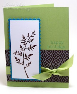
Supplies:
Stamps: Stem Silhouettes, Birthday Basics, Retro Background Basics
Ink: Chocolate Chip, Tangelo, Taken with Teal, Fresh Snow
Paper: Saffron, Tango, Chocolate, White, Teal, Celery
Ribbon: Celery Polytwill, Saffron Grosgrain
Accessories, etc.: Nestabilities, Pop Dots, Brown EP


 The first card features some watercolouring. I didn't do it the traditional way. Instead of using a paintbrush, I used a blender pen. I couldn't find a decently pointy paintbrush for the finer details, but the blender pen worked nicely. I quite like this owl, I like how he's kind of pointing to the greeting.
 For the second card, I returned to the Copics. I really love this cute, little potted flower. I coloured it in, cut it out, popped it up, added a bit of piercing and a sentiment. Then I paired that with some lined paper, and keeping with the whole stitching them, some ribbon, thread, and a button.
 Supplies:


 I had a lot of fun with Little Critters. Anytime I see a set with different animals in it, I feel the need to stack them. I don't know why, it's just something that I think is cute with animal sets. I stamped the elephant, giraffe, and the bird and got to work colouring them in with
  For my next card, I was still on a
  First up is a card featuring Damask Designs. I was happy with the Ocean Tides, Vintage Cream, and Dark Chocolate colour combination the other day, so I decided to do that again. I added in one extra colour- Sage Shadow. It works quite well with these colours. The card is pretty basic. I did however do one thing I don't normally do... scoring as a means of decorating the card. First I masked off the side, stamped the one repeated background image there, then I scored two lines beside that, leaving enough room for a thin strip of cardstock. I really like how it turned out, I'll have to try that again some time.
 Second up is a card featuring Fifth Avenue Floral. One thing I really like about line art is you can use not only for making fun backgrounds, but you can also really bring it to life with some sort of colouring medium. I stamped this flower and stem on watercolour paper, got out a few reinkers and got to work. I added some grey to really contrast with the orange and green.
 I kept things pretty simple. I made some stamped patterned paper using black, white, and grey ink on grey cardstock. I adhered that to the card, added some 5/8'' black grosgrain and a simple knot. Next I added in my sentiment and stamped a few more flowers on the white base. Very quick, and any colours or sentiments could be used to fit any occasion.


 Supplies:
  As soon as I saw the Damask Designs, I knew I wanted to try giving them some texture with flocking powder. I stamped these two images in Melon Berry, then got to work with my glue pen and powder. I thought I'd add a cute little button and a nice sentiment. Again, I didn't want to take away from all that work (and that would not have looked good anyway), so I matted the image and put that on a Melon card base.