Sunday, December 31, 2006

Tutorial!

I have posted the tutorial for "Faux Airbrushing/Splatter Backgrounds" . I hope it helps those of you who are visual learners! Here's the card I made for that tutorial (which can also be seen at the link).

Just can't get enough!


I love this colour combination. There's just something very fun about pink, teal, and brown! This was one of those cards where I sat down at my space and had no idea what I felt like doing. I knew I wanted to use All in a Row, so I started with that. I found some paper where it wasn't supposed to be, so I continued with that. Then I decided that since I was using Winter mini paper and colour scheme, I would use a winter mini set, Big Pieces. So that's pretty much my design thought process from last night.


I will be posting the tutorial for faux airbrushing some time soon. I just have to organize my stuff and take the photos.


In other news, how about a New Year's Eve challenge? A while back my sister came up with this one challenge. Put together a card using a colour combination with colours that would taste GOOD together. Stampin' Up! isn't the only company with food inspired names, but it's a place to start. Maybe some chocolate chip, barely banana, and very vanilla is on the menu? Or perhaps some always artichoke, more mustard, and certainly celery? If you choose to partipate, please post a link to your gallery or blog! Also, why not join in the fun? Start your own New Year's Challenge!!

Saturday, December 30, 2006

Friend!


Here's a cheerful card to brighten up this foggy, snowy day. I finally pulled out the gift set and created something I was pleased with. The inspiration came from the Saturday inspiration challenge seen here . I used the colours of the blocks behind the word friend for my colours.

The little paisley charm was made using polyshrink. I stamped the paisley with orchid onto sanded polyshrink, then coloured it in and shrank it.

Friday, December 29, 2006

Birthday Tag Card

These types of creations always take me so long to make, but I really enjoy it. It's kind of like making 4 mini-cards. To get the basic tag card shape, I cut my paper to 12x4.25. I scored it every 3 inches and used the tag corner punch. Then I went crazy making the card. When I plan on doing these types of designs it is never spur of the moment. I sketch the whole thing out, usually in an environment where I am away from my supplies (aka WORK). If you're interested, here's my sketch from earlier this morning.


Then you can see the final product. I didn't deviate too much. I switched aspects from the 2nd and 4th panels, but other than that I pretty much kept to my plan. It also just so happened that the bonus LSC was to use alphabet sets. I used two alphabets on here, so I figured it qualified.

Thursday, December 28, 2006

Quilted Colour Blocking


I saw the "Less Loved Stamp Set" at ScrapTV this last week and wanted to participate. I definitely have a few stamps that fit into the "so not my style any more/lives a dark, lonely life in the drawer"-category. This set, Quick & Cute was the first set that my mom bought from Stampin' Up! It was the first party we had been to, and it was when the US/CAN exchange was REALLY bad so we scared away by the prices of other stamps. We were also starting out so we wanted something that was multi-occasional, something that came with a few images, as well as a few sentiments. Quick & Cute fit the bill! Well, then 4 months later I discovered SCS, and I quickly realized that this set was SO not my style. I don't mind it, I just never use. It was the first of MANY. I just quickly realized that there was so much more out there. And when it retired this last July, it stayed away. I decided to pull it out for this challenge. I also used this year's All in a Row. This is a set that I had great intentions for, but it was also part of my first (and a little impulsive) new catalog order. I used the diamond/x stamp as quilted faux stitches.

Yahoo for free stuff!!


Yesterday my contest winnings arrived (after sitting at the Winnipeg airport since late Dec 22...). I got Headline Alphabet, Short Order Alphabet and this set seen here, Stamp of Authenticity. This isn't my usual style, but I like the look of it. I also thought it'd be fun to use for scrapbooking projects. The card is based on this week's sketch challenge. I used a pocket note envelope as a library card pocket (the library card stamp in Stamp of Authenticity fits very nicely, go figure. I love purchasing stuff from a company that coordinates virtually EVERYTHING). I tried a collaged style, and stuck with earthy tones.
I also used the words from Amazing to Zany, and the Rough Edges alphabet, and the Aida Cloth background on here.

Monday, December 25, 2006

Happy Holidays!


I haven't had much time for sitting down and stamping. I've been having loads of fun with my family. Everyone is in town, so the pace is pretty much non-stop. It's intense, but lots of fun. However, I did receive some wonderful supplies for Christmas, so I couldn't just let them sit. I managed to squeeze in this one card. The main image stamp is Plum Branch, by Judikins. The paper is shimmery cream and this cool fabric brown 'paper'. It came in a fancy textured paper pack (also a gift).

Thursday, December 21, 2006

Embossed swirls


I really love dry embossing. I got a new light table, and it's amazing. There's so much space, it's so bright, and it's not dangerous (the old one was!). I was trying to reproduce the look of the Cuttlebug Swirl Embossing Folder using the Bodacious Bouquet Brass Template. I'm really happy with how the card turned out. I also used the corner rounder on my oval to make it scalloped. This card is going to go to the lady at work who is retiring tomorrow and I am her replacement. We are having a little party in her honour tomorrow, so I wanted to make something special.

More Clear Cards


You know it, I can't stay away from these clear cards. The card base is 8.5 x5.5 acetate. Only the front is stamped with the white stazon flourishes. One the front is also the Blush Piece and the "Mom Amie" greeting. Inside is a 4x5.25 peice of sage stamped with the fancy French Flair. I made this card for this week's colour challenge (rose red, sage shadow, blush blossom, and chocolate chip). These colours screamed VINTAGE to me, so Carte Postale it was.


I also made this other card for the colour challenge. I wasn't too keen on it, but here it is anyway. It just wasn't coming together how I wanted.

Tuesday, December 19, 2006

Petal Prints Stationary Set


It's my Grandma's 81st birthday today, so I've made her a stationary set. I like using Petal Prints for this type of project. They lend themselves well to quick cards that still look very nice. To make a stationary folder, you need 12x12 paper. I scored and folded it in half (6 inches). The bottom fold-up is at 3.5 inches. I used the horizontal slot punch along the sides. I fed ribbon through those and that's how it's kept closed. I used glue dots along the sides of the fold-up to keep everything contained. The cards and envelopes are standard size. The stationary paper is 8x5. This whole project, including all cutting took less than an hour, so if you're in a pinch for last minute gifts, this one goes really fast.

Monday, December 18, 2006

Stamp Night


On Sunday night, I invited a few stamping friends over. There certainly were some interesting cards made. I kept mine very tame, but theirs were very entertaining. There was a juggling Santa stuck in a jar at the bottom of the ocean. There was a crying penguin in a bag on a "not wild about Christmas?" card. There was a wedding card using candy love hearts and a gumball machine. There was also a juggling Santa on top of a festive cupcale. Definitely some gems in the humour department!! Here is one of my creations from yesterday. Like I said, I kept mine tame. They brought over Flaky Friends, a set that I don't have, but like. It is so nice to colour it in. I love colouring in snowmen, using Bashful Blue to add just the slightest of shading. I may have to break down and get me a snowman set. This card also uses the Four Seasons double sided papers, some marker coloured ribbon (my ribbon swap from Texas has not reached me yet), and some of the rich regals buttons.

Sunday, December 17, 2006

Maps!


I haven't been able to find a nice map stamp. For now, I found a nice alternative, printing detailed brushes from Photoshop Elements onto acetate. The background you see on this card was found here: http://scully7491.deviantart.com. I printed it, then sponged some acrylic paint on the backside, then ran it through the xyron, and pasted it to some aged brown paper. Yes, a stamp would've been easier, but this works for now. Then I set about colouring the sailboat image to match nicely with the map. I stamped the saying on the twill tape. It wasn't as dark as I had hoped, so I carefully went over it with a marker. It actually worked better than I expected. The little dangling charm is a shrink art sailboat. Ideally, a metallic anchor charm attached with a jump ring would've been great on this card, but I don't have any of those. I saw a few in Victoria, but they were over a $1.00 each. Not exactly cost effective.

Saturday, December 16, 2006

Faux Air-Brushed Background


I finally got some minature misting bottles!! So now I've been playing with them, experimenting with different things. My favorite technique so far is what I call "faux air brushing". I made a template by punching out various different circles in a piece of cardstock. Instead of sponging, I used the template as a mask and sprayed colour over it. I mixed reinkers (cool caribbean in one and tempting turquoise in the other) with a little bit of rubbing alcohol, then firmly held onto the mask and sprayed away (don't inhale too much). The result is a very cool background. Then, I removed the mask, held the misters farther away and sprayed a few times to get the splattered effect all over. If there's any demand fo it, I can post a photo tutorial, so speak up if that is something you'd like to see. This card is relatively simple because I didn't want to cover my background after all that work! If you are wondering why I mixed the reinkers with rubbing alcohol and not water, it's because the alcohol dries a heck of a lot faster and it won't warp your cardstock.

Friday, December 15, 2006

A little different...


I got these new Flourishes stamps by Rhonna Farrer/Autumn Leaves. They are really cool! These are clear stamps, which make it very easy to place all the flourishes together. I was very glad that the store ordered them in, and held them for me. Apparently, only 2 came in, the rest were back-ordered. Anyway, I was itching to use them yesterday, but I had already made evening plans. So today, I pulled together this somewhat strange card. The red paper is the Dasher Tree Skirt paper. I made a transparency overlay to go over top. The Seasons Greetings was printed in the very popular font Porcelain on my laser printer. I stamped the Flourishes ( I got V. 2, by the way) in white stazon. It didn't feel complete enough, so I went about adding ribbon. I dyed the white and the organdy ribbons with a mix of Caribbean, Teal, and Glorious Green inks. This light blue might seem like a surprising choice, but I had seen it work several times over this week, since Red and Caribbean were this week's colour challenge. The blue ribbon also brings out the little flecks of blue in the Basic Grey paper.

Thursday, December 14, 2006

Bubbly birthday.


This side pocket, with the circle levered insert is one of my favorite types of pocket cards. The original style is by Cindy Lyles (aka StarLitStudio). You can find the instructions and measurements there. I had to modify mine a tiny bit. Normally I wouldn't put the circle pull so high, but there was a taping incident with the bottom fold, so I had to improvise. My insert is 4.75x 3, instead of 5x3. I used the "Loves Me" papers, and Big and Little Pieces, as well as Amazing to Zany for the outside greeting, and In My Thoughts for the interior greeting. I also used almost all my circle punches: 1-3/8, 1-1/4, 3/4, 1/2, 1/4, and 1/16.

Answering a question.

There was a question regarding my local scrapbooking store. There are actually two I check out, both are located on Pembina Highway. Dalcrafts is located behind the Office Depot, and Scrapbooking By Design is closer to the Pancake House, near the Shell gas station. I've had better luck with the customer service at SBD. Both places have a huge selection of papers. They both carry quite a few stamps. Dalcraft has lots of Hero Arts. I've seen My Sentiments Exactly and Rhonna Farrer Clear Stamps at SBD (I've actually got a set on order from there, they are willing to specially order things in for you!).

Tuesday, December 12, 2006

Copper Garland Monogram

Here's a card showcasing more of the papers I picked up on Monday. The elaborate background is Basic Grey's Garland. I also picked up some brushed copper cardstock.

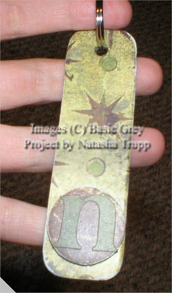
I handstitched the x-stitches with copper thread. The copper scalloped circle was made using the corner rounder (check here for details on how to do that). The vanilla piece is some covered chipboard. The m is made by Heidi Swapp. I sponged Sage Shadow all over, then stamped Paisley in white craft on top of that. I finished it off with a piece of twill tape with some copper eyelets. Now I just need to send this to someone whose name starts with the letter m. I just liked the way the m looked, I have no recipient in mind yet.

Monday, December 11, 2006

Glittery Chipboard Ornaments!

Hello everybody! Sorry for the lack of weekend updates, I was busy making the Family Christmas cards. I even got my mom to help. We only have a few more to make. We did 2 designs, each design had 2 versions, the mail version (i.e. FLAT so it could be sent at the .51 rate, and not the 1.05 rate) and the in-person version (not so flat, bows and knots and whatnot).


Today, I had time to go to a local scrapbooking store. I saw the Holiday Undressed Chipboard by Basic Grey. Is that stuff ever fun. The shapes are crazy detailed! So I picked up a pack, as well as some Fruitcake paper. I've only made one so far, but they are so easy. I covered both sides (one already has adhesive). Then I sanded it, covered one side in versamark and coated with iridescent ice. I tied some silver cord through the top, and look at that, a lovely ornament. Just think, you could decorate your whole tree with Basic Grey papers. It'd be a gorgeous tree too. And you wouldn't have paid tons of money for the ornaments!

Friday, December 08, 2006

Garnet Cranberry Snowflakes


You know, I have no clue why this idea never crossed my mind. I saw Alesha's awesome layered snowflake card and thought hey, I HAVE to try that! I've certainly spent plenty of time in the past cutting out all those snowflakes, so why not actually do something awesome with them?? I really liked her idea of emboss resisting them too, so I did that too. I did change up my layout and my colours. I thought it would look really stunning using cranberry and shimmery paper. Of course, other than the silver, I made my own shimmery paper (mix white pearl ex with rubbing alcohol, spray onto paper, let dry, then set with sealer). I also was somewhat inspired by another outrageously priced card at work. It was a huge square card. This one measures 5.5x5.5. The card base is actually vellum. I stamped the snowflakes with white craft, then dabbed the russet pearlex overtop to shimmer it all up. I sealed it afterwards too. This card also gave me an excuse to USE my rhinestone brads!! Each snowflake layer is mounted with a double layer of foam tape to give it quite a lot of dimension!

Thursday, December 07, 2006

$4.99


I saw this card at work, it came in the Christmas shipment from our greeting card provider. It was so ridiculously simple. A long pink card base, with a sparkly white chipboard star. And how much was that? At least 4.99 (it might've been more). It's crazy. And I know we'll sell it. I just don't get it. People continuously push down that which is handmade, yet they embrace that which is manufactured? I know I'm totally ranting to the wrong audience here, but it never fails to boggle my mind what people are willing to pay for something that isn't at all unique, costs a company mere cents to make, and is imitating the handmade look too. Anyway, here's my version. It's by no means a "wow" card. Just simple and sparkly. I coverd a chipboard star with some designer paper, then podgied the top and sprinkled it with glitter. The little word sparkle, was embossed with iridescent ice. Simple, quick, that's it.

Tuesday, December 05, 2006

Harvested Blooms.


The colour challenge this week was to use Cranberry, Mustard, and Sage. I really like this colour combo, and I am quite pleased with the final result. I pulled out an old favorite, the 2nd set from SU! that I ever owned. I made it a bit more 'now' by adding quite a bit of sponging and some paper pierced accents.

Monday, December 04, 2006

Inspired!


Did you all see this super cute card by Taylor VanBruggen? I was quite inspired by it. I decided to finally open up my Christmas Slab of paper (that I totally forgot I had bought...) and make a holiday version. I also used Big Pieces. My colours were taken from what I could best match in the paper (old olive, always artichoke, regal rose, real red).

Marbled Cake!


I just realized I haven't made an actual card for quite a few days now, like a standard sized card. You'll have to bear with me as I get back into the groove. I decided to pull out Eat Cake, there are a few December birthdays in the family, so I might as well get started now!! I was determined to use the Friends and Flowers paper, so I went with those colours. I also wanted to try some of the faux shaving cream technique (Ink your stamp in a light colour, find a wheel with lots of solid images, ink that up in a darker colour, then squiggle the wheel over the coloured stamp- this works best on solid stamps). I used so saffron as my cake base, and swirled chocolate chip overtop. I also used some masking to get the cake into the swirly label. I love putting stuff in those labels, and I noticed that I tend to ignore all the other labels from that set, other than the rectangle. So expect to see some cards in the next few days with the other shapes, as I am keeping that one out on my table. Other notes about this card, I used some of the Flirty ribbon, which is quite dimensional, so my main image had to be put on pop dots . Then the greeting is on popdots on top of that. So, yeah, this isn't a mailing card, I tend to make those...

Saturday, December 02, 2006

Gift Labels


I was "assigned" to make the gift labels for the presents. You see, we put up the tree today, and there are no gifts under it yet. We cannot wrap the gifts until there is something special to label them with. I just cut these to a basic business card size (2x3.5), then decorated them with the stamps from Wishing You, as well as the To/From stamps from the set Label Classics. I made 20 for now, I'm not sure how many we need. They are easily replicable.


And here's a picture from my tree. I got this glass bird ornament in my stocking last year. It's from Pier 1 Imports, I love looking through their Christmas ornaments!!


Friday, December 01, 2006

Cute and Sweet

Image Hosting by PictureTrail.com


I pulled out an old, retired set for this card- Oh So Sweet. I remember seeing the cupcakes done up in peach and pink before, and I really liked the non-chocolate take on the set. This card was made using scraps from my desktop. The clear base when folded measure 3.5x2.25. It would make a cute, little note for slipping in someone's lunch, or something. I also used the new Sweet On You set, as well as little pieces.

See, I told ya!

Like I said, since I've got my template all worked out now, I'll change it frequently. The beach one is already gone (if you liked it, I'm sure it will return or be improved in the future). This morning I went searching over the internet for some fun winter-themed Photoshop Elements brushes. I found these cute snowflakes, so I set about making a new banner. I used to do this sort of thing all the time a few years ago, it's nice to do it again. I've got no card to post this morning, was using my creativity to do this instead.

Thursday, November 30, 2006

3-D TV Screen


I tried this concept before, but it went horribly wrong. See, then I didn't know that crystal effects was waterbased. So, if you attempt to glaze over dye ink, guess what, you'll get some serious bleeding issues. Anyway, since the Thursday challenge was to use Crystal Effects, I decided to try this out again. This time, I embossed the TV image, as well as the message I placed on screen. The only problem was the long drying time of the glaze. It takes a while, and you know , when you have an idea, you want it done. Moral of the story, don't consider putting eyelets on a card where you should let key components dry for over an hour, at least, not until that hour is up. I salvaged it however by setting the eyelets with 3/4 of the card hanging off of my table.

In other news, after much hair pulling and frustration, I personalized my page. I had no problem creating the banner, took all of 5 minutes. However, figuring out exactly where to place the image source into the html code, and overcoming some of the more annoying blogger 'blips' was not my idea of a super time. I hope you like the sandy, beachy feel to it. Although, now that I have my base template, I will likely change it frequently :D

Wednesday, November 29, 2006

More clear cards

I tell you, making this kind of card is becoming an obsession. There's something really satisfying about using the clear medium as a base, not sure why.
In case you are wondering what I use, here's a mini product review:


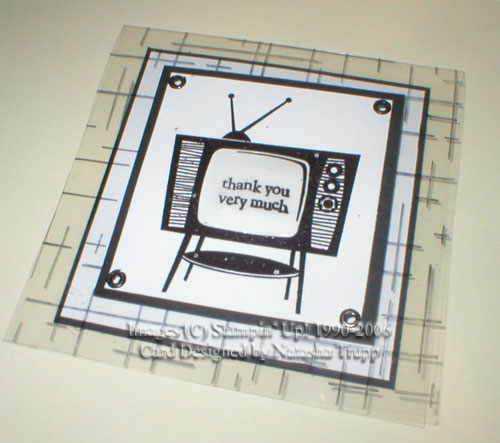
I went to Staples today to pick up the slightly sturdier acetate. This was not the easiest of tasks. All of the boxes say they are .10mm thick. However, some are sturdier than others.

  • The write-on acetate is very flimsy. This type works well for making shaker boxes and doing mirror stamping. It is also the cheapest. For about $14.00CDN you get 100. I would not recommend the write-on transparencies for use as a stand-alone card.However, you can use this type of transparency if your design has a reinforcing cardstock fold.
  • I bought the box that is intended for use in a copier. These are $32.00CDN for a box of 100. These transparencies, although also .10mm thick, are way sturdier. They score nicely and stand up just fine. They also are embossable (that was the first thing I checked once I was home). I also just ran the copier transparency through my laser printer, and it turned out beautifully! Just remember to open up the feed so that it goes straight through.
  • The store had ones that are designed for laser printers, they are even more expensive. For 50 it was $24.00 CDN. They had boxes of the copier and laser open, and honestly I could not tell the difference. One did not feel any different then the other(i.e no special coating, equally sturdy, etc.).
  • As far as comparison with Stampin' Up!'s window sheets? These are the heaviest feeling transparencies that I have found. I believe these are also embossable, however they are not nearly as cost-effective as buying a box of 100. Also, I think they are temporarily unavailable.

This card measures 6-1/4x3-1/2. I rolled my Bodacious jumbo wheel through the white stazon a few times, then rolled it onto the cardfront. The white piece (which is 2-1/4x5) was decorated with the small leaves and the swirls from Bodacious Bouquet. Then I stamped and cut out the bigger flowers. The biggest flower is regal rose stamped off once, then rocked/rolled in rose red. That one is also popped up on a dimensional and the little dots in the center are covered with glitter. I put a piece of regal rose on the interior (this piece is 5-1/2x2-1/2). Just a brief note about doing clear cards like this, attach your interior piece first so that you can center the front piece easily overtop of it.

Sketch Challenge Fun!


First off, my stamping get together was loads of fun. I think everyone really enjoyed the cards, and they all made them their own, which is so cool to see.
I squeezed in the sketch challenge tonight. I really like this layout, and I'm happy with how my card turned out. I was in the mood for something not at all winter-y. Go figure, it snowed at least a foot of snow and I made Christmas cards all evening with my guests, so I don't feel like making more holiday greetings.

Monday, November 27, 2006

Clearly, she has returned!


Sorry for the brief hiatus. I was a little more swampled by work then I expected to be (the word swampled has been brought to you by my sister Tamara). Anyway, I'm back now, and I should have time these next few days to be creative.
Don't you love it when a card just comes together. This one took no more than 10 minutes, and I love it. I finally broke open my thicker acetate ( I need to get some more of that stuff, add it to the growing list of stuff to pick up from Staples...). I wanted a clear card that would actually stand up and stay folded decently and this worked out great. I had my spectrum pat, Blue Frost still on my work table and the other day I had been thinking how pretty the dove from Wishing You would look in those blues. I stamped that first, then sorted through my backgrounds. French Script offered the classic touch I sought. I stamped that with the white stazon on the acetate. I attached all the pieces with glue dots, they provide a clean, close to invisible way of adherance (is that a word??). Then I finished it off with some white organdy and silver cord. Voila, one simply elegant card. I would love to do this for the Christmas card, but the knot would require extra postage, and thicker acetate isn't the cheapest medium. I suppose I could make this one for my non-mailing group.


Oh man, I cannot wait for January right now. I'm planning on getting the Carte Postale set and the matching French Flair, and I can just see the same card design with those stamps. Top that off with the fact that a friend mentioned wedding invitation design...too many things swirling in this head of mine, but that's a good thing.

Friday, November 24, 2006

Look Familiar??


So, here they are! I finally found the time to finish my other set of ATCs. I took my inspiration from a card I made back in October. I really liked how that one turned out, so I just scaled it down. The brown piece is covered chipboard. I pierced it to give it a bit more texture. The background is the fun, retro, and retired Linograph. The other stamp set is Bodacious Bouquet (love that set!!). On the olive I sponged around the edges to give it a bit more definition. There's also a bit of chocolate ribbon hiding on there. I really had fun making these, I hope the other swappers like them!!

Quick & Easy Holiday Cards!


I decided to offer a free holiday card class, and so far I am receiving several confirmations of attendance. I am very excited, since in the past I have been amazingly well at choosing the worst possible day for all the people I know. I'm doing 3 projects. They are relatively simple because I want to showcase designs that are great for "mass production". These cards don't require a lot of supplies or cutting, and they still look pretty. I'm also showcasing 2 of the holiday mini sets because the workshop is near the end of that order period. I want to put those sets out there as a "last chance, if you like, get it know". Anyway here they are. The sets I used from the holiday mini are Wishing You, as well as Snow Flurries. I also used Glad Tidings on the navy and blue one. The other card was actually designed by my up-upline. It uses glossy white, a spectrum pad, and the Holiday Print background. I modified it a tiny bit, to speed up the process for a group setting.

Thursday, November 23, 2006

Shiny Snowflakes


This card uses Lumiere. Lumiere is a kind of paint. It is a pearly white, really shimmery acrylic paint. For the background paper, I started out doing the faux mother of pearl technique. For this I combined some blue pearl ex and the lumiere and sponged it all over. After seeing the colour blue it produced, I then set out to match the Basic Grey Blitzen: Jack Frost papers {check that out here}. I sponged a few different browns, and stamped on plently of snowflakes. After all that work of creating this pretty neat background paper, I didn't want to cover it. So I stamped and tore some vellum to give it a frosty winter look. Then added some eyelets and some sponged twill tape to finish it off.

I don't normally do this...


Sorry for the lack of updates. I've been re-organizing my stamping area. It was LONG overdue, and I am trying to be ruthless. I almost have a bluebox full of recycling. I did take time today (once I reaquainted myself with my tabletop) to make a card from the 3 challenges that have been posted so far at SCS. The technique challenge was faux wood. The colour challenge was olive, cranberry, and bashful blue. And the sketch challenge, well, that's obvious, that's where I got the layout. For the leaf, I inked it up in olive first, then stippled cranberry overtop. This created an almost mustard colour between the 2, which I thought was pretty.

Tuesday, November 21, 2006

Monogram Keychain


I bought the Colorbok chipboard bundle because it had an interesting variety of shapes. However, there were several shapes that I already had. A few of those shapes fell in the "what the heck am I ever going to do with this?"-category. The shape in particular, a long rounded rectangular tag. This tag isn't the right proportion for most of the cards I make, and I don't do that much scrapbooking, at least not right now. So what to do?? How about make a personalized keychain. With some Basic Grey Hang Ten papers and matching letter stickers, some Mod Podge, and a few jump rings, this cute little keychain was created. After creating the keychain, I also saw how this exact design would work well on a scrapbook page. A group of them (without the jump rings) would make a cool title.

Sunday, November 19, 2006

Party Dress Card


When this card began, I didn't know where it was going. I started by covering a piece of chipboard and piercing the edges, then attaching the cut out flowers. Then I decorated the caribbean paper by using the brass template as a stencil. Then I wanted to add some velvet ribbon and do something different with the bottom two thirds. I tried various things with vellum. Dry embossing it didn't turn out so hot, then I tried using pink vellum, again not good. Finally, I decided to wheel the bodacious pattern in versamark and embossing it. Just a note about embossing vellum, keep your heat tool a fair distance away. It takes a lot longer to emboss, but you don't get burnt vellum!!

Anyway, the finished product reminds me of a little girl's party dress. The layout and the variety of textures seemed to mimic that clothing kind of appearance.

Saturday, November 18, 2006

Overlay tutorial!!


I promised that it would be up sometime this week, and here it is!! The tutorial can be found here: Invisibly Attached Overlays and here is the card I made to go with the tutorial. Hope that helps for any visual learners out there.

Thursday, November 16, 2006

Copper Fairy

First all, yay, new stamps!! Tamara and I went on about an 8-km roundtrip walking 
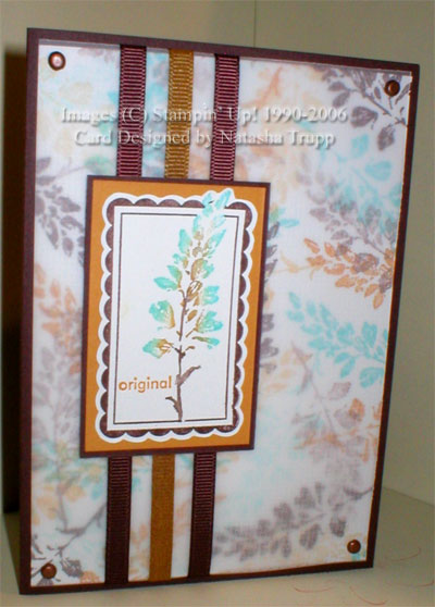
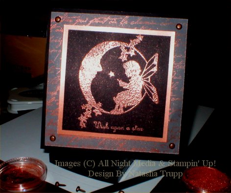
expedition to the Stampers! store in Victoria. The store is quite overwhelming, you are bombarded with SO MANY different stamp styles and types. We walked up and down the aisles quite a few times. I hemmed and hawed over several things. This silhouette fairy stamp caught my eye, and I knew it'd be perfect for this Thursday's "use copper tones" challenge. For the main image, I picked perfect pearls with clear embossing powder. There is also a vellum layer stamped with French Script and I did the poppin' pearls technique: i.e. stamp with versamark then lightly brush some mica powder overtop. To finish it off, I placed some copper brads in the corners.

Tuesday, November 14, 2006

Chipboard Flower


Just before heading out west, I happened to go to Michaels. They had a new Colorbok assortment of chipboard shapes and other goodies! This flower was one of them. I covered it with the Summer Mini petal patch paper, and then used those colours for the rest of my card. I didn't have any ballet blue ribbon, so I marker-dyed it. It worked wonderfully, just the perfect amount for my card.

Monday, November 13, 2006

Pocket Love Notes


This cute little pre-scored and cut cards are adorable. They make really cute little valentines. For this set of 4 I used a variety of products. On the firs one I used some chipboard and dressed it up with the Loves Me paper, then I wrapped it with some silver cord. The next one I watercoloured the heart with markers on confetti white paper. I also mixed the Sweet On You with Warmest Regards. I liked the different fonts together. For the postage stamp look I used the double hole punch because I could easily measure the spacing. The 3rd also uses some of the Loves Me paper and the Sweet Nothings accents and elements (the 'ribbon'). For the last one, I stamped the heart on the designer paper and popped it over the love note accent. It's lots of fun working with such a small medium.

Sunday, November 12, 2006

Beaded Snowflake


Sorry for the brief hiatus. I'm visiting my sister, so I had packed all my vital stamping stuff and it was inaccessible until last night. We each did 6 of the VSN challenges at SCS. It was a lot of fun! This is one of my creations from this morning actually. The challenge was to use beads and have your birthstone colour as the central colour. So here's my garnet snowflake card. I glued the beads on the bigger spots of the snowflake. I did a fallback layout. It's nice to have layouts in mind that you know work to fall back on. Once again, I had fun setting the scene for this photograph :D

Also, I will be doing a visual tutorial for the transparency overlays in the next few days. I think a visual might help some people with it.

Thursday, November 09, 2006

Big and Little Pieces


This set is such fun to work with. It actually makes me want to scrapbook (not that I have started that up again...) I've seen some awesome overlay transparencies using white ink, as soon as I saw this set I wanted to try that. Back before I could even order the winter mini goods, I put together a digital prototype. You know, when you really want a set, you have this great idea for it, but it's frustrating because you can't make it? Well, I wanted to know if what I had planned in sketch form would work in actuality, and it did. I don't think I can show you my prototype because that's probably against copyright and all that jazz. But I can show you the final product! I made 18 of these cards. They are 4.25 square cards. Trust me, if you haven't tried transparency overlays using white ink, you must! Especially combining big and little pieces!! So much fun!

Yay for embossing!!


I made this card following the layout of the SCS sketch challenge. I don't usually do layouts like this because I have a tendency to make them too busy or too lacking. I was really happy with this one because I solved the bare background problem by embossing it! This card is going to go to my friends, Carly and Arron who just recently bought a house!!

Wednesday, November 08, 2006

Cherish the butterflies!


So here's my first creation for an ATC swap I'm in. I really didn't think I'd get them all done today, but I did!! There were a lot of steps involved in these, but I'm really happy with them, and I hope the recipients will be too! I did masking, sponging, watercolouring, cracked ice, and a little bit of faux hardware.

In other news, my winter mini stuff is due to arrive today!! It isn't here yet, and I have to go to work in 30 minutes. How cruel! I just know that as soon as I leave, the delivery will happen. I either get my stuff before 11AM, or sometime after 1:00. I was planning on doing the SCS sketch challenge, but I already designed what I wanted to do based on the new stuff!!

Tuesday, November 07, 2006

A Tuesday off...


So here is the first of hopefully many items I will make today. I kind of got off to a late start. I wanted to make a really unique layout, but the elements I wanted to add didn't look right. Instead I want with a slightly longer than usual format (6x4.25), and I did triple ribbons behind the central image, which is something I don't normally do. There is actually a vellum overlay on here and it is stamped with the Aida Cloth in white stazon. In person, it gives the card a very fabric-like texture. I didn't have any mustard ribbon, so I coloured some pale yellow grosgrain, then ran it firmly through a towel to take out any extra ink. This is a great way to get small amounts of matching grosgrain. I ran it through the towel at least 5 times, basically until no more colour comes off the towel. It's a relatively quick process and less messy than dyeing. And, if you like the colour, and think you'll use it all the time, then you might want to consider dyeing a couple yards.

Monday, November 06, 2006

Bad Stamping Day...


This card, I had high hopes for and I had lots of really inspiring cards in mind, but it just didn't work out completely. I decided to give photo corners a try. I like how those turned out. I really liked LodiChick's idea of flipping the petal print flowers and grouping them, and that worked out alright. I got the photo corners placed, and then I didn't know what to do with the birthday greeting (it had to be a birthday card, by request). So the greeting is there, but it seems like kind of an afterthought. I was also going to put some hodgepodge hardware on here, but then the whole thing dumped on the floor. (Keep in mind I have only used about 2 pieces from this set of hardware, so yeah, over 100 metal embellishments falling onto a berber carpet, not a good time). Amazingly, everything BUT the brads fell out, so it wasn't too much of a pain to pick up. And then, after that was cleaned up, the whole Amazing to Zany set jumped ship. I wasn't even near it, and boy did those pieces scatter! It's crazy, things I've had stacked for weeks are suddenly decided to randomly collapse. Perhaps it is a good thing that I am leaving for work in the next 25 minutes... Anyway, here is the card.

Saturday, November 04, 2006

Whimsy Holiday Planner


I was at Dollarama today, it's nice to actually go to a dollar store where everything is actually $1.00. I saw the composition notebooks there, so I picked one up with the intent of covering it. Then I went and bought some gorgeous Paper Salon papers. Their "Dazzle" collection is really fun and whimsical (check it out here: Paper Salon: Dazzle Collection). I thought it'd be great fun to make a holiday planner out of the paper. I covered the notebook with mod podge, slapped on the fitted piece of designer paper, then designed my title in Photoshop Elements. I used the 2 Peas font High Tide, and I screen-captured the paper so I could match the colours. I applied a drop shadow and an inner glow effect to the font. It looks so cool. I really like it when my colour printer works properly! The inside tabs are painted chipboard. Amazingly I had paint that matched the colours quite well, so I didn't even have to experiment with mixing today!. I'm not sure what I want to label the sections as, so I just put in a little piece of the designer paper for now.

Friday, November 03, 2006

A different style


Every once in a while I like to try something that goes beyond my usual style. I borrowed this set from a friend and I wanted to try the aged, collaged style of card with it. I actually pulled out some watercolour paper. I don't know why I was avoiding the stuff, it really doess make painting easier. The focal butterfly was embossed then painted on the watercolour paper. For the sponged background on the white, I tore a rectangular template out of a piece of cardboard. Using that as my mask, I sponged and stamped to my heart's content. I also took out some stress on the chocolate paper. I used my homemade distressing tool, a v cut into a fake plastic credit card, works quite well and gives your nails a break.