Saturday, August 26, 2017

Stamp-a-faire 2017! Inked Woodgrain Impressions


Hi everyone! I am so excited to be playing be a part of Stamp-a-Faire this year! I've played along every year so I felt honored to come up with my own challenge and video this year! I can't wait to see what everyone does! My Anniversary Tradition Theme was Wood.


Check out my video HERE

Be sure to check out the official Stamp-a-faire post here. That's where you can enter the contests to win a few prizes!

Here's my card:


Inked Woodgrain Impressions:

Impression plates add depth and interest to cards. In keeping with the 5th Anniversary gift theme of Wood, I am challenging you to use your wood themed impression plates. In order to add an additional “wow” factor, we’ll be inking up those impression plates. If you don’t have a wood-themed impression plate, you could also use a stencil or embossing folder.  You can try this technique with other impression plates, but be sure to still include a wood-type theme into your card somehow. A lot of the other Papertrey Ink impression plates would still look very wood like if used in brown tones (other suggestion: Diagonals, Rustic Burlap, Aida, Diagonal Stripes, Striped Sweater, Herringbone, Animal Prints (zebra stripes side), Argyle, Diamonds, Cane Print, Linen and Canvas, Moroccan Motifs, Tin Types, etc.) Get creative!


Supplies all by:
Papertrey Ink
Other: Foam Tape, Glue, Tape

Paper and Measurements:
Kraft Card Base: A2 size: 5-½ x8-½ , scored in half (at 4-¼ mark)
Dark Chocolate Piece: 5-¼ x4
Rustic Cream sentiment strip: 5-½ x ½
Leaf print cut outs from Rustic Cream Card stock
Americana (enough to cut out the “thanks” die cut 3 times- about 3 strips- 1x3 each)

  1. Cut card base to size and score it.
  2. Gently ink up an impression plate with your ink of choice (Dark Chocolate used in my project). Try to swipe the ink pad in the same direction as the pattern to avoid ink from going into the grooves. If any ink gets in the grooves, you can also wipe it with a cotton swab. Place Dark Chocolate cardstock on top of the inked impression plate. Place items into a folded piece of lightweight copy paper. Place rubber mat on top of this sandwich, ensuring that the entire impression plate is covered. Run through your die-cutting machine (I used the cuttlebug and used the sandwich A,B, impression plate/paper, rubber mat, B, cardboard shim)
  3. Die cut 3 “thanks” out of Americana card stock and one of each of the leaf prints from Rustic Cream card stock
  4. Adhere the 3 thanks together
  5. Stamp the leaf prints images onto the corresponding leaf prints die cuts.
I used Harvest Gold and Honey Oat for the elm leaf, Prairie Grass, Honey Oat, and Cocoa Bean for the oak leaf, and Americana and Terracotta Tile for the maple leaf. I used Dark Chocolate for the line detail image. To achieve a blended look, start with the lightest ink color, then ink the desired portion with the darker color and then tap the lightest color back over the entire image.
  1. Stamp the sentiment on Rustic Cream sentiment strip, using Dark Chocolate
  2. Adhere woodgrain panel to the Kraft card base. Next adhere the sentiment strip to the woodgrain panel. Attach the “thanks” die cut. Adhere all of the leaves with foam tape.


Other Ideas: Try this technique with other colors.
The other samples I showed in the video are Kraft with Classic Kraft Ink, Kraft with Vintage Cream ink, Cocoa Bean with Vintage Cream Ink, Dark Indigo with Dark Indigo Ink (I realize now I said Island Indigo in my video, haha, that's a Stampin' Up colour, not a Papertrey Ink colour, I used Dark Indigo in the video), and for an ombre effect- Scarlet Jewel, Americana, and Terracotta Tile on Kraft.


Tuesday, August 22, 2017

Camp Create


I've got several projects for you today! I meant to participate in the June Camp Create, but time got away on me. However, I knew I had to make time for these challenges! I just recently got the newest 12 colours of Distress Oxide inks, so I found a way to use these on all my projects!


First up- the Inlaid Made Easy! Inlaying Die-cuts is really a great technique for when you want to put a die cut over a background, but you don't want the die cut to get washed out. I started off with a blending Distress Oxide inks on some white cardstock. I really wanted a fun background, so I took my Floral Fantasy background image and spritzed it with water. I pressed that onto the blended background for a few seconds and waited for the oxide magic to happen. I love how it has a suede like look! Once that was dry, I die cut the word celebrate once from white, and once from the background so I could inlay the die. The final touch was adding the "You're kind of a big deal" sentiment from Happy Hippos.


The second challenge was Magnificent Masking. I didn't make a whole background scene, but I did mask together these two characters (Beary Special Birthday and Happy Hippos) and a pile of presents. Once I had that birthday scene all set to go, I decided to add it to a stenciled background made with the Cascading Scallops stencil and distress oxide inks. I went with these products because I thought the swoosh of the stencil went nicely with the cake design and I could choose distress inks (Peacock Feathers, Fossilized Amber, Abandoned Coral) that nicely coordinated with the Copic colours I used.


The third challenge was background bonanza. It's funny, because I started out this one with the intention of using the first part of my stenciling, but I decided to use the other piece instead. I taped my Sun Ray stencil to some card stock and blended distress oxide over it. I like how it looked, but decided to make use of the stencil a second way. Since there was ink all over it, and I had to wash it off anyway, I spritzed water over the stencil and then used that to stamp to my paper. I loved the look! I decided to use a sentiment from the Rainbow of Happiness and coordinating die (now retired), a few Wplus9 clouds and also added a few sequins to finish it off


The fourth challenge is Monochromatic Magic. I got out my Large Desert Blooms (now retired) and decided to figure out something. Once again, I got out three Distress Oxide inks (Lucky Clover, Twisted Citron, and Peeled Paint) I smooshed them all over a clear block, spritzed some water and "stamped" with it on some white card stock. Next, I stamped the small leaf all over in Lucky Clover. I really like the painted look to the background. Keeping with the monochromatic theme, I die cut the word hello from the Hello There set and added "a birthday" from Hand Lettered Hello.


The fifth challenge is Delightful Die-cutting. I kept my die-cut Celebrate from the above die-cut inlay challenge and decided to make a card around that. I wanted it to be a bit more impactful so I layered it with 2 more layers of white die-cuts and also clear embossed it. The background was really fun. I chose 4 distress oxides (Salty Ocean, Twisted Citron, Fossilized Amber and Spiced Marmalade) and blended those loosely on the white cardstock to match up with the same colours on the die-cut word. I spritzed some water and also got out the non-oxide versions of those same inks for some ink splatters. Once again, I found a greeting from the Happy Hippos set to finish it off nicely.


Here's a close-up of the shine on that celebrate:


The final challenge, a bonus bonfire challenge was Awesome Ombre. I was inspired by how the colouring was completed in the video, so I attempted a similar style with my hippo and the balloons. Once again, I couldn't stay away from incorporating Distress Oxides. I decided to make an Ombre background. I used some washi tape to make even stripes and then I started blending with Black Soot. I had a heavy hand at the one end and really tried to evenly dissipate my blending as I got closer to the other side. I think it worked out pretty well. I realize that black and grey may not seem like the "hip hippiest hooray" colours, but with the pop of colour from the balloons, I think it works!


Monday, August 07, 2017

MFT Sketch & Colour Challenges


First up the colour challenge. This one was a bit tricky for me, since I don't have these colours and they are pretty unique. I managed to find a blue-ish purple that worked for "Purple Rain" (I think I used a now retired SU!). The "Factory Green" wasn't too difficult to match either. However, since I don't have inks to go with the three vibrant colours, I decided to rely on Copics.

I made a simple scene, using a cloud stitched die on some Soft Stone card stock (filling in for Grout Gray). I adhered that to the sky and then stamped and cut out my dragon and his little puff of smoke. 


It still felt too simple once assembled, so I decided to make my sky a starry sky. I used a bit of watered down silver reinker and the end of a paint brush to add little dots all over. I also added a shimmer layer to my dragon.


Supplies:
Stamps: Magical Dragons
Ink: Memento- Tuxedo Black, Silver reinker
Paper: Dark Blue/Purple, Simply Chartreuse, Soft Stone, White
Accessories, etc.: Lawn Fawn Puffy Cloud Borders, wink of stella


Now, onto the sketch. I have to say, this one was giving me a similar vibe to one a few weeks back, but I still like it. I wasn't really sure where I wanted to go with this, so I just kind of started playing around. When inspiration isn't immediate, I find that I work best to just get out some watercolour paper, some distress inks, and go with it. It worked!

I decided to start with a piece of paper edged with one of the stitched scallop basic edges. Next I did a water wash and added in rainbow stripes (Fired Brick, Spiced Marmalade, Mustard Seed, Mowed Lawn, Mermaid Lagoon, Wilted Violet). Once that was done, I was looking around my desk, and remembered that I have the Floral Fantasy stamp. I tend to forget about rubber stamps, but I still appreciate how much sturdier rubber  background stamps feel. So I spritzed the 6x6 background with water and held it on my background for a few seconds. I gave it almost a batik or tie-dye look. To accentuate the background image even more, I decided to stamp the same image with versamark and apply clear embossing powder. It's subtle, but a really neat look.


To finish it off, I stamped a sentiment from the Rainbow of Happiness set (so sad to see this one retired) and to balance the black sentiment, I added some sheer black polka dot ribbon. This is from a super old ribbon share I did years ago, but this stuff still is classic. Love products that don't really fall out of trend!

Supplies:
Stamps: Floral Fantasy, Rainbow of Happiness
Ink: Fired Brick, Spiced Marmalade, Mustard Seed, Mowed Lawn, Mermaid Lagoon, Wilted Violet, Versamark, Black
Paper: White, Watercolour
Accessories, etc.: stitched scallop basic edges dies, ribbon, clear embossing powder


Sunday, August 06, 2017

Popsicles & Splatters


Here's my post for this last week's Simon Says Challenges.

Monday's Challenge was Food and/or Drink, so I pulled out Ice Cream Dream and some distress inks. I started with a piece of watercolour paper and painted a washed background from Carved Pumpkin, Fossilized Amber, Twisted Citron, and Salty Ocean. Once that was done, I stamped the popsicles all over with versamark and then embossed them with white embossing powder. Next, to give them a little "pop", I added more ink.

The sentiment comes from the Wishing and Sending set. I stamped the banner image with Aqua Mist ink and cut it out. Next I die cut Wishing, adhered that over top and added some glossy accents to give it that nice shine.


Supplies:
Stamps: Ice Cream Dream, Wishing and Sending (SSS)
Ink: Carved Pumpkin, Fossilized Amber, Twisted Citron, Salty Ocean, Versamark, Black, Aqua Mist
Paper: White, Waterclour, Black
Accessories, etc.: Glossy Accents, Wishing Die, White Embossing Powder


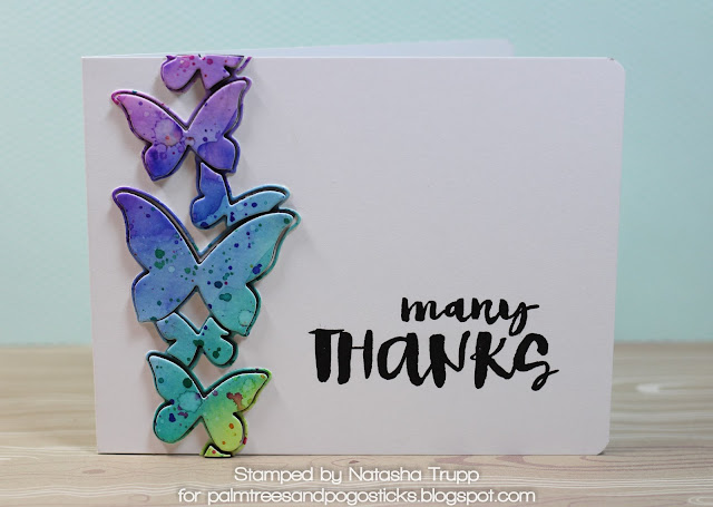
Wednesday's Challenge was Splatter It, so I pulled out distress inks, the Butterfly Drift die, and Many Thanks.

Once again I started with watercolour paper. I applied a wet wash all over and then pushed various inks into the wash. Once that was dry, I splattered more ink and also spritzed water overtop. I die cut the Butterfly Drift out of that and adhered the outline only to the card base. I adhered each of the solid images to fun foam and attached them for that extra dimension. I finished it off by rounding the corners of the card and adding a greeting from the Many Thanks Set.


Supplies:
Stamps: Many Thanks (SSS)
Paper: Watercolour, White
Inks: Black Onyx, Wilted Violet, Picked Raspberry, Blueprints Sketch, Peacock Feathers, Twisted Citron, Lucky Clover, Squeezed Lemonade
Accessories, etc.: Corner Rounder Punch, Butterfly Drift die


Friday, August 04, 2017

Dare to Get Dirty 2017

So it's been several years since I contributed to the Dare to Get Dirty challenge over at Splitcoast Stampers. However, this was really the website where I "put down my crafting roots".  I was part of the Dirty Dozen starting in August 2007 (ten years ago!). A lot has changed since then, but I am still an avid crafter and stamper.

Although I didn't host any challenges, I provided samples for a few of the challenges. I thought I would share my projects here and encourage you to check out the challenges.

I won't share the specific challenge details (that's part of the fun, those details are for Fan Club members only), but here are my cards and the write-ups copied over from SCS:


I put this together for Edna15's challenge.

I have to stick to a stamping budget, so sometimes even though there are coordinating dies for a stamp set, I don't buy them! I also like my images to look a certain way, so I have gotten quite used to cutting them out.

This birthday bouquet was for my Grandmother's 80th birthday.

Stamps: Gran's Garden, Pen & Ink
Paper: White, Dark Chocolate
Paper Size: 5x6.5
Ink: Harvest Gold, Summer Sunshine, Honey Nut, Simply Chartreuse, Ripe Avocado, Dark Chocolate
Accessories: Mix and Mat Scallops Die


I put this together for jeannes's challenge
A while back, I made a similar card with the dotty butterfly trails using nuvo drops. However, I decided to use black acrylic paint and a stylus to get the same look. The perks to using the paint and stylus- easier to control, dries quickly and flat!

Stamps: Butterfly Hope, Polka Dot Basics
Paper: White, Harvest Gold
Paper Size: A2
Ink: Harvest Gold, True Black
Accessories: black acrylic paint, sheer polka dot ribbon, stitched scallop basic edges die, butterfly hope die


I put this together for va.sunshine's challenge.

For this card, I first embossed the hearts onto the vellum using white embossing powder. I then created a window card base and sandwiched the vellum between the front white piece and the card base. I added a few colourful heart dies and the celebrate word. I thought it'd be a fun and different wedding card.

Stamps: XOXO
Paper: White, Vellum, Berry Sorbet, Sweet Blush
Paper Size: A2
Ink: versamark
Accessories: good times die, xoxo die, mix and mat scallop die, white embossing powder
Techniques: heat embossing

Tuesday, August 01, 2017

Sparkly Unicorns


Sometimes it's just a rainbows and unicorns kind of day- at least that's the sentiment I've used on this card!

The Simon Says Stamp Wednesday challenge this week is Anything Goes. So I decided to just sit down, play with some stamps, and see where it lead me!

Here's the card, I started with the blue stitched cloud background (Lawn Fawn). Isn't that such a fun backdrop for various animals or creatures? I was going to pull out the dragons, but my circle panel was a bit too small, so I thought the Mama Elephant unicorns from Unicorn and Rainbows was perfect!
I coloured the unicorn with Copics and applied a nice layer of Spectrum Noir clear sparkle over top. I knew I wanted the contrast of orange for my main panel, and then I found this sparkle paper in my stash. It's from a Michaels Recollections multi-pack, and I have to be honest, it reeks. I cannot be alone in thinking the smell of some of the specialty sparkle papers smells totally toxic? Anyone know of a good sparkle paper that doesn't reek? I'll just let the card air out for a bit before I send it out.

Anyway, despite the smell, it's a perfect match! In order to make sure my sentiment stamped well, I used archival dye ink and my MISTI.


Also, in other news- have you all seen Cathy's latest release over at Simon Says Stamp? I hope to get the Hello You and Yay sets soon. I also kind of want the Salty Ladies set. I'm sure we all know some friends that would totally go for those sentiments! I've been a Cathy fan for a long time. Her clean and simple scrapbooking style is amazing, so I was thrilled when she jumped into cardmaking recently!