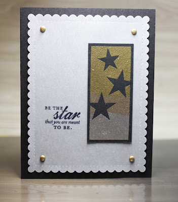
It's the beginning of the Papertrey Ink 10th year anniversary festivities. Today's challenge was to look back at the sets released in their first year- 2007. I brought out some sets that had not seen ink in some time.
First up: Beautiful Blooms
I went with the colours: Kraft, Vintage Vanilla, Melon Berry, Canyon Clay, and Dark Chocolate
I wanted to try something else with a different floral image from the set. I inked up the flower with Hawaiian Shores and then Tropical Teal to get an ombre floral effect.
The leaves were embossed with clear on Limeade Ice. I pulled out an old sketch from the clean and simple stamping blog, since I started that up in 2008. Thought it'd be fun to revisit.
The next set I brought out was Text Boxed. I made a background with the burst-y image. I decided to bring a more updated set with it- the Shakers and Sprinkles dies and stamps.
Lastly, I brought out Green Thumb. I made two simple 4.25 square cards. They are pretty straightforward. I love the spring vibe of this set and thought bright colours would be ideal.


Wow! You've been busy. These cards are beautiful!!
ReplyDeleteI saw your group of cards over on the Forum and had to come see them individually. It's amazing that stamp sets designed 10 years ago can still look current. My favorite of the cards you shared here is the first one. That's a great color palette and reminds me that I need to stamp leaves in colors other than green.
ReplyDeleteOnce again timeless beauty! All of your cards are wonderful!
ReplyDelete