Sunday, June 28, 2015

One with Nature!

I decided to have a bit of fun watercolouring these leaves/trees from the newly released One With Nature. I went with atypical colours for leaves because that seemed fun at the time (Spiced Marmalade, Crushed Olive, Seedless Preserves and Peacock Feather if you're curious). I also decided to go with a more fun sentiment- this one is from Ice Cream Dream.

I had the hexagon embossed cardstock on my stash from a failed card attempt from the previous date. It worked on this card, especially with the colours I had already selected. I dug into my ribbon stash for some cute matching ribbon and that was that!

And even better, the card completely works for this week's Simon Says Wednesday Challenge! The challenge this week was to feature Simon Says Exclusive Product and the theme was Anything Goes!


Mists+Stamps

When I saw this week's Simon Says Monday Challenge: Stamps+ Mist, I knew I wanted to give it a go. Of course, I use stamping as one of my main tools for card-marking. However, although I have made mists a few times, I have rarely managed to use them on a card to my liking. I really wanted to try my hand at using mists and actually liking the end product.

Here's the first card- I made my own mist using few different blue reinkers and water. I taped down the Ledger Drop stencil onto some watercolour paper and got to misting. Once I was relatively happy with how it turned out, I stamped the greeting from Many Thanks. Finally, the final touches were a few vellum flowers attached with blue brads and a few blue rhinestones. I was feeling just "ok" about the card but decided to move.


The next day as a bit of a warm up, I got out the Zig Zag stencil and didn't even tape it down- I just placed it on top of some watercolour paper and started misting. I used 3 different colours of mist I had made- the blue one from yesterday, a yellow/gold one and a brown one. Well, was I ever surprised when I actually liked the messy, chaotic look to it! I picked out the lace next thinking that would pair well. Finally, I decided on Spring Blooms. I used the colours of the misted background as a guide for the ink colours. I went with all Stampin' Up inks here- Baked Brown Sugar, Hello Honey, and Lost Lagoon. The greeting is from Fanciful Feathers. I was definitely more satisfied with this card.


Overall, I was really glad I went for the challenge and stepped a tiny bit out of my comfort zone. It's good to try different techniques and products!


Thursday, June 25, 2015

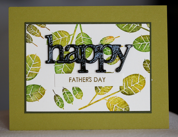
Leafy Father's Day


I know Father's Day was last weekend, but my dad was out of town, so he's not getting the card until this upcoming weekend.  Although, you could also easily apply these techniques and layout to a different sentiment.

I was feeling really inspired by all of the cards I saw using the newly released One with Nature. Being in Canada, I knew that even if I ordered that set (which I have), I wouldn't be receiving it for at least a week. When you feel that inspired, sometimes you need to see what you can do with what you have.

I pulled out this oldie, but goodie Stampin' Up! set (All the Best) and decided to ink them up with distress inks. I have the spots, so I just kind of inked up randomly with several different colours, ensuring that I covered the whole stamp. I stamped that onto my favorite cotton paper. Once they were all stamped, I went over the images with a fine, wet brush to blend and smooth the colours.

After all that work, I didn't want to hide my background, so I decided on a bold and clear embossed die cut "happy" with a small sentiment strip.


Supplies:
Stamps: All The Best (SU), Men of Life (PTI)
Ink: Various Distress Inks, Ripe Avocado
Paper: Cotton Paper (Savoy), Ripe Avocado, Simply Chartreuse, Meadow Moss
Accessories, etc.: Happy die (happy trio- WP9), clear embossing powder


Saturday, June 20, 2015

Cool Treats!

After seeing the recent Simon Says Stamp Color of Fun Blog Hop and then the Wednesday Challenge, I was feeling very inspired! I decided to focus on two of my favorite techniques- Heat Embossings and Watercolouring and one of my favorite products- Distress Inks.

The watercolored ice cream card by Yoonsun Hur was especially inspiring! I don't have any of the products from the new release yet so I decided to see what I could make with the stamps in my stash.  I pulled out the Ice Cream Dream stamp set. What's great about this set is it's line art, which makes for easy watercolouring!

I stamped various ice cream treats and popsicles on the cotton paper with versamark and then clear embossed them. Then I started to paint each image using Distress Inks. I really love the vibrant look you can achieve with these inks as watercolours!

Finally I needed a sentiment on there, I decided to die cut the word happy out of black cardstock and then I stamped the word birthday (from the Birthday Balloons set) on a small strip of paper.


I have to say I really like how the card turned out!


Wednesday, June 10, 2015

Stars & Watercolour

Here is the anniversary card I made for my husband this year. I bought this set when it first came out because I love all things starry and also because I thought the sentiments were sweet. I had yet to make a card for my husband and when he read the sentiments, he may have teased me a bit at the cheese factor. So because of that I decided I had to use it on his card. I'm cheeky like that :)

For this background, I worked in sections, wetting the paper and then dabbing the inked up paintbrush into the water, letting the ink blend and move with the water as it pleased. I really like this look and you can make it as light or as bold as you like. If you want more colour, you can go back in with more ink, or use slightly less water.

Once I was happy with the background, I decided on my sentiment placement, then started adding in the stars.

The final step was the embossed, popped up star. I don't dark blue embossing powder or craft ink, so I did the old stamp in Versamark first and then into your dye ink trick. Doing this doesn't damage the dye ink pad and it gives the image enough stickiness for embossing powder to stick to!


Supplies:
Stamps: Super Stars (PTI)
Ink: Tumbled Glass, Chipped Sapphire, Broken China (Distress Inks), Versamark, Black Onyx, Enchanted Evening
Paper: Enchanted Evening, Brushed Silver, Savoy Cotton 118lb

I know the price point may seem a bit steep for a 25 pack, but I have to say, I absolutely love this paper for watercolouring! I initially bought it to use with my letterpress kits, and it really does press quite well. However, I happened upon watercolouring onto it by happy accident and now I almost always pull it out for that. I have both the bright white and the natural white. I love it since it's a smooth surface. I've always disliked the extremely textured watercolour papers. 

Thanks for stopping by!


Sunday, June 07, 2015

Stencilled Backgrounds

On Saturday, I picked up these fun Bo Bunny stencils to try out. I didn't have any cards in mind, I just wanted to see how well they did. The next day I came back to the backgrounds and decided to make a few cards.

I have to say it was nice not to have to tape down the stencil. Also, since these are mildly intricate designs, it was great not having to worry about them shifting or popping up mid-sponge.

First up, I wanted a cheerful card. The colours I used were PTI's Harvest Gold, Summer Sunrise, Orange Zest, and Terracotta Tile.  Next I die cut 3 layers of the WPlus9 hand lettered hello from some Basic Grey cardstock. I adhered those together to make it dimensional. Last few steps were stamping the word "sunshine", and then getting my layers altogether and finishing it off with some satin ribbon.


This card features the first stencil from the pack I used. If you know me well, you may know that I like stars, quite a lot! So this stencil definitely "spoke" to me! I wanted a rainbow look, so I decided on PTI's Hawaiian Shores, Limeade Ice, Harvest Gold, Summer Sunrise, and Berry Sorbet. Since I had the background already cut as a square, I decided to make a 5.5x5.5 card. I die cut a few stars, and sponged them. For added pop, I also clear embossed them. The "happy" was die cut three times and made to be another dimensional sticker. I paired that with one of the birthday greetings from the Whole Lotta Happy set.


For my final background, I had gone with blue tones. I wanted a bit of an ombre look, although I foresee myself using a rainbow colour scheme in the near future...

I went with PTI inks once again- Enchanted Evening, Blueberry Sky, and Spring Rain. Ever since I got the reinkers for these, I have been quite happy with how they sponge using the mini blending tool. Whatever ink you decide to use with blending or sponging techniques, I highly recommend keeping the associated reinkers. I definitely plan on getting the reinkers for the distress inks eventually, as I use those quite a bit for watercolouring and blending.

Anyway, back to the card, with this background, I wanted something a bit different from the first two. I decided that Spring Blooms would go nicely. I wanted something to contrast with the blues so I decided on yellows (Harvest Gold and Summer Sunrise). The green was a bit trickier to decide. I found that most of the PTI greens were too yellow heavy for this card and the one that's not was too vibrant. I ended up going with Stampin' Up!'s Pistachio Pudding. It had a nice softness that stood out enough from the blue background, but still coordinated with the yellow flowers.

I stamped the flowers and leaves and fussy cut those out. The sentiment comes from Strictly Sentiments 1.


I would definitely recommend these stencils for ink blending. I had no issues with them getting stuck to or damaging the paper. They cleaned very easily, almost even seemed to repel the ink a bit. I'm not sure how they will do with texture paste. I may give the final stencil (the heart one) a go, as I am not as attached to that one!

Thanks for stopping by.


Thursday, June 04, 2015

TBT Challenge

I saw the throwback challenge over on Dawn's blog and thought it would be fun to play along. I loved the use of the Fanciful Feathers in the post and thought I would use that set too, since it had been too long!

For the large feather I inked up with the dark blue first, then went over with the lighter ink and made sure they blended before stamping on the paper. I like doing this a lot with similar coloured inks. It makes a nice ombre effect!


I also thought I'd share this card that I made several weeks ago. I only shared it on Instagram, but really liked how it turned out! I stamped the flowers using various Distress Inks and then applied water to give them a painted look. The hello die was stamped with the sparkly versamark and then clear embossed.


Supplies:
Card 1- Stamps- Fanciful Feathers


Saturday, April 18, 2015

A few recent cards

I thought it was long overdue to share a few non-sketch cards!

First up, a technique that I haven't done in years- wax paper resist. The technique is pretty easy, crumple up a piece of wax paper, and then flatten it against your card stock. Next use an iron to transfer the wax to the cardstock. Be sure to layer another piece of paper between the wax paper and the iron so none transfers to the iron.

Next is the fun part, seeing exactly how the pattern transferred. To do this, choose your ink colours and start sponging them.


The rest is pretty straightforward- die cut inlay.

Next up is a card that I made quite a while ago. I can't remember the exact challenge that my husband presented me, but this was my take on it- a very fruity card! I have to say I love the use of the clear foam tape here. I used it top pop up my velum greeting.


Lastly, I have a relatively quick card. I cut out the word hugs 3 times and layered them all together to make a dimensional greeting. Next I stamped my aqua background using aqua mist, hawaiian shores, and fresh snow on aqua mist paper. The sending banner is one of the stamps in the hugs set, so I thought I would trim that out and pop it up. Easy peasy!


All cards featuring primarily Papertrey Ink.

Sunday, March 01, 2015

Rainbow Smooshing!

If you haven't heard of smooshing, you must go here and check out the "queen of smooshing", Laura Bassen. She also has an easy to follow video so that you can try too!

I've done this technique before, but it had been a while, and now that I have so many more Distress Inks, I thought that I ought to try it again. Now you don't have to use Distress Inks, but they really do react so nicely with water. I have also used Papertrey Ink's Inks (lol, that was awkward to type) and they work pretty good too!

For my card, I started with some of my favorite cotton paper. I bought this paper years ago when I intended to do a bit more letterpressing with the Lifestyles Craft Letterpress kit. However, as much as I loved doing that, I found that this paper is amazing for watercolour techniques!

I stamped and embossed the triangles from Mama Elephant's Trifecta. Once that was set up, I chose my colour scheme and starting smooshing (apply ink directly to an acrylic block, spritz with water and stamp directly to the paper)

Once that was done, I die cut a Happy Birthday sentiment and added a few black sequins and rhinestones.


For my colours I used Fired Brick, Orange Marmalade, Mustard Seed, Mowed Lawn, Peacock Feathers, Broken China, Crushed Preserves

Saturday, February 14, 2015

A few more challenge cards!

I found a little bit of time to play along with the rest of the Papertrey Ink 8th anniversary challenges.

First up, the metallic and neutrals challenge- This one was very inspired by Danielle's card set. I masked off a thin stripe and used Versamark directly to paper and then applied gold embossing powder. I also embossed the dots with gold.


The next one is for the ombre challenge. I had much higher hopes for this card, but was feeling the pressure of a time constraint. Oh well, it got done!


Monday, February 09, 2015

A few cards

Hello!

Over the past few months I've been busy making cards, but have been somewhat inconsistent with blogging them. I have a few reasons- my card reader on my laptop is working poorly, my hard drive was mostly full (this has since been rectified!), I've felt more like creating than writing about creating, and the list goes one. I know they are just excuses, I guess I just need to make the effort to get back to regular blogging! I certainly have enough projects that I could be sharing!

It's February, and that brings out the Papertrey Ink anniversary contests! I've been playing along with all of the challenges so far!

Here are my cards for the first 5 challenges.

#1 Colour Combination/Sketch
I used the colour combo of Melon Berry, Blueberry Sky, Fine Linen, Classic Kraft, and Aqua Mist. I was really drawn to this combination and didn't think I'd ever put these colours all together before.


#2 Inspired by Maile
Really, who hasn't been inspired by Maile at some time? I drew some inspiration from this post. I really liked the idea of using a coverplate over a colourful background. I don't have the star cover plate, so I did some selective die cutting, being careful to leave an un-cut panel. I also wanted a more blended background so I sponged by background instead. I suppose with the rainbow look, you could say I was a little inspired by Laura Bassen as well.


#3 Make a Tag and Matching Gift Bag
I always like using the bold flowers from Beautiful Blooms 2 and thought they would work well for a gift-giving duo. Here's a look at the tag:


And here's the full project:


#4 Bouquet using Multiple Stamp Sets
I think this might be my favourite challenge so far. It was so fun going through all my stamp sets and figuring out which flower images might go well together. On the car I used flowers from Green Thumb, Everyday Classics, and Rosie Posie. I really wanted them to look like they could have come from the same stamp set. I stamped the images onto some natural cotton paper. Once I had my bouquet arranged to my liking, I went over with a fine paintbrush and water and blended the images to create a more painted look. I also added a few free-hand stems and then tied a silver bow around the whole thing. It was surprisingly enjoyable to do this with my stamps, as I am a little guilty of refusing to combine stamp sets with different design styles.


#5 Use a stamp set that hasn't been used in a while.
I've used In Bloom and the Year of Flower sets in the past, but it's kind of been a long while since I've used either. I also had it in my mind that the card was supposed to be Spring themed, so I went with a Spring type colour combination.

For this one, I first decided on a colour palette- Winter Wisteria (lol the irony!), Spring Rain, Spring Moss, Lemon Tart, and Sweet Blush. Next, I knew I wanted to try to split panel type of layout and I also knew that I wanted a spring-ish sentiment.


That's all I've made for the challenges so far! I am looking forward to the next 5 days!


Tuesday, October 14, 2014

Sparkle Watercolour Backgrounds

The other day I was seeking some inspiration. My husband gave me one of his challenges. He wanted a rainbow sparkle card. He wasn't that specific with the requirements, so I did what I wanted with the suggestion.


First I got some watercolour paper and blending several colours into a rainbow type background. I used all distress inks here (Red Brick, Spiced Marmalade, Mustard Seed, Mowed Lawn, Peacock Feathers, Salty Ocean, Seedless Preserves, and Picked Raspberries).

Once that was dry, I stamped some flowers over top with Fresh Snow pigment ink. Before those faded too much, I covered the whole thing with Versamark and embossed it with a clear/glittery embossing powder. I loved how sparkly it became! Because of the glitter in the embossing powder, it's not the easiest surface to stamp on. I cut a piece of acetate to the same size and stamped my greeting using black Stazon. I attached that to the watercolored layer using brads. It's nice because the acetate gives the card a nice smooth, shiny finish.

This photo gives a slightly better view of the sparkles!


Friday, September 26, 2014

'Tis the Season

Here's my card for this week's sketch at Clean & Simple Stamping. I went with a gold holiday themed card. I started by using some older holiday paper. I used the colours in that to figure out the rest of my colour scheme. Once I had the circles adhered to my card base, I really wanted the greeting to pop out. I tried die-cutting a few things, but couldn't decide on a colour. So finally, I decided to add a vellum overlay and emboss a gold sentiment on that. I have to say, I'm glad I did! I added a few sequins to mirror the circle elements and that was that!


Supplies:
Stamps: Big and Bold Holiday Wishes
Paper: White, Retired Stampin' Up! DSP, Vellum
Accessories, etc.: Sequins, Gold EP

Wednesday, September 17, 2014

Wedding Cards

There were a few weddings on the agenda this September. So that meant making a few Congratulations/Wedding themed cards.
 
First up, I had the opportunity to play with Altenew's Painted Flowers. They are a bit tricky at first, but the more you play with them, the easier it gets. I used Soft Suede as my outline colour here. It kind of has a gold under tone, so I wanted to pair that with some metallic embossing. I stamped a greeting from Bigger Blooms and embossed that on vellum. I used clear foam tape (amazing stuff I tell you!) to pop up the greeting. I made the card so long away that I am totally guessing at colours. I think I used Mossy Meadow and Certainly Celery for the greens. The coral flowers are maybe Calypso Coral and Crisp Cantaloupe, and the yellow flowers are Daffodil Delight and Crushed Curry. Again, these are total guesses, and because the lighting is a bit dark in the photo, I really can't confirm.
 
 
Next up is a card using the soon to be mine (seriously, this set is out for delivery as I write this...) Spring Blooms. The wedding colours were purple, so I thought it'd be nice to incorporate those onto the card. I used Elegant Eggplant and Perfect Plum for the flowers and Pear Pizzazz for the leaves.
I added stickles into the flower centres and also added these pretty pearly sequins as an extra embellisment. The sentiments comes from this great $5 Keep it Simple set.
 
 
Next up, a silver medallion look of sorts. I made this during Stamp-A-Faire 2014. I didn't have any of the wax for making seals, so I did my own version of it. I covered a strip of paper with Versamark and then embossed at least 4 layers of silver embossing powder. To get the impressions, I inked up my medallion image with versamark, heated the embossing powder so that it was melty and then quickly stamped into the molten silver. I did that three times, then punched these out with a circle punch. Both the image and sentiment comes from Giga Guide Lines. It's a great set for making these sort of medallions out of embossing powder. I can always make a video if people want to see this in action. 

 
The last card features some rainbow butterflies. I really like the variety of shapes and sizes in Beautiful Butterflies and I also really like that sentiment. For this one, I stamped all of the butterflies on the white layer first. Then I die cut the larger four images and restamped those. I did this since the dies don't include the antennae. By stamping all of the butterflies on the base layer first, you know exactly where you will be placing the popped up dies and you still get to include the antennae!

 
That's all for now! A bit of a wordy post, I haven't listed the supplies at the end, as it is all listed throughout the post. I have linked to any stamp sets used :)

Thursday, September 11, 2014

Starry Splatter

Hello!
 
I have a card to share today. I was very inspired by Jennifer's video. I loved the card then and always wanted to recreate it with my own spin. Let me tell you, I got quite messy doing this technique, but it was just so fun!
 
For inks, I used Night of Navy (Stampin' Up!), Broken China (Distress), and Salty Ocean (Distress). I blended the whole paper with the lightest colour and then splattered all three inks in stages. The next step was blending the edges with the navy ink. Finally, I mixed some Pearl Ex with water and splattered that all over. Once dry, I set the whole thing with some hairspray. The next step was adding some celestial features. The little stars are actually from this awesome die. I used the solid star peices and I also cut off a few of the outline stars. The moon was simply made using a 1-3/4 circle punch and a 1-1/8 circle punch.
 
Finally, I kind of liked the scene as it was, but I just have a hard time with sentiment-less cards. I decided to die cut this happy birthday die out. To add extra pop and strength to the die, I clear embossed it. I know it's a bit busy, but sometimes, you just want to go all out and make a mess!
 

Also, I just wanted to share that I was featured in yesterday's "Spotted" feature over that the Simon Says Stamp blog! This was a first for me!

Wednesday, September 03, 2014

Spring Blooms Two Ways

Here are a few more Spring Blooms card I made. They are both pretty simple, but they have slightly different styles.
 
For the first one, I wanted layered blooms and leaves. Once I had those stamped and cut out, I arranged them as a corner cluster. I didn't want just a plain background, so I used a hexagon embossing folder to jazz it up a bit. The last step was adding the greeting from Strictly Sentiments 5.

 
The next card features more of a distressed/painted look.. I stamped the leaves using distress inks and ran over top of the images with a slightly damp paint brush. Next I added some ink splatters. The final few steps were adding the bit of baker's twine and a sentiment. Easy peasy!


Supplies:
Paper: White, Terracotta Tile, So Safron, Cherry Cobbler, Daffodil Delight, Dark Chocolate
Stamps: Spring Blooms, Strictly Sentiments 1 and 5
Ink: Mowed Lawn, Fired Brick, Spiced Marmalade, Mustard Seed, Archival Black
Accessories, etc.: Hexagon Embossing Plate, Baker's Twine,

Friday, August 29, 2014

Favorite Flowers

Today's post features Favorite Flowers used in three different ways!
 
 
This first card was a bit of a "warm-up" card from my weekend stamping extravaganza. I had flown into Calgary (only 1.5 hour flight), and then had a two hour commute to Lethbridge. It was an alright drive, plenty of fun conversation and pretty landscapes to watch, however, the creative juices don't always flow easily when you're just sitting down to get started. For this card, I found a cheerful colour scheme and decided to go with the cluster approach. One thing I really like about this set is that it has the solid images that match the swirly floral design. I stamped my images once off for the solid image and then stamped the swirl directly over top. It worked out quite well! Colours used here were Pear Pizzazz, Tangerine Tango, Daffodil Delight, and Strawberry Slush, plus Black.
 
 
For this next card, I wanted to try Stampin' Up!'s new blendabilities markers. I went with the Melon Mambo and Old Olive families. I stamped a similar cluster design of the flowers and leaves in Memento's Tuxedo Black and got to work colouring them. For the lighter flowers, I coloured the flower first with the lightest marker, then loosely followed the swirl with the medium marker. For the smaller flowers, I coloured the flower first with the medium marker, then loosely followed the swirl with the dark marker. The leaves were done using the same basic idea- light marker for the whole image, medium marker for the swirl. I ended up outlining everything with a grey marker to give it an extra pop.
 
I rarely do diagonal type designs, but my crafty friend Chera encouraged me to do it. I'm glad I did, the more I looked at the card, the more it grew on me!
 
Colours used here were Melon Mambo, Basic Black, and White.


For my last card, I wanted a simple design- something other than my go-to cluster stamping. I stamped the flowers and leaves on white card stock and then cut those out. I positioned the center flower on mounting tape to pop it up. All of the flowers have a bit of clear Wink of Stella on them. This last weekend was my first time using that stuff, it's great! I finished off this card with a fun sentiment from WPlus9's Strictly Sentiments 5.

Colours used here were Blushing Bride, Strawberry Slush, Certainly Celery, Garden Green, White


Tuesday, August 26, 2014

A very productive weekend

I had a fun filled crafty weekend out in Alberta at my friend Chera's house. The "excuse"for the trip was PTI's Stamp-A-Faire event. I only ended up doing a few of the challenges, however I had a goal to make 25 different cards over the weekend. I ended up exceeding the goal and made 27 over 3 days. I thought that was pretty good!

I brought several sets out there and had the chance to play with lots of Chera's stamps that I don't (yet) own. 

I liked what I had seen made with this pear set (Punny Produce: Pears) so far, but it wasn't really on my list. Then I had the chance to play with it, and I just loved watercolouring it! I stamped it in Ranger's archival ink. I used a few distress inks- Mowed Lawn and Mustard Seeds and a little bit of Stampin' Up!'s Early Espresso.


This next card features Spring Blooms. This is a set that I've always wanted, however I haven't had the chance to purchase it yet. I love how it has so much potential for many different looks. This is the first of quite a few cards I made with this set. For this one, I stamped the leaves and flowers onto some watercolour paper with distress inks. Next I painted over the images, blended a bit of ink to give a soft background and added some splatters for extra texture!


Supplies:
Stamps: Punny Produce: Pears, Spring Blooms, Get Lost
Paper: Basic Black, White, Lucky Limeade, Cotton White
Ink: Ranger's Archival Black, Mowed Lawn, Mustard Seed, Spiced Marmalade, Picked Raspberries, Early Espresso
Accessories, etc.: Ribbon

Friday, August 15, 2014

Butterfly Thanks

I don't really remember what my inspiration for this card was. I guess I wanted to use a bunch of distress inks and see what happened! I sponged distress ink all over some cotton card stock and spritzed it with water. I added in some more sponging since I wanted a bit more vibrancy. Next, I stamped one of the background triangle images from Trifecta and filled random triangles with solid and patterned smaller triangles.

I decided to add a scalloped border on there. I was looking for some ribbon the coordinated nicely with the colours and found some of this old stitched Baja Breeze that went nicely! I finished it off with a layered butterfly die cut and an embossed thanks die cut.


Supplies:
Stamps: Trifecta
Inks: Seedless Preserves, Mowed Lawn, Peacock Feathers, Salty Ocean, Versamark
Paper: Cotton pater, White, Vellum, Dark Chocolate
Accessories, etc.: Life is Beautiful die, Wet Paint Cuts I, clear embossing powder, scalloped edge die, white enamel dot


Tuesday, August 12, 2014

Make It Monday- Embossing Paste

This week's Make It Monday focused on making backgrounds with embossing paste.

I've only just recently started playing with embossing paste. I've mostly used it in single colours at a time- usually the white that it comes as, or with jazzing it up with reinkers. I've tried to do some blending, but hadn't had much success at first. After lots of practice and several garbaged attempts, I have started to get more consistent results that I've been happy with.

Some tips for success-

1) Make sure you have a bit more space than you're used to working in. Stuff gets messy and it's best if you can temporarily place tools and whatnot down away from the project. Likewise, make sure you have plenty of cleaning supplies handy.
2) Until you get better at blending, work in similar colour families. Start by colouring the paste with your lightest reinker. When you scrape off the excess, add in your next slightly darker reinker. This way each colour is built upon the previous colour. For my card here, I started with Orange Zest reinker,  my next colour was Berry Sorbet, and then I finished with Pure Poppy.
3) Don't be afraid to make your own stencils. I did that here using the Quatrefoil coverplate.


I like the look of the swirl thread behind a main sentiment that I've been seeing a lot lately. On Laura's card she showed how to achieve this look by using the circle scribble vellum dies. I liked this choice since it was more controlled and it was super easy to attach the circle.

Supplies:
Stamps: Wet Paint I
Ink: Orange Zest, Berry Sorbet, Pure Poppy, Smokey Shadow
Paper: Smokey Shadow, White, Harvest Gold, Vellum
Accessories, etc. Circle Scribble dies, Wet Paint Cuts, Embossing Paste