Sunday, February 17, 2019

Seasonal Scene Building

 Happy Sunday!

I have another Altenew Academy creation today. This one is for the Seasonal Scene Building by Nichol Spohr. This class has lots of ideas for using your stamps with other stamps or dies to create new images and scenes. I was inspired to use some floral images to create a cheerful scene.

For my card I combined a few of the lessons- Making a Window Scene and a little bit of Background Building.

I thought the flowers and leaves from Adore You would be great to make a little window type scene. I found some old oval dies from my stash and used those to create the window element. I didn't want my window opening to be a single colour though, so I blended some Faded Denim and Tumbled Glass distress oxides. I blended the lighter colour in the middle first and then blended the dark blue around the edges. 


I coloured my leaves and flowers with various alcohol markers. I coloured more than necessary since this allowed me to pick and choose which flowers looked best together and also allowed me to play around with the scene building. I decided that I liked two flowers on the bottom left and three flowers on the upper right best.

Next, I decided to make a subtle stamped card front using some darker grey cardstock. I really wanted the colours to shine in the scene I made. Lastly, I decided on a sentiment from Many Thanks. The larger greeting was stamped directly on the background and the smaller sentiment was stamped on a banner and popped up.

I'm quite happy with my little scene and it reminds me of a pretty corsage that could be worn.


I thought I would make a sketch of my card, keeping with my old Sunday sketches. Feel free to let it inspire you!


Supplies:
Stamps: Adore You, Many Thanks
Ink: Weathervane, Tuxedo Black, Black Onyx
Paper: White, Black, Weathervane
Accessories, etc.: Oval dies, alcohol markers

Friday, February 08, 2019

All About Layering 2


Hello! I'm back with another Altenew Academy project. This one is for All About Layering 2. This is a free class, so I highly encourage you to check it out. Even if you don't have any of the stamps featured in the class, it gives great tips overall for how to line up the layering style Altenew stamps and the card ideas are awesome too!


I don't own any of the stamps featured from this class, but I was heavily inspired by Yana's card in the bonus inspiration part of Lesson 1- Peony Bouquet. I used different colours, but I love how she made a cluster the focus of her card with a simple sentiment banner over top, so that's what I have done here.

I used Handpicked Bouquet, which is a really beautiful, elegant set. To start, I stamped the outline image in Rocky Shore ink. I used my Misti, so I could do two impressions to make it just a touch bolder. Next I decided on the rest of my palette- for the flowers, I used Blush for the lighter pinks and Coral Berry for the dark tones. For the leaves, I used Frayed Leaf for the base layer and Moss for the detailed layer.

Some key tips:
DO make use of the guide that comes with the Altenew sets, this is a huge time saver!!
DO use a stamp positioner. This allows you to re-stamp if you don't get a decent impression, but more importantly, it allows you to use the same ink colours to build up darker tones. 

On my card, I used the Coral Berry twice- I used it for the floral 2nd layer, and for the 3rd layer, I used it again, but I stamped that layer twice to make it even darker than the previous layer. 


Once I had all my fill in layers stamped, I stamped the outline once more to really make it pop, since some of the fill in layers had covered the outline which muddled it a bit.

Next I added my sentiment banner. I wanted to make sure my sentiment banner lay flush so it's adhered to the main image panel with regular tape, but I used a thin strip of foam tape for the part that is adhered to the card front.

Thanks for stopping by!

Supplies:
Stamps: Handpicked Bouquet
Ink: Frayed Leaf, Moss, Blush, Coral Berry, Rocky Shore
Paper: Kraft, White, Berry Sorbet, Sweet Blush
Accessories, etc.: rhinestones.

Thursday, February 07, 2019

Clean and Simple Boutique Style Cards


Hello everyone, I'm here with another duo of cards. This time for the class Clean and Simple Boutique Cards taught by the talented Jennifer Rzasa .

I was really excited for this class, because I love clean and simple cards. When I first started stamping, I did what was trendy at the time, which was lots of layers and sponged edges and ALL THE THINGS, it seemed. But as I became more confident as a crafter, I really found my own style and it definitely is more on the clean and simple side, with a few messier techniques thrown in. Although there are typically less layers, less stamping, less embellishments, and just less overall, the execution of getting the card "just so" can often take longer than a more detailed card.

For my cards, I took pointers from the Simple Styling lesson. The cards for this part of the lesson are all quite simple, but they have something about them that pops! I took that lesson and applied to the below two cards- keep it simple, but bring in a "pop" element, whether that's a simple embellishment, a pop of colour or dimension or something unexpected.

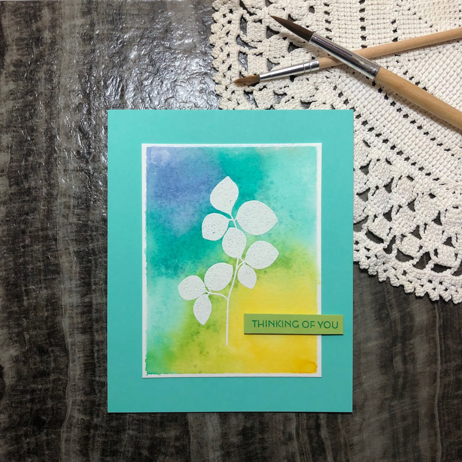
First up, I really wanted to use the Crafty Life stamp set. I own both the Crafty Life and Crafty Friends sets, and I love that there are a few sentiments in both that can still be used for non-crafter recipients. I saw this sentiment -My world is more colorful with you in it- and knew that I wanted to figure out a rainbow colour scheme. Although I didn't use any metallics here, I was inspired by one of Jennifer's cards that featured a bold sentiment over a watercoloured background, so that's what I've done here. I also find that the card itself feels more luxurious and boutique-y, due to the cotton watercolour paper.

I started with a few distress inks and painted simple stripes in rainbow order. I used Blueprint Sketch, Peacock Feathers, Mowed Lawn, Mustard Seed, Spiced Marmalade, and Candied Apple for my rainbow. A key tip for these is to use a paintbrush that is the approximate width that you are wanting each of your stripes, that way you don't have to fuss too much about getting them all the same width. It's okay to still have a little bit of variety with all the stripes, since that helps achieve a more organic and interesting look, but the paintbrush does help with consistency.


Next, was time to stamp the sentiment that inspired it all! I highly recommend using a stamp positioner (I used the MISTI) when inking up sentiments, especially when you've already put a lot of work into your background, and also when using textured paper, such as watercolour paper.

After that was stamped, I wanted that extra little "pop". I found this cute flower shaped button. It was white, so I used a yellow alcohol marker that coordinated nicely with the Mustard Seed stripe and coloured it. This allowed it to add a pop, while still blending in. I love the little something it added!


For this next card, I still had the Crafty Life set out and wanted to use these awesome block words. I thought this would make a fun card for one of my crafty friends. I used a stamping positioner to ensure that the 4 sentiment stamps were lined up and spaced evenly. I also used the MISTI for this because I wanted to ensure that the boldness of the block sentiments would be stamped and the MISTI allows for additional impressions if needed.


Next, I stamped a second "craft" on a scrap piece of the same kind of cardstock as the card base in Raspberry Fizz and cut that out. I popped it up with foam tape so in addition to the pink pop, it also pops because of the dimension. This is a great way to jazz up an otherwise one layer card. 

Due to the visual space of the sentiment, I decided that a 4-bar card would be a better fit. This was just the right amount of white space. Don't be afraid to use different card dimensions when attempting to achieve the right amount of white space. This really took the card from a lost, floating sort of feel to balanced.

Thanks for coming by! I hope you've been enjoying my posts so far this week. I have just a few more Level 1 cards to post and then I'm hoping to take on the Level 1 challenge and go through my Level 2 classes. I have been having so much fun learning new techniques, re-discovering older ones and using my Altenew stamps and dies to their full potential!


Supplies:
Stamps: Crafty Life
Ink: Blueprint Sketch, Peacock Feathers, Mowed Lawn, Mustard Seed, Spiced Marmalade, and Candied Apple, Ranger Archival Black ink, Raspberry Fizz (PTI)
Paper: White, Watercolor paper
Accessories, etc.: small button, yellow alcohol marker, foam tape, paint brush

Wednesday, February 06, 2019

Irresistible Ink Techniques


Good morning everyone!

I'm back with some more class projects from Altenew Academy for the Altenew Educator Certification Program the Irresistible Ink Technique class taught by Sara Naumann. My big takeaway from this class was that inks are more than just for inking up stamps. Ink pads are really just a great tool that holds dye or pigment that can be used to interact with pretty much anything! Sure, we primarily use them to ink up stamps, but they can be used for so much more!

I decided to tackle stamp block inking. In order to get better coverage, I added a bit of water and used watercolor paper, so it's similar to a "smooshed" technique.

Here are some of my blocked, pre-card pieced. It was so much fun to play with ink and paper and get messy! This is one thing I loved about this class, it really inspired me to get messy and it got me playing with my supplies!

For the upper left sample- I used a single larger block. For the upper right sample, I used several smaller blocks, dedicating one colour to each block. For the bottom sample, I did the block stamping in stages. I really liked how that one turned out, but it wasn't big enough for what I wanted, so I actually found an even bigger block and did it again (which is featured on the first card below).


Here's the card, I have several very large blocks, so I used my largest one. It's about 4.5 x 5.25 in size. I inked up the block and added water so I would get a bit of blending between the colours. I stamped with it, let it dry, and then I couldn't help but add some more splatters. This technique is fantastic for achieving a perfectly blended watercolour look, with no fuss!


I trimmed the blocked panel down and matted it on some white cardstock and then placed that on a Coastal Cabana card front. I stamped the two leaf clusters from Leaf Canopy, using the same inks and rocked the edges in the the teal ink for a little more depth. I cut those out and adhered them over the blocked background with foam tape. The sentiment is from Handpicked Bouquet


My next card features one of the blocked samples from above.


This time, I really wanted to feature the blocking, so I trimmed it down, but left the natural white edge. I used Leaf Canopy again and stamped the smaller leaf cluster in Versamark and embossed it with white. The sentiment comes from that same set. I used the teal ink that I used in the blocking to stamp the sentiment. That was placed on the card using foam tape for that little "pop".


Supplies (some affiliate links used):
Stamps: Leaf Canopy, Handpicked Bouquet (Altenew)
Paper: Watercolour Paper, Coastal Cabana (Stampin' Up!), Hawaiian Shores, Green Parakeet (Papertrey Ink)

Thanks for stopping by, I hope you'll check out the class!

Monday, February 04, 2019

Easy Die-Cutting Techniques


Hello everyone! I'm back from my month+ long hiatus. The holidays are a busy season, and although I got a decent amount of crafting done, I needed a bit of a blog break.

I'm back today with a few Altenew cards. I've jumped back into getting my Level 1 certification completed for the Altenew Educator Certification Program. Today's cards are for the Easy Die Cutting Techniques class, taught by the amazing Yana Smakula. This class is fantastic if you're really looking for some other ways to use your die cuts. You'll be looking at your dies in a whole new light! I highly recommend you check it out!

I started by using the Striped Leaf Cover die. This die is a great stand alone die, but this class really had me looking at how I could get more from it. Cover plates in particular make really great stencils. The great thing about stencils is that you can use them to cover the entire card front or opt to use only a section.  I die-cut the cover plate out of a thin, but durable paper and used that as a stencil.

I often think of greens when I use this cover die, but I thought it'd be fun to use some bright fall colours, so I used a red-orange-yellow colour palette of distress inks. I had so much fun with the stenciling that I had to make another one right away.

Here's my card submission for the class. I decided to jazz up the background by splattering inks over top. I recommend keeping some acrylic black ink on hand if you're wanting black ink splatters. I watered some down to get the bolder black splatters on the project.

To complete the card, I stamped 3 "thanks" from the Many Thanks set, cut them out and stacked them and then completed the greeting by stamping the "for your kindness" onto the stenciled background.


Here's my "cleaner" version of the card above. I opted for no paint splatters on this one. I used the same thank you set, but this time embossed one of the sentiments on red cardstock, using white embossing powder.


And here are the two pieces together!

This class definitely inspired me to go through my dies and seek out other uses beyond the original intended purpose. I can see myself using this technique with many other cover dies, or even making my own stencil by die-cutting several smaller dies.


Supplies:
Stamps: Many Thanks 
Dies: Striped Leaf Cover die.
Ink: Candied Apple, Ripe Persimmon, Spiced Marmalade, Mustard Seed (all distress inks), Versamark, Black Onyx Versafine
Paper: white, red
Accessories, etc.: white embossing powder, black acrylic paint