Tuesday, October 14, 2014

Sparkle Watercolour Backgrounds

The other day I was seeking some inspiration. My husband gave me one of his challenges. He wanted a rainbow sparkle card. He wasn't that specific with the requirements, so I did what I wanted with the suggestion.


First I got some watercolour paper and blending several colours into a rainbow type background. I used all distress inks here (Red Brick, Spiced Marmalade, Mustard Seed, Mowed Lawn, Peacock Feathers, Salty Ocean, Seedless Preserves, and Picked Raspberries).

Once that was dry, I stamped some flowers over top with Fresh Snow pigment ink. Before those faded too much, I covered the whole thing with Versamark and embossed it with a clear/glittery embossing powder. I loved how sparkly it became! Because of the glitter in the embossing powder, it's not the easiest surface to stamp on. I cut a piece of acetate to the same size and stamped my greeting using black Stazon. I attached that to the watercolored layer using brads. It's nice because the acetate gives the card a nice smooth, shiny finish.

This photo gives a slightly better view of the sparkles!


Friday, September 26, 2014

'Tis the Season

Here's my card for this week's sketch at Clean & Simple Stamping. I went with a gold holiday themed card. I started by using some older holiday paper. I used the colours in that to figure out the rest of my colour scheme. Once I had the circles adhered to my card base, I really wanted the greeting to pop out. I tried die-cutting a few things, but couldn't decide on a colour. So finally, I decided to add a vellum overlay and emboss a gold sentiment on that. I have to say, I'm glad I did! I added a few sequins to mirror the circle elements and that was that!


Supplies:
Stamps: Big and Bold Holiday Wishes
Paper: White, Retired Stampin' Up! DSP, Vellum
Accessories, etc.: Sequins, Gold EP

Wednesday, September 17, 2014

Wedding Cards

There were a few weddings on the agenda this September. So that meant making a few Congratulations/Wedding themed cards.
 
First up, I had the opportunity to play with Altenew's Painted Flowers. They are a bit tricky at first, but the more you play with them, the easier it gets. I used Soft Suede as my outline colour here. It kind of has a gold under tone, so I wanted to pair that with some metallic embossing. I stamped a greeting from Bigger Blooms and embossed that on vellum. I used clear foam tape (amazing stuff I tell you!) to pop up the greeting. I made the card so long away that I am totally guessing at colours. I think I used Mossy Meadow and Certainly Celery for the greens. The coral flowers are maybe Calypso Coral and Crisp Cantaloupe, and the yellow flowers are Daffodil Delight and Crushed Curry. Again, these are total guesses, and because the lighting is a bit dark in the photo, I really can't confirm.
 
 
Next up is a card using the soon to be mine (seriously, this set is out for delivery as I write this...) Spring Blooms. The wedding colours were purple, so I thought it'd be nice to incorporate those onto the card. I used Elegant Eggplant and Perfect Plum for the flowers and Pear Pizzazz for the leaves.
I added stickles into the flower centres and also added these pretty pearly sequins as an extra embellisment. The sentiments comes from this great $5 Keep it Simple set.
 
 
Next up, a silver medallion look of sorts. I made this during Stamp-A-Faire 2014. I didn't have any of the wax for making seals, so I did my own version of it. I covered a strip of paper with Versamark and then embossed at least 4 layers of silver embossing powder. To get the impressions, I inked up my medallion image with versamark, heated the embossing powder so that it was melty and then quickly stamped into the molten silver. I did that three times, then punched these out with a circle punch. Both the image and sentiment comes from Giga Guide Lines. It's a great set for making these sort of medallions out of embossing powder. I can always make a video if people want to see this in action. 

 
The last card features some rainbow butterflies. I really like the variety of shapes and sizes in Beautiful Butterflies and I also really like that sentiment. For this one, I stamped all of the butterflies on the white layer first. Then I die cut the larger four images and restamped those. I did this since the dies don't include the antennae. By stamping all of the butterflies on the base layer first, you know exactly where you will be placing the popped up dies and you still get to include the antennae!

 
That's all for now! A bit of a wordy post, I haven't listed the supplies at the end, as it is all listed throughout the post. I have linked to any stamp sets used :)

Thursday, September 11, 2014

Starry Splatter

Hello!
 
I have a card to share today. I was very inspired by Jennifer's video. I loved the card then and always wanted to recreate it with my own spin. Let me tell you, I got quite messy doing this technique, but it was just so fun!
 
For inks, I used Night of Navy (Stampin' Up!), Broken China (Distress), and Salty Ocean (Distress). I blended the whole paper with the lightest colour and then splattered all three inks in stages. The next step was blending the edges with the navy ink. Finally, I mixed some Pearl Ex with water and splattered that all over. Once dry, I set the whole thing with some hairspray. The next step was adding some celestial features. The little stars are actually from this awesome die. I used the solid star peices and I also cut off a few of the outline stars. The moon was simply made using a 1-3/4 circle punch and a 1-1/8 circle punch.
 
Finally, I kind of liked the scene as it was, but I just have a hard time with sentiment-less cards. I decided to die cut this happy birthday die out. To add extra pop and strength to the die, I clear embossed it. I know it's a bit busy, but sometimes, you just want to go all out and make a mess!
 

Also, I just wanted to share that I was featured in yesterday's "Spotted" feature over that the Simon Says Stamp blog! This was a first for me!

Wednesday, September 03, 2014

Spring Blooms Two Ways

Here are a few more Spring Blooms card I made. They are both pretty simple, but they have slightly different styles.
 
For the first one, I wanted layered blooms and leaves. Once I had those stamped and cut out, I arranged them as a corner cluster. I didn't want just a plain background, so I used a hexagon embossing folder to jazz it up a bit. The last step was adding the greeting from Strictly Sentiments 5.

 
The next card features more of a distressed/painted look.. I stamped the leaves using distress inks and ran over top of the images with a slightly damp paint brush. Next I added some ink splatters. The final few steps were adding the bit of baker's twine and a sentiment. Easy peasy!


Supplies:
Paper: White, Terracotta Tile, So Safron, Cherry Cobbler, Daffodil Delight, Dark Chocolate
Stamps: Spring Blooms, Strictly Sentiments 1 and 5
Ink: Mowed Lawn, Fired Brick, Spiced Marmalade, Mustard Seed, Archival Black
Accessories, etc.: Hexagon Embossing Plate, Baker's Twine,

Friday, August 29, 2014

Favorite Flowers

Today's post features Favorite Flowers used in three different ways!
 
 
This first card was a bit of a "warm-up" card from my weekend stamping extravaganza. I had flown into Calgary (only 1.5 hour flight), and then had a two hour commute to Lethbridge. It was an alright drive, plenty of fun conversation and pretty landscapes to watch, however, the creative juices don't always flow easily when you're just sitting down to get started. For this card, I found a cheerful colour scheme and decided to go with the cluster approach. One thing I really like about this set is that it has the solid images that match the swirly floral design. I stamped my images once off for the solid image and then stamped the swirl directly over top. It worked out quite well! Colours used here were Pear Pizzazz, Tangerine Tango, Daffodil Delight, and Strawberry Slush, plus Black.
 
 
For this next card, I wanted to try Stampin' Up!'s new blendabilities markers. I went with the Melon Mambo and Old Olive families. I stamped a similar cluster design of the flowers and leaves in Memento's Tuxedo Black and got to work colouring them. For the lighter flowers, I coloured the flower first with the lightest marker, then loosely followed the swirl with the medium marker. For the smaller flowers, I coloured the flower first with the medium marker, then loosely followed the swirl with the dark marker. The leaves were done using the same basic idea- light marker for the whole image, medium marker for the swirl. I ended up outlining everything with a grey marker to give it an extra pop.
 
I rarely do diagonal type designs, but my crafty friend Chera encouraged me to do it. I'm glad I did, the more I looked at the card, the more it grew on me!
 
Colours used here were Melon Mambo, Basic Black, and White.


For my last card, I wanted a simple design- something other than my go-to cluster stamping. I stamped the flowers and leaves on white card stock and then cut those out. I positioned the center flower on mounting tape to pop it up. All of the flowers have a bit of clear Wink of Stella on them. This last weekend was my first time using that stuff, it's great! I finished off this card with a fun sentiment from WPlus9's Strictly Sentiments 5.

Colours used here were Blushing Bride, Strawberry Slush, Certainly Celery, Garden Green, White


Tuesday, August 26, 2014

A very productive weekend

I had a fun filled crafty weekend out in Alberta at my friend Chera's house. The "excuse"for the trip was PTI's Stamp-A-Faire event. I only ended up doing a few of the challenges, however I had a goal to make 25 different cards over the weekend. I ended up exceeding the goal and made 27 over 3 days. I thought that was pretty good!

I brought several sets out there and had the chance to play with lots of Chera's stamps that I don't (yet) own. 

I liked what I had seen made with this pear set (Punny Produce: Pears) so far, but it wasn't really on my list. Then I had the chance to play with it, and I just loved watercolouring it! I stamped it in Ranger's archival ink. I used a few distress inks- Mowed Lawn and Mustard Seeds and a little bit of Stampin' Up!'s Early Espresso.


This next card features Spring Blooms. This is a set that I've always wanted, however I haven't had the chance to purchase it yet. I love how it has so much potential for many different looks. This is the first of quite a few cards I made with this set. For this one, I stamped the leaves and flowers onto some watercolour paper with distress inks. Next I painted over the images, blended a bit of ink to give a soft background and added some splatters for extra texture!


Supplies:
Stamps: Punny Produce: Pears, Spring Blooms, Get Lost
Paper: Basic Black, White, Lucky Limeade, Cotton White
Ink: Ranger's Archival Black, Mowed Lawn, Mustard Seed, Spiced Marmalade, Picked Raspberries, Early Espresso
Accessories, etc.: Ribbon

Friday, August 15, 2014

Butterfly Thanks

I don't really remember what my inspiration for this card was. I guess I wanted to use a bunch of distress inks and see what happened! I sponged distress ink all over some cotton card stock and spritzed it with water. I added in some more sponging since I wanted a bit more vibrancy. Next, I stamped one of the background triangle images from Trifecta and filled random triangles with solid and patterned smaller triangles.

I decided to add a scalloped border on there. I was looking for some ribbon the coordinated nicely with the colours and found some of this old stitched Baja Breeze that went nicely! I finished it off with a layered butterfly die cut and an embossed thanks die cut.


Supplies:
Stamps: Trifecta
Inks: Seedless Preserves, Mowed Lawn, Peacock Feathers, Salty Ocean, Versamark
Paper: Cotton pater, White, Vellum, Dark Chocolate
Accessories, etc.: Life is Beautiful die, Wet Paint Cuts I, clear embossing powder, scalloped edge die, white enamel dot


Tuesday, August 12, 2014

Make It Monday- Embossing Paste

This week's Make It Monday focused on making backgrounds with embossing paste.

I've only just recently started playing with embossing paste. I've mostly used it in single colours at a time- usually the white that it comes as, or with jazzing it up with reinkers. I've tried to do some blending, but hadn't had much success at first. After lots of practice and several garbaged attempts, I have started to get more consistent results that I've been happy with.

Some tips for success-

1) Make sure you have a bit more space than you're used to working in. Stuff gets messy and it's best if you can temporarily place tools and whatnot down away from the project. Likewise, make sure you have plenty of cleaning supplies handy.
2) Until you get better at blending, work in similar colour families. Start by colouring the paste with your lightest reinker. When you scrape off the excess, add in your next slightly darker reinker. This way each colour is built upon the previous colour. For my card here, I started with Orange Zest reinker,  my next colour was Berry Sorbet, and then I finished with Pure Poppy.
3) Don't be afraid to make your own stencils. I did that here using the Quatrefoil coverplate.


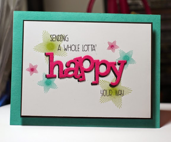
I like the look of the swirl thread behind a main sentiment that I've been seeing a lot lately. On Laura's card she showed how to achieve this look by using the circle scribble vellum dies. I liked this choice since it was more controlled and it was super easy to attach the circle.

Supplies:
Stamps: Wet Paint I
Ink: Orange Zest, Berry Sorbet, Pure Poppy, Smokey Shadow
Paper: Smokey Shadow, White, Harvest Gold, Vellum
Accessories, etc. Circle Scribble dies, Wet Paint Cuts, Embossing Paste


Tuesday, August 05, 2014

Wet Alphabet Background

Over the weekend, I had packed up a few stamp sets, inks, and papers and was off house-sitting. I really wanted to try a few background stamping techniques, but didn't have any background stamps with me. I did, however, have the Wet Paint Alphabet with me. I took a look at how the letters were all arranged on the plastic sheet they came on and thought, "hey, that'd make a good background". I temporarily adhered the plastic sheet to a larger acrylic block, inked the stamps up with Fresh Snow, and then stamped it onto some water colour paper. I applied a coating of clear embossing powder, heated it, then washed a few colours over it.
 
The colours I chose, from left to right are New Leaf, Tropical Teal, Blueberry Sky, Ripe Avocado.


I wasn't sure what kind of card to make, given that anything with an alphabet background reminds me of school, so I thought maybe I could make a congratulations card and then I have a school related or perhaps a graduation card, ready to go!

Supplies:
Stamps: Wet Paint Alphabet, Wet Paint III
Ink: Fresh Snow, New Leaf, Tropical Teal, Blueberry Sky, Ripe Avocado
Paper: Smokey Shadow, White Cotton
Accessories, etc.: Clear Embossing Powder

Saturday, July 26, 2014

A few congrats!

I really loved how Shari had used the Butterfly Drift die on a card recently. I was inspired to use the die similarly, filling it with various patterned papers.  I liked the Congrats with a Happy For You for a bridal shower card.


Once that one was completed, I thought I should try something similar with the Star Parade die. I didn't have the same variety of patterned papers, so I stuck with two colours of cardstock. I kept the Summer Sunrise stars plain and added some polka dots to the Lemon Tart stars. I used the same big sentiment, but changed the small one to You Did It. For both cards, the Congrats was done using Smokey Shadow, however I just recently re-inked it, so it comes across quite dark in the photos.


Supplies: Stamps: Wet Paint III
Ink: Summer Sunrise,  Smokey Shadow, Baja Breeze
Paper: White, Baja Breeze, Various Retired Stampin' Up Patterned Papers, Summer Sunrise, Lemon Tart
Accessories, etc.: Star Parade die, Butterfly Drift die, rhinestones

Thursday, July 24, 2014

Thanks a Million!

I wanted to use some different dies together, I combined one of the dies from Butterflies and the thanks die.

After the butterfly was cut out,  I stamped it using the background image included in Ice Cream Dream. I made a little banner tag using one of the greetings from Really Big Thanks. Finally, I wanted more than just a plain colour background, so I set up my Ledger Drop stencil and blended coordinating ink over top.

Supplies:
Stamps: Really Big Thanks, Ice Cream Dream
Ink: Harvest Gold, Bermuda Bay, Berry Sorbet
Paper: White, Berry Sorbet, Harvest Gold, Bermuda Bay

Tuesday, July 22, 2014

Dots & Spots & Balloons!

I recently got some new goodies from Simon Says Stamp, including this super fun Circle die, called Bubble Parade. I adhered some wide tape to some cardstock and ran it through the Cuttlebug. I removed the adhesive piece by piece to get a multi-color glitter effect! 

I didn't want to add much else, so I added a fun greeting from Birthday Balloons and finished it off with a brown card base!


For my next card, I wanted to use the Happy Birthday die. I decided place that over a stamped balloon background. The balloons also came from the Birthday Balloons stamp set.


Supplies (for both cards):
Stamps: Birthday Balloons
Ink: Summer Sunrise, Sweet Blush, Melon Berry, Harvest Gold, Orange Zest, Berry Sorbet, Dark Chocolate
Paper: Chocolate Chip, Summer Sunrise, White
Accessories, etc.: Glitter, Happy Birthday Die, Bubble Parade Die

Sunday, July 06, 2014

A few drinks!

Hello! Hope everyone's having a good weekend. I've got a few drink themed cards.

For the first one, I was inspired by this month's PTI Colour Play. I just loved the colours and was inspired to make a drink themed card. I used the Day at the Beach stamp set and the Sunrise impression plate to give the background a bit of texture. I managed to use all of the colours in the drinks. To add dimension I cut out the itsy bitsy garnishes and popped them up.


For my second card, I pulled out some old Stampin' Up! sets- Sparking Summer and Tart & Tangy. I coloured the drinks with Copic markers and added just a touch of Stickles for sparkle. I finished it off with a sentiment from PTI's Flipping Out.


Supplies: Stamps: Day at the Beach, Sparkling Summer, Tart & Tangy, Flipping Out
Ink: Memento Tuxedo Black, Orange Zest, Terracotta Tile, Summer Sunrise, Limeade Ice, New Leaf, Aqua Mist
Paper: Terracotta Tile, Summer Sunrise, Black, White
Accessories, etc.: Copic markers, Stickles, Sunrise Impression Plate

Thursday, July 03, 2014

Watercolour Bouquet

 
Here's a card I made last week. It ended up being one of those projects that was done in pieces. One evening I didn't really feel like making a card, but I wanted to be creative.
 
So, I stamped a little bouquet using Fresh Cut Florals and did a little bit of water painting to make it look more like a hand-painted image instead of a hand-stamped image. To do this, I started with some cotton paper. I inked up the flowers using the Coastal Cabana marker. The leaves were done using Pistachio Pudding.
 
Then I just went in with a wet paintbrush and started blending. I wanted a bit more shading, so I scribbled the markers on an acrylic block as my palette and added in some shading using the wet brush.


A few days later, I came back to the mini artwork and decided it should go on a card before I forgot to use it! I mounted it on some Pistachio Pudding paper. For the card base, I ran only the front bottom half through an embossing folder. I added the satin ribbon and a nice little greeting from Heartfelt Mix.

Supplies:
Stamps: Fresh Cut Florals, Heartfelt Mix (WPlus9 Designs)
Ink: Pistachio Pudding, Coastal Cabana, Black Onyx
Paper: Cotton Paper, Pistachio Pudding, Bermuda Bay
Accessories, etc.: White Satin Ribbon, Embossing Folder (Darice)

Tuesday, July 01, 2014

Vintage Cream Roses

I was checking out a recent forum post where people were discussing making white roses form the Sweet Life stamp set (by PTI). I decided to try something similar. Instead of white, these ones are more like a soft cream coloured rose.

To get the look, I started with Soft Stone as my base. I skipped the first step of the 3-step stamping (the solid rose base image). The Step 2 image was done with Vintage Cream. This ink is so thick and opaque that it almost added a layer of texture to the paper. The Step 3 image was done with Fine Linen. This colour worked really nicely with the Vintage Cream and the Soft Stone base.

I stamped out some leaves using Spring Moss and Ripe Avocado, then cut it out all and arranged it. Figured this would make a nice wedding card for the July 5th celebration I'll be attending.


Supplies:
Stamps: The Sweet Life, Simple Sentiments: Congratulations
Ink: Vintage Cream, Fine Linen, Spring Moss, Ripe Avocado
Paper: Soft Stone, Kraft
Accessories, etc.: Corner Rounder

Wednesday, June 25, 2014

Papertrey Ink June Blog Hop

I haven't played along with the PTI blog hops for a bit. I saw this month featured an inspiration photo, some colour recipes, and sketches.


I used both the of the above items and made this card, although I modified the colour scheme a tiny bit.


Supplies:
Stamps: Wet Paint
Paper: White, Aqua Mist, Summer Sunrise, Harvest Gold, Berry Sorbet, Orange Zest
Ink: Black
Accessories, etc.: 1-3/4 circle punch, hello die

Thursday, May 15, 2014

Some more watercolour!

Here are a few more watercolour themed projects.

For the first card, I used the "faux watercolour" technique, which by the time I was done with the project, I would hardly refer to it as faux. I used the rose from Fifth Avenue Floral and the leaves from Autumn Splendour. I used the vellum transfer technique and then just started watercolouring the image. It took quite a while to get it just right, but I was finally happy enough to step back. After I was done, I couldn't bring myself to covering it up at all with a sentiment.


My next card featuring more watercolouring stamping. I inked up the seashell stamps then misted them with a mini mister. I also stamped the one seashell and watercoloured that.


Sunday, May 11, 2014

A Whole Lotta Watercolouring!


I've got lots of projects to share this evening.

The first 3 cards feature watercolour background techniques. The first one involved an ink direct to block technique.


These next two cards featured misting an inked background stamp.


The next one features watercolouring a stamped image. So basically, I stamped the flowers and then added water with a fine brush.


This card features watercolouring an embossed background image. For this one, I embossed the image, then coloured tiny bits of colour into each shape. I finished that off with a fine brush and water.


Here's a close up look of that effect:


This last card features a DIY twinkling watercolours of sorts. I once again embossed the image, then added very small bits of colour with Stampin' Up! markers. Then I mixed in some white Pearl Ex powder into my water, and voila, instant sparkle!

I've included a close-up to try and illustrate the effect a bit better.

Sunday, May 04, 2014

Wished Upon a Star

I was inspired by the Make it Monday from a week or so back featuring watercolour splats. I didn't actually end up doing the technique on the first card. I just couldn't bring myself to potentially ruining my nicely blended background. (A little bit of background info here, I made several blended pieces, added the splats and was quite unimpressed with the results, so I was a bit leery to adding the water to one that I was really happy with)

Anyway- I added a swash of stars, embossed them with white embossing powder and added my sentiment in two parts (the you was die-cut from the Wonderful Words collection) and then I chose a nice sentiment from the Simply You.


For this one, I ended up using Distress inks to make my blended background. The water reacted much better than my previous results with other inks. I die-cut the happy from the same die set as above and added a sentiment from Stylish Sentiments- Birthday.


Saturday, May 03, 2014

Old meets new

I mentioned a few weeks ago how my fiance likes to give me creative challenges. The challenge last night was to use my oldest set with my newest.

I no longer have my oldest set (Stampin' Up!'s Quick and Cute). I looked through my Splitcoaststampers gallery to confirm which set might be my oldest and I'm pretty sure it's All the Best. I still have this set easily accessible. I think despite it being over 10 years old, it's actually quite classic and it still works well with today's trends and techniques. 

For my newest set, I had quite a few options. My latest PTI order came yesterday (love it when it actually arrives on a Friday so I have the weekend to play!) and there were about 6 new sets in that order. I really liked how the mix of fonts in Wet Paint looked with the leaves.


Although not part of the challenge specifically, I ended up using some old paper (anyone remember Gable Green) and one of my newest embellishments (Studio Calico sequins).

I was really happy with how it turned out! I hope it inspires you to mix up your old and new products. We get so hung up on having the latest and greatest and those old products that we "had to have" sometimes get forgotten.

Supplies:
Stamps: All the Best, Wet Paint
Ink: New Leaf, Cottage Ivy, New Sprout, Black Onyx
Paper: New Leaf, Gable Green, White, Vellum
Accessories, etc,: Sequins


Monday, April 21, 2014

Watercolour Balloons

So yesterday I was checking out the latest online card class and I was totally inspired by one of the sneak peek images on the sign-up page. I saw the balloons and thought, hey, I should try that.

To achieve the look, I stamped my balloons in a Fine Linen ink (stamped off twice), so I would have just the faintest of guidelines. Next I outlined that in pencil, and also drew my little balloon strings. Then I just got to watercolouring using Reeves watercolour paints and an assortment of brushes. I was quite happy with the result!


Supplies:
Stamps:Birthday Balloons (SSS), Birthday Basics (PTI)
Ink: Black, Fine Linen
Paper: Savoy- Natural White (a cotton paper that works very well for watercolouring), Soft Sky, Smokey Shadow
Accessories, etc.: Reeves watercolour paints

Saturday, April 12, 2014

A Whole Lotta Happy!

Good evening! I have been having so much fun with the Whole Lotta Happy set. This one came together very quickly!

Supplies:
Stamps: A Whole Lotta Happy, Strictly Sentiments 1
Paper: Bermuda Bay, Smokey Shadow, Pool Party
Ink: Smokey Shadow, Pool Party
Accessories, etc.: Happy Trio die, sequins

Friday, April 11, 2014

Inspiration Mash-Up #1!

So I was feeling a tad uninspired the other day so I asked my fiance for a challenge. Every so often he'll give me a random challenge. A previous one for instance was to use complimentary colours and feature an animal.

For this particular challenge, he decided to pick 2 cards that I've previously made and I was to get inspiration from both and make a mash-up of sorts. I keep all my cards that I haven't used in a box in the craft room. He closed his eyes and randomly chose two

Here they are!


And here's what I ended up doing! I took the products from the first card and the layout from the second.

So if you're feeling uninspired, I urge you to do something similar. We all have cards lying around, close your eyes, randomly select two cards, and see how you can pull inspiration from both and make a mash-up! 

Thursday, April 10, 2014

Sushi Birthday!

I've had my eye on this Lawn Fawn set, Let's Roll for some time. I love all things sushi! So when I was passing the time checking out the new products at my local scrapbook store, I couldn't resist!

I love that the set comes with the faces separate. So if you feel like making something cutesy, you can; or if you'd rather, you can keep it face-free.  I had lots of fun putting together and colouring the sushi platter!


Supplies:
Stamps: Let's Roll (Lawn Fawn), Birthday Balloons (Simon Says Stamp)
Paper: White
Ink: Tuxedo Black
Accessories, etc. Copic markers, dimensional tape

Tuesday, April 01, 2014

A Whole Lotta Happy

I've been having lots of fun with the Wplus9 Designs Whole Lotta Happy and the coordinating dies. These first two are the same card, just different colour palettes. I really liked the look of offsetting the happy dies to create a shadow.


Next up is a fun and vibrant card. I liked the pop of the happy in black.


And finally, a one layer card. I was in the mood for something a bit different from the first. I embossed the stars, added sequins, and die-cut happy in gold.