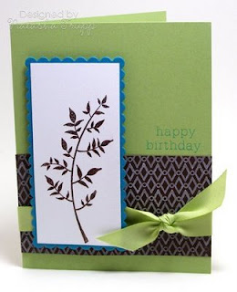
 So I wasn't feeling that inspired today, but I wanted to make something, so I checked out a few recent colour challenges. First up was this one by Kristina Werner . What I like to do with colour challenges is pull out a full piece of paper in each colour and see where it takes me. When I saw these 4 together, I thought Retro, which led me to using the Retro Background Basics. I like this diamond and circle pattern and thought it would look cool stamped in white on chocolate. Next, I grabbed Stem Silhouettes. One thing I really like about silhouette images is you can pair them with almost any colour group and any type of greeting. I thought this leafy image matched the whole retro vibe nicely.
 Next, I thought about doing this challenge by Dawn McVey. As I assessed the colours, I realized they would work well with the exact same layout. I kept the chocolate patterned part, used celery in place of saffron, and teal in place of tangerine. It worked really well, since the colours in this challenge were of similar brightnesses to those in the previous challenge. The only change here: I embossed the leaves. After the first card was mostly together, I thought, hmm embossing would've worked here. I already had everything adhered so I didn't want to take it apart or emboss over it (since warping would have occurred).
Supplies:
Stamps: Stem Silhouettes, Birthday Basics, Retro Background Basics
Ink: Chocolate Chip, Tangelo, Taken with Teal, Fresh Snow
Paper: Saffron, Tango, Chocolate, White, Teal, Celery
Ribbon: Celery Polytwill, Saffron Grosgrain
Accessories, etc.: Nestabilities, Pop Dots, Brown EP

Very clever!! talk about multi-tasking :) Love the different versions.
ReplyDeleteBeautiful!! both of them!! I love how you did the background paper!! awesome!!!
ReplyDeleteWow Natasha - these are gorgeous! I have this sketch up on my computer to finish soon, love it!
ReplyDeletethey both are beautiful.
ReplyDeleteReally fun cards. You did great with this color challenge.
ReplyDeleteIt's a good life!
Terri E.
very nice. I like the simple yet elegant look to the card. I especially like the geometric DP you used.
ReplyDeleteTFS
Clouds :o)
These are both so nice!
ReplyDeleteBoth are very pretty! Great layout!
ReplyDeleteBoth of these are great!
ReplyDeleteSuper cards...I love how you just switched the colors!
ReplyDeletelove 'em both!
ReplyDeleteLove 'em! Hope you are well Natasha!
ReplyDeleteThese are beautifully simple! Great job! TFS
ReplyDeleteRobin
GORGEOUS!! Love these elegant cards... wonderful layout, too.
ReplyDeleteBoth colour combos are great and the design is clean and stylish
ReplyDeleteHow neat this is using the same image and patterned paper but changing the background color.
ReplyDelete