Sunday, July 06, 2014

A few drinks!

Hello! Hope everyone's having a good weekend. I've got a few drink themed cards.

For the first one, I was inspired by this month's PTI Colour Play. I just loved the colours and was inspired to make a drink themed card. I used the Day at the Beach stamp set and the Sunrise impression plate to give the background a bit of texture. I managed to use all of the colours in the drinks. To add dimension I cut out the itsy bitsy garnishes and popped them up.


For my second card, I pulled out some old Stampin' Up! sets- Sparking Summer and Tart & Tangy. I coloured the drinks with Copic markers and added just a touch of Stickles for sparkle. I finished it off with a sentiment from PTI's Flipping Out.


Supplies: Stamps: Day at the Beach, Sparkling Summer, Tart & Tangy, Flipping Out
Ink: Memento Tuxedo Black, Orange Zest, Terracotta Tile, Summer Sunrise, Limeade Ice, New Leaf, Aqua Mist
Paper: Terracotta Tile, Summer Sunrise, Black, White
Accessories, etc.: Copic markers, Stickles, Sunrise Impression Plate

Thursday, July 03, 2014

Watercolour Bouquet

 
Here's a card I made last week. It ended up being one of those projects that was done in pieces. One evening I didn't really feel like making a card, but I wanted to be creative.
 
So, I stamped a little bouquet using Fresh Cut Florals and did a little bit of water painting to make it look more like a hand-painted image instead of a hand-stamped image. To do this, I started with some cotton paper. I inked up the flowers using the Coastal Cabana marker. The leaves were done using Pistachio Pudding.
 
Then I just went in with a wet paintbrush and started blending. I wanted a bit more shading, so I scribbled the markers on an acrylic block as my palette and added in some shading using the wet brush.


A few days later, I came back to the mini artwork and decided it should go on a card before I forgot to use it! I mounted it on some Pistachio Pudding paper. For the card base, I ran only the front bottom half through an embossing folder. I added the satin ribbon and a nice little greeting from Heartfelt Mix.

Supplies:
Stamps: Fresh Cut Florals, Heartfelt Mix (WPlus9 Designs)
Ink: Pistachio Pudding, Coastal Cabana, Black Onyx
Paper: Cotton Paper, Pistachio Pudding, Bermuda Bay
Accessories, etc.: White Satin Ribbon, Embossing Folder (Darice)

Tuesday, July 01, 2014

Vintage Cream Roses

I was checking out a recent forum post where people were discussing making white roses form the Sweet Life stamp set (by PTI). I decided to try something similar. Instead of white, these ones are more like a soft cream coloured rose.

To get the look, I started with Soft Stone as my base. I skipped the first step of the 3-step stamping (the solid rose base image). The Step 2 image was done with Vintage Cream. This ink is so thick and opaque that it almost added a layer of texture to the paper. The Step 3 image was done with Fine Linen. This colour worked really nicely with the Vintage Cream and the Soft Stone base.

I stamped out some leaves using Spring Moss and Ripe Avocado, then cut it out all and arranged it. Figured this would make a nice wedding card for the July 5th celebration I'll be attending.


Supplies:
Stamps: The Sweet Life, Simple Sentiments: Congratulations
Ink: Vintage Cream, Fine Linen, Spring Moss, Ripe Avocado
Paper: Soft Stone, Kraft
Accessories, etc.: Corner Rounder

Wednesday, June 25, 2014

Papertrey Ink June Blog Hop

I haven't played along with the PTI blog hops for a bit. I saw this month featured an inspiration photo, some colour recipes, and sketches.


I used both the of the above items and made this card, although I modified the colour scheme a tiny bit.


Supplies:
Stamps: Wet Paint
Paper: White, Aqua Mist, Summer Sunrise, Harvest Gold, Berry Sorbet, Orange Zest
Ink: Black
Accessories, etc.: 1-3/4 circle punch, hello die

Thursday, May 15, 2014

Some more watercolour!

Here are a few more watercolour themed projects.

For the first card, I used the "faux watercolour" technique, which by the time I was done with the project, I would hardly refer to it as faux. I used the rose from Fifth Avenue Floral and the leaves from Autumn Splendour. I used the vellum transfer technique and then just started watercolouring the image. It took quite a while to get it just right, but I was finally happy enough to step back. After I was done, I couldn't bring myself to covering it up at all with a sentiment.


My next card featuring more watercolouring stamping. I inked up the seashell stamps then misted them with a mini mister. I also stamped the one seashell and watercoloured that.


Sunday, May 11, 2014

A Whole Lotta Watercolouring!


I've got lots of projects to share this evening.

The first 3 cards feature watercolour background techniques. The first one involved an ink direct to block technique.


These next two cards featured misting an inked background stamp.


The next one features watercolouring a stamped image. So basically, I stamped the flowers and then added water with a fine brush.


This card features watercolouring an embossed background image. For this one, I embossed the image, then coloured tiny bits of colour into each shape. I finished that off with a fine brush and water.


Here's a close up look of that effect:


This last card features a DIY twinkling watercolours of sorts. I once again embossed the image, then added very small bits of colour with Stampin' Up! markers. Then I mixed in some white Pearl Ex powder into my water, and voila, instant sparkle!

I've included a close-up to try and illustrate the effect a bit better.

Sunday, May 04, 2014

Wished Upon a Star

I was inspired by the Make it Monday from a week or so back featuring watercolour splats. I didn't actually end up doing the technique on the first card. I just couldn't bring myself to potentially ruining my nicely blended background. (A little bit of background info here, I made several blended pieces, added the splats and was quite unimpressed with the results, so I was a bit leery to adding the water to one that I was really happy with)

Anyway- I added a swash of stars, embossed them with white embossing powder and added my sentiment in two parts (the you was die-cut from the Wonderful Words collection) and then I chose a nice sentiment from the Simply You.


For this one, I ended up using Distress inks to make my blended background. The water reacted much better than my previous results with other inks. I die-cut the happy from the same die set as above and added a sentiment from Stylish Sentiments- Birthday.


Saturday, May 03, 2014

Old meets new

I mentioned a few weeks ago how my fiance likes to give me creative challenges. The challenge last night was to use my oldest set with my newest.

I no longer have my oldest set (Stampin' Up!'s Quick and Cute). I looked through my Splitcoaststampers gallery to confirm which set might be my oldest and I'm pretty sure it's All the Best. I still have this set easily accessible. I think despite it being over 10 years old, it's actually quite classic and it still works well with today's trends and techniques. 

For my newest set, I had quite a few options. My latest PTI order came yesterday (love it when it actually arrives on a Friday so I have the weekend to play!) and there were about 6 new sets in that order. I really liked how the mix of fonts in Wet Paint looked with the leaves.


Although not part of the challenge specifically, I ended up using some old paper (anyone remember Gable Green) and one of my newest embellishments (Studio Calico sequins).

I was really happy with how it turned out! I hope it inspires you to mix up your old and new products. We get so hung up on having the latest and greatest and those old products that we "had to have" sometimes get forgotten.

Supplies:
Stamps: All the Best, Wet Paint
Ink: New Leaf, Cottage Ivy, New Sprout, Black Onyx
Paper: New Leaf, Gable Green, White, Vellum
Accessories, etc,: Sequins


Monday, April 21, 2014

Watercolour Balloons

So yesterday I was checking out the latest online card class and I was totally inspired by one of the sneak peek images on the sign-up page. I saw the balloons and thought, hey, I should try that.

To achieve the look, I stamped my balloons in a Fine Linen ink (stamped off twice), so I would have just the faintest of guidelines. Next I outlined that in pencil, and also drew my little balloon strings. Then I just got to watercolouring using Reeves watercolour paints and an assortment of brushes. I was quite happy with the result!


Supplies:
Stamps:Birthday Balloons (SSS), Birthday Basics (PTI)
Ink: Black, Fine Linen
Paper: Savoy- Natural White (a cotton paper that works very well for watercolouring), Soft Sky, Smokey Shadow
Accessories, etc.: Reeves watercolour paints

Saturday, April 12, 2014

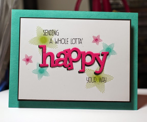
A Whole Lotta Happy!

Good evening! I have been having so much fun with the Whole Lotta Happy set. This one came together very quickly!

Supplies:
Stamps: A Whole Lotta Happy, Strictly Sentiments 1
Paper: Bermuda Bay, Smokey Shadow, Pool Party
Ink: Smokey Shadow, Pool Party
Accessories, etc.: Happy Trio die, sequins

Friday, April 11, 2014

Inspiration Mash-Up #1!

So I was feeling a tad uninspired the other day so I asked my fiance for a challenge. Every so often he'll give me a random challenge. A previous one for instance was to use complimentary colours and feature an animal.

For this particular challenge, he decided to pick 2 cards that I've previously made and I was to get inspiration from both and make a mash-up of sorts. I keep all my cards that I haven't used in a box in the craft room. He closed his eyes and randomly chose two

Here they are!


And here's what I ended up doing! I took the products from the first card and the layout from the second.

So if you're feeling uninspired, I urge you to do something similar. We all have cards lying around, close your eyes, randomly select two cards, and see how you can pull inspiration from both and make a mash-up! 

Thursday, April 10, 2014

Sushi Birthday!

I've had my eye on this Lawn Fawn set, Let's Roll for some time. I love all things sushi! So when I was passing the time checking out the new products at my local scrapbook store, I couldn't resist!

I love that the set comes with the faces separate. So if you feel like making something cutesy, you can; or if you'd rather, you can keep it face-free.  I had lots of fun putting together and colouring the sushi platter!


Supplies:
Stamps: Let's Roll (Lawn Fawn), Birthday Balloons (Simon Says Stamp)
Paper: White
Ink: Tuxedo Black
Accessories, etc. Copic markers, dimensional tape

Tuesday, April 01, 2014

A Whole Lotta Happy

I've been having lots of fun with the Wplus9 Designs Whole Lotta Happy and the coordinating dies. These first two are the same card, just different colour palettes. I really liked the look of offsetting the happy dies to create a shadow.


Next up is a fun and vibrant card. I liked the pop of the happy in black.


And finally, a one layer card. I was in the mood for something a bit different from the first. I embossed the stars, added sequins, and die-cut happy in gold.


Thursday, March 27, 2014

A few cards!

Good evening! I keep procrastinating updating over here, but I still have been busy making cards for more than just the clean and simple stamping blog.

The first two cards are ones I made for the PTI blog hop about using glossy accents. I didn't end up getting to blog them in time for the hop, but here they are now!

For the first card, I wanted to feature bright rubber boots- I used several layers of ultra thick embossing powder to make them ultra glossy. I was kind of on polka dot kick, and added a polka dot umbrella, used a swiss embossing plate, and finished it with ribbon!


For my next card, I wanted something that was a bit more "me". So I went with a much simpler layout. On this one, the umbrella was glossified using Ranger Glossy Accents.


Next up, I just got some new WPlus9 Studio stamps, including Fresh Cut Florals and Strictly Sentiments 1, so I've been having fun playing around!

First up, a very simple card using some nice, bright colours!


This one was a touch more complex. I used the coordinating dies and a chevron embossing plate. I was pleasantly surprised at how easy it was to use the Fresh Cut Florals. The images line up so easily on the die-cuts. There's just the right amount of wiggle room to get a centered impression!


Sunday, March 02, 2014

Stretching

When I first saw this week's WPlus9 challenge, I was a little stumped. There's not much that I haven't tried as far as techniques go, and my style has evolved so much throughout the years as well. Then I started playing around in my craft room and I remembered seeing someone make their own embossing folder a few weeks ago. I found some scrap chipboard and starting cutting out clouds. I attached those to a piece of card stock and than ran it through my Cuttlebug using a rubber mat and a cardboard shim. It worked even better than I anticipated.

Supplies: Heartfelt Mix, Hearts & Clouds dies
Ink: Blueberry Sky, Enchanted Evening, Spring Rain, Dark Chocolate
Paper: White, Spring Rain, Chipboard

Sunday, February 23, 2014

Trend Watch challenge

I decided to make a few cards for this week's WPlus9 challenge: Trend Watch.

Card #1 features metallic watercolours (Twinkling H2Os), gold, and peacock feathers. Feathers, although not the newest trend, are still quite prevalent in the crafting and fashion industry.

The card itself was quite simple. I used a few twinkling H2Os and blended a nice shimmery background. I also stamped and embossed a feather and painted it to match a peacock feather. I completed the card off with a little bit of gold card stock and a gold embossed sentiment.


Supplies:
Stamps: Fanciful Feathers
Ink: Versamark, Gold
Paper: White, Cotton White, Gold
Accessories, etc.: twinkling H2Os, white and gold embossing powders

This next card features a few trendy items- grunge look, rainbows, 80s themed. Again, they aren't the newest trends, but they are still quite prevalent in both the fashion and craft industry. 

This card was also quite simple. I chose my colour palette, then staggered the starry paint swipe image. I completed it was embossing the word "Awesome" in white and popped up the "you're so". All that was popped up on a white card base.

Supplies:
Stamps: So 80s
Ink: Rich Razzleberry, Melon Mambo, Tangerine Tango, Daffodil Delight, Old Olive, Pacific Point, Black
Paper: White
Accessories, etc.: White embossing powder

Friday, February 14, 2014

Superstar!

Here's my card for today's challenge over at PTI.  The challenge was to make a card and a matching decorated envelope. I stamped star clusters all over gold card stock. I stamped and embossed the larger gold star and then added my sentiment. For the envelope, I decided because my card was vertically oriented, I'd make my envelope that way too. I stamped a starry border, another greeting, and a popped up star.


Supplies:
Stamps: Superstars, Star Prints, Inside & Out: Baby
Paper: Gold Card stock, White, Black
Ink: Dark Chocolate, Gold
Accessories, etc.: Gold embossing powder, star punch

Thursday, February 13, 2014

More challenge cards!

I really wanted to get two cards made tonight, one for the PTI challenge and one for WPlus9.

Here's my PTI card. I really liked this challenge. Basically, there were 9 lists that consisted of 6 items. I used a random number generator and got the following items:
Colours: Enchanted Evening, Hawaiian Shores, Spring Moss and Kraft as my neutral
Embellishments: Baker's Twine (Fiber), Glitter
Technique: Heat Embossing
Theme: Anniversary
Sketch #6

I was really happy with me selections, although I was a bit unsure about the colour combination. It worked out though! For my stamps, I chose Rosie Posie and Beautiful Butterflies. I combined my glitter and embossing elements as one. I used Pearly Sparkle embossing powder.

From the straight-on shot, you don't get the full impact of the glitter. Here's a slightly different angle to show just how this glittery embossing powder picks up the light!


The WPlus9 Designs challenge was all about dimension. It was called Step it Up! I was inspired by the fact that tomorrow is Valentine's Day and figured I should make a card for my fiance. Here's an angle that really shows how popped up these hearts are:


And here's the front view. So first, I die cut the hearts, one at a time. I layered dot-embossed paper behind that, then popped up the stamped little hearts. Very simple, but a nice impact I think!


Supplies: Stamps: Heartfelt Mix
Ink: Black Onyx, Cherry Cobbler
Paper: Soft Stone, Cherry Cobbler, Basic Black, Smokey Shadow
Accessories, etc. Hearts & Clouds dies, swiss dot embossing folder


Wednesday, February 12, 2014

More PTI Anniversary Cards

Here are two recent cards I made for some of the Papertrey Ink anniversary contests.

This first one was for the birthday card challenge. I really love using the notched flower die and I wanted a matching notched leaf. I drew out a few freehand leaves on cardstock and then cut them out with a few notches. I sponged ink around the edges of the flower and leaves to give it a bit more pop.

Here's my card for the stripes challenge. I really like using Faux Ribbon to make patterned paper. I decided on 4 colours and 4 line images and just started stamping. Two of my colours were Melon Mambo and Old Olive, which made me think watermelon- so I pulled out this image from Scent-imentals.


Saturday, February 08, 2014

ATC

Here's a quick ATC I made this morning. I wanted to keep with the whole scrapbooking theme and make something that you could easily fit into a layout (instead of something that specifically screamed card/sentiment).

Supplies:
Stamps: Beautiful Blooms II, Simply You, Polka Dot Basics II
Ink: Hawaiian Shores, New Leaf,  Fresh Snow
Paper: Kraft, New Leaf, Aqua Mist
Accessories, etc.; banner die (SSS), sequins, 1/2inch circle punch


Friday, February 07, 2014

Festivities!

Here are two cards I made for the PTI 7th anniversary celebration.

The first I did was for the limited supply challenge. I chose my 7 supplies (white card stock, 5 ink colours, and 1 stamp set) within 7 minutes. And then I completed my card in under 17 minutes (I actually took only 8 minutes!).


Supplies:
Stamps: Happy Trails
Ink: New Leaf, Hawaiian Shores, Harvest Gold, Orange Zest, Berry Sorbet
Cardstock: White


For my second card, I used one of the sketches and colour combinations from here (I went with New Leaf, Ripe Avocado, Aqua Mist, Kraft, and Hawaiian Shores).


Stamps:Year of Flowers:Marigold, Bloomin' Button Bits
Ink: Ripe Avocado
Paper: New Leaf, Hawaiian Shores, Kraft, Aqua Mist
Accessories, etc.: Copic markers, brads

Wednesday, February 05, 2014

Feathers on the line!

Here's a card for WPlus9's "Comfort Zone" challenge. What makes this a "comfortable" card for me?

-The use of two of my favorite Wplus9 stamp sets
-Mix of bright and earthy colours
-Minimal layers (2)

Supplies:

Stamps: Fanciful Feathers, Heartfelt Mix (WPlus9 Design Studio)
Ink: Terracotta Tile, Harvest Gold, Dark Chocolate (Papertrey Ink), Island Indigo (Stampin' Up!)
Paper: White, Island Indigo (Stampin' Up!)

Wednesday, January 22, 2014

An old classic.

Sometimes it's fun to go digging through the old stash of stamps and see what one finds! I stamped a few of these cheerful sealife images onto some basic card stock, coloured them with copic markers and then a quick swash of twinkling h2os overtop that.

Supplies:
Stamps: Silly Sealife, Fishy Friends, Whale Wishes, Medallion
Ink: Tuxedo Black, Tempting Turquoise
Paper: Tempting Turquoise, Winter Wisteria, White
Accessories, etc.: Copic Markers, twinkling H2Os

Tuesday, January 21, 2014

Happy Cupcakes!

Today was a bit of a snowy, overcast day. What's a good solution for that? Rainbow cupcakes!!


I really like the look of simple, bold outlined images in a range of colours just in a cascade down one side.

Supplies:
Stamps: Sweets & Treats 
Ink: Summer Sun, Only Orange, Tempting Turquoise, Limeade ice, Raspberry Fizz, Black
Paper: Raspberry Fizz, Black, White

Thursday, January 16, 2014

Happy Birthday Flowers

I was cutting out several purple flowers the other day, and liked how the card stock looked with negative cutouts. I adhered that over a piece of acetate and then placed that over some shimmery purple paper. I finished that off with a few baubles and a sentiment strip and called it a day!


Supplies:
Stamps: Stylish Sentiments: Birthday
Ink: Royal Velvet
Paper: Royal Velvet, Coastal Cabana, Certainly Celery, White, Shimmery Purple, Acetate
Accessories, etc.: gems, button, twine, blooms dies