Friday, August 01, 2008

Happy Haunting!

So today I have a bit of a tutorial/product focus for you. Tape- it's on every stamper's list, you can never have enough (you never would want to come across the situation where you run out!) There's also the ongoing search for the perfect tape for specific projects. You want extra sticky for keeping that chipboard attached the a card, you want to simply keep your card together after it survives a trip through the postal service, or you want to attach vellum. It seems there's a tape for all of these things. I have recently discovered Stamper's Magic Tape thanks to Tracey. It's great and comes in quite the assortment of shapes and sizes. I have a few of the 6x10 sheets. There were claims that this was the stuff to use with vellum. I love putting vellum on my cards, but I don't always want to attach it with brads, you know?

Alright, so here's what I did...
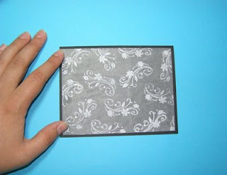
#1 Using the 6x10 sheets, cut a piece of the adhesive to the same size as your vellum

#2 Peel the backing (it's nice how there's a slight seam so you can do this with ease)

#3 Attach your vellum, being carefully to place flat so no bubbles occur
Now for my finished product. I also used the tape on the tree piece. For that I covered the stamped image with the tape, than coated in glitter. Easy, and SO much cleaner than dealing with interfacing, white glue, or packing tape!
Supplies:
Stamps: Inkadinkadoo- Cats & Bats
Ink: Brilliance Moonlight, Tuxedo Black, Stazon Black
Paper: Black, Vellum, White
Accessories, etc.: Glitter, Stamper's Magic Tape, Ribbon, Cord, Polyshrink

Thursday, July 31, 2008

Heads Up!

Have you ever wanted to attend a rubber stamp and scrapbooking show??
If you're in the Ontario area you just want to make a day trip down to Hamburg, NY. It's about 38 miles from the Canadian border at Niagara Falls! August 23 and 24, 2008at the Agri Center at the Fairgrounds. For show information visit our host: http://www.stampscraparttour.com/

Starving Artistamps will be there, sadly I will not :(

Although here is a Starving Artistamps card to get you in the mood. I had lots of fun with Copic and shimmery type products- Brilliance Moonlight inkpad, pearl ex, Spica pens, and satin ribbon. Stamps from here!

Wednesday, July 30, 2008

My Challenge

I hosted a challenge for the DTGD over at SCS, but I forgot to post my samples. I actually did two. I never bothered posting the first one. I like it, but it's kind of somber and it was not the easiest thing to photograph. So here it is, blog exclusive, well until I upload it over there. Also, this was a card where I really, REALLY, wanted to use black velvet ribbon. However, it seemed that I do not have any, I really thought I did. Anyway, the main image was stamped with a glue pad, then I quickly applied some black flock. The patterned paper is from a pack I got at Costco about a year ago. The phrase comes from Verve.

Supplies:
Stamps: Heartfelt Phrases, Inkadinkadoo stamp
Ink: Black, glue pad
Paper: Kraft, Black, White, Patterned Stripes
Accessories, etc.: Doodlebug Black Flock, grosgrain ribbon, mat pack and piercer

Monday, July 28, 2008

Sending Sunshine!

It's funny, I meant to spend the whole weekend stamping up a storm. Other plans came up and Sunday evening rolled around and I had nearly nothing to show for it! Well, then we decided to watch Harry Potter: Order of the Phoenix. It's one of those movies, since I read the book and they really don't deviate much from the storyline, you can really focus on doing something else. All of a sudden, by the end of the movie, I had 5 cards that I was quite pleased with completed!!
I think one of things that helped the most is I limited myself to very specific supplies, since I temporarily relocated upstairs. One of the stamps I brought with me was this delightful Surfboard Trio stamp by DeNami Designs.

I stamped that, coloured it in with the Kohinoors, then put in quite a few layers. I wasn't really thinking too much about it, I just kept thinking "hey, this would look good layered on green, then black..." So I did that, twice. I have to say I LOVE the effect of stamping a solid image on a textured cardstock. Especially on a card that is tropical themed. It just seems like the perfect touch. The funniest thing about this card, when both my mom and my sister picked it up to check it out (they were NOT in the same room at the times) they both said "whoa". I guess it did end up a tad on the heavy side. Guess it's a hand deliver only kind of card :D

That's all for now! Hope your day was full of sunshine!

Supplies: Stamps: Surfboard Trio, Small Solid Bamboo Leaf, Sending you Sunshine (Denami Designs)

Saturday, July 26, 2008

Cupcake!

So this card started out as being inspired by the ribbon (for Jody's challenge). It was pretty, pink and brown, and striped. Those colours had me thinking of cupcakes which fit nicely with Taylor's challenge. And then I thought, why not throw Holly's sketch in there, it brought things together nicely. I know there's SO much cupcake stuff out there right now, but I still haven't found what I deem the "perfect cupcake". Since I don't have cupcake stamps that I <3, I sketched out a few and went from there. It is by no means the "perfect cupcake", but it'll do.

Supplies:
Stamps: Birthday Basics (PTI)
Ink: Rosebud
Paper: Cocoa, Pretty in Pink, White, Rose
Accessories, etc.: Ribbon, oval nesties, stickles, pencil crayons, black pen

Thursday, July 24, 2008

Getting Dirty, again

The Dare to Get Dirty week is half way through, but there's still plenty of time to join in the challenges! Here are few cards I have made for some of the challenges.

This first card was made for Julie's challenge. The challenge was to make a clean and simple white based card. I really like making this type of card. It truly is a challenge, adding the exact right amount of images and embellishments. I used a long rectangle nestability to emboss/deboss (depends how you're looking at it!). I masked that and stamped my images and saying within the rectangle.


This next card was made for Sharon's challenge. It was a similar concept: Stamp Simply. by this she means keeping it clean and pretty, but adding that little extra something that brings about an elegant quality. For this card, I started out with vellum. Vellum always makes me think of elegance. I stamped that with a damask image in white ink. I let that dry a bit, then flipped it over and attached it to a chocolate card base using chocolate coloured brads. I finished it off with some luscious chocolate satin ribbon and a sentiment that was a bit on the script-font side.
I will be working on more of the challenges tomorrow (3 day weekend for me!), so stay tuned. In the mean time, the Dare to Get Dirty challenges can be found HERE for the forum. Check HERE for the gallery.
AND... there are still a few more hours in this week's round of gallery idol (it ends noon at mountain time today). If you would like to support me, check out here and go to the link under Description, and vote for Tashers.

Monday, July 21, 2008

Voting, DTGD, and more?

Hello everyone!

So, my card made it through the first round at the PaperCrafts Gallery Idol. The theme for the next round was Monochromatic. I went with a truly "stampy" card. I know it's popular to make scrappy cards, especially for magazine publications, but that just wasn't being true to my style. If you would like to support me, check out here and go to the link under Description, and vote for Tashers.

In other news, the Dare to Get Dirty challenges start this week!
Check HERE for details
Check HERE for the forum
Check HERE for the gallery


I said there was more...

So I might as well post a card. This card features another new gel-a-tins set. This one is called Sheltering Tree and it's a fabulously fun build a tree set. For the tree, I stamped the top part with regular dye ink, then went over with an aquapainter to shade it all in.

Sunday, July 20, 2008

Gel-a-tins: family tree

I have to say, when I first saw this set. I thought WOW, what a neat set for scrapbooking. I was a little stumped as far as what I should do a card. But then, inspiration hit! I thought, hey, wouldn't the tree trunk look nice as a limb. I was thrilled with how it turned out. I had stamped all the leaves on the white layer, but I wanted a bit more WOW, so I stamped them all on white and cut them out.
For card number two, I was thinking about how cool the swirly bits in this set would look as a background on white. So that's what I started out with. Then I went ahead and used the tree trunk as a trunk, adding in some nice green leaves. Next I went over all the leaves with a green Spica marker.


Saturday, July 19, 2008

New Gel-a-tins!

When I first saw this set I could hardly wait to make samples. I can finally share those, so here goes:
For this first one, I wanted to show how versatile these apples were. I wanted to make them look a little more lifelike. I sponged my inks and outlined the apples and I have to say, I was thrilled with the results!!

For this one, I wanted to make use of the adorable shaped sentiment. I went with a good old stand by layout, but jazzed up the background with embossed circles.
I had JUST purchased the Memento Ink Pear Tart. It only seemed appropriate to use it with this pear image. For the bite marks, I stamped the pear on a post-it, then drew over where I wanted the image to be taken away from. I used those to carefully mask.

Other news: I made it to the Top 15 in the Gallery Idol contest!! Thanks to all who voted! I will also be sharing more fun gelly releases throughout the week. These ones are set to be available by July 25th!

Thursday, July 17, 2008

Just keep swimming!

Here's a quick and fun clear card for you. One thing I LOVE about making the square clear card is using this layout. All you need is a fun image that will fit nicely into a 3x3 square and a sentiment that is also about 3 inches in length. Find the perfect coordinating embellishment and you're set!

Supplies:
Stamps: Starving Artistamps Tropic Sentiments 2 DoodleFactory Tropics,
Ink: Tuxedo Black, Stazon Jet Black
Accessories, etc.: gelly gems, Copic markers, Acetate

Tuesday, July 15, 2008

Arigato

I am still quite enjoying this Sushi set by a muse. So much fun! For this card I really wanted a band of something behind the main image. Finally I found this piece of paper from the DCWV Far East mat stack.

Supplies:
Stamps: Sushi set
Ink: Tuxedo Black
Paper: White, Red, Black, Grey, DCWV Far East mat pack
Accessories, etc.: circle nestabilities (regular ones), label die cut, copic markers, glitter pen

Remember, you can still vote in the PaperCrafts gallery idol contest. My card is here. To vote for any card, go to the link under Description. It will take you to ballot.

Monday, July 14, 2008

I need your help

Hello! The PC Gallery Idol cards are all posted now. If you want to view them all check this out.

Mine can be found here!

To vote, be sure to follow the links under the description, where it says Click Here to Vote for your favorite! . It is not the "love it" button.

Thanks for your support!

Sunday, July 13, 2008

This is a card I made quite a while back. I was in the mood for a wordy transparency overlay, so I made one! I really like how the brads worked as an attachment device and a decoration.

Supplies:
Stamps: Big and Wild Things, Friend by Definition, Heartfelt Phrases
Ink: Summer Sun, Old Olive, Stazon Brown
Paper: SU! mustard polka dots DP, Creamy Caramel, White, Transparency
Accessories, etc.: Twill, brads, pop dots

Friday, July 11, 2008

Just roll with it!

I've seriously been wanting this set for months. I even held it briefly in my hands at the Winter CHA. Finally, I have it all for my own! I love sushi, I love stamps, it's really strange that I didn't pick up this set sooner! I've been away from my craft stash since Wednesday and I am feeling pretty exhausted, so it's just a quaint and simple type of card tonight. In keeping with an Amuse tradition, I made my card base 3.5x5. It really is a nice size when you are wanting something quick, but with a bit more room than the 3x3 square note card. I stamped the sushi with Memento Tuxedo Black. These inks are quite awesome! I coloured with some Copics. And to finish off the fish roe, I added various stickles.

Supplies:
Stamps: Amuse Sushi Set
Paper: White, Taken with Teal, Old Olive
Ink: Tuxedo Black
Accessories, etc.: pop dots, Copic markers, black ribbon, stickles

Thursday, July 10, 2008

The Little Things

Seriously, all these amazing Amuseapalooza samples I've been seeing have been taking their toll on me (in a good way). I was always afraid to try the cute little banner, pendant, sparrow tail (there's many names for it) sentiment tag. But now, it's my latest obsession. Especially after seeing Scoopy's easy method of making these!

This is card is WAY cuter in person! I already a 6x3 card cut out. But then I thought, how cute would it be to make the entire thing scalloped. So I used a the largest scalloped rectangle Megability. Love the result!

Stamps: Pet Shop (gelatins), Little Lady (pti)
Ink: Burnt Umber
Paper: Various Bazzill, and staples brand CS
Accessories, etc.: square punch, brads, pop dots, various nestabilities

Tuesday, July 08, 2008

Paradise Found!

For this card, I was wanted to show how the DoodleFactory Tropics set can be used for not just ultra cute character type cards. There are a lot of other beach images in the set that can stand on their own quite nicely. This large palm tree is one of those. I ran my orange paper through the cuttlebug with a texture plate to give it a cooler look. The palm was coloured in with pencil crayons, and the sentiment was cut out using a Nestabilities tag die.

Supplies:
Stamps: DoodleFactory Tropics, Tropic Sentiments 2
Paper: Teal, Orange, Green, White
Ink: Black
Accessories, etc.: tag die cut, corner rounder, pencil crayons, spica, twill ribbon

In other news, we're still waiting on the Top 20 PaperCrafts Gallery Idol to be posted, and for voting to begin. Voting is set to begin tomorrow, and continues for 2 days. Check here out for details: http://www.papercraftsmag.com/gallery/. Please vote, it doesn't have to be for me, but the more votes the better! (I'm tashers over there, by the way)

Sunday, July 06, 2008

Surf's Up!!!!!!

Sometimes cardmaking seems a bit TOO fun. I had a good time creating this card. At first I thought the scallops might not work with a summery, masculine type theme. But, you know what, I really like the postcard vibe they brought to the card.

Supplies:
Stamps: DoodleFactory Tropics and tropic sentiments 2

Paper: River Rock, Chocolate, Orange, White
Ink: Versafine Black, turquoise
Accessories, etc.: Rectangle Nestabilities, Copics, Spicas, pop dots

Friday, July 04, 2008

A few quickies

Just a few quick cards today. Whenever I get 12 x 12 paper, I cut it up into 6x6 squares. This has really encouraged me to use what I have. Anyway, I LOVE this Granny's Kitchen paper by SEI, and really wanted to make some Kraft based cards with the paper as an accent. So I grabbed one 6x6 square and got to work. I used the same stamps and ribbon on each card. On the first card, I really wanted to try stamping on some twill. I also wanted to try the sentiment flag style. I was quite pleased with this look. I see it a lot but I've never tried to pull it off. The brad on there is strictly decoration. I used tape to secure the flag, so it's not like the brad serves any practical purpose. For the other card, I went with the same orientation, but used the ribbon as exactly that. I switched up the was the sentiment was stamped. I still have 2 decent sized scraps from my 6x6 square, so I need to do something with those as well!

Supplies:
Stamps: Birthday Basics (PTI)
Paper: Kraft, Vanilla, SEI Granny's Kitchen
Ink: Burnt Umber (Palette)
Accessories, etc.: twill ribbon, pop dots, copper brad

Thanks for stopping by today! My exciting news for the week was that my card was chosen as one of the Top 20 finalists in PaperCrafts gallery idol. Mine is second from the bottom here. Be sure top check out the site on Monday for the challenge cards!

Tuesday, July 01, 2008

How-To...

For my card yesterday, I thought I'd show how I used the nestabilities to make the scalloped and rounded edges on the card. I'm sure there's a tutorial somewhere on the internet. I briefly looked, but didn't find one. Basically, you just feed your cardstock through the template so that only one side is in contact with the cutting side. Then just run it on through your die cut machine as usual. That's all there is to it.

Monday, June 30, 2008

Chocolate and Celery

Two of my favorite colours together! I had been meaning to try out one of these cards for quite some time. They have the side fold, but the front has been rounded and is shorter than the back. You keep it tied shut with some ribbon. Since this was my prototype, I didn't do anything too extravagant. I was just happy that it worked!

I ran the card base through the cuttlebug using the largest oval from Petite Ovals. I then ran the chocolate piece through using the same die, and then I ran the celery piece using the coordinating scalloped die. I adhered the celery piece first, then placed the chocolate piece over top, so that the interior is still all white. I found some matching ribbon, then die cut another oval and scalloped mat, stamped a branch and sentiment from Out on a Limb, and that was that! The oval is mounted up on strategically placed pop dots, so that the ribbon can easily be pulled under and through.

Supplies:
Stamps: Out on a Limb (PTI)
Paper: Chocolate, Celery, White
Ink: Chocolate, Celery, Olive
Accessories, etc.: Scalloped and Normal Petite Oval Nestabilities, pop dots, double stitched ribbon, horizontal slot punch

Sunday, June 29, 2008

Butterflies!

I was so busy yesterday, stamping up a storm, that I didn't even realize until today that I had nothing to show for it! (At least not yet...) So today, I decreed, was a stamping for me day. It's not like I didn't enjoy myself yesterday, but sometimes, you just need do something for the pure enjoyment. No commitments, no challenges, just back to the basics- what sucked you into stamping in the first place. You know?

I finally got my hands on Wonderful Wings. It's such a gorgeous set and I really like watercolouring the butterflies with twinkling H2Os. I started with one butterfly, then sketched out a layout, which then brought to my attention that I needed to do a second butterfly. I used textured cardstock for the base and for the white panel. I think sometimes a little bit of texture is all you need to bring that visual WOW forward.
Supplies:
Stamps: Wonderful Wings (Su!), Birthday Basics (PTI)
Ink: Versafine Black
Paper: Textured Brown, White, More Mustard, Confetti White for watercolouring
Accessories, etc.: twinkling H2Os, aquabrush, pop dots


Thursday, June 26, 2008

Sometimes...

You just need a bit of inspiration before starting a project. I happened to be checking out Julie's blog this morning, and took a peek inside the "miscellaneous designs". I saw this beauty from a little while back, and was hit with the inspired bug!

I don't have any vellum cardstock, so I improvised. I took a piece of vellum, folded it in half, then trimmed off most of the back. I attached that to a piece of vanilla cardstock. It worked wonderfully and is quite stable. For some reason, this particular project just wasn't photographing nicely, but it is quite pretty in person! The petal prints are stamped on vanilla. I mixed banana and apricot on the flowers themselves to get a nice gradient look going. I added in a bit of speckles around the image, and finished it off with some awesome ribbon from A Muse. The vellum piece is stamped with white craft ink. I always love the look of the script in white on vellum. It's so soft and pretty, especially with those other Soft Subtles colours. One other thing I did, was add a touch of glitter to the flowers with a Spica Clear pen. It's subtle, but nice.

Supplies:
Stamps: More Petal Prints, Petal Prints, It's Your Birthday, French Script, Itty Bitty Backgrounds
Ink: Barely Banana, Apricot Appeal, Certainly Celery
Paper: Apricot Appeal, Very Vanilla, Vellum
Accessories, etc.: Sheer Organdy Palm Green edged

Wednesday, June 25, 2008

New Verve!!

Today is the release day for four new sets at Verve Visual! This card features one of the new sets, Asian Flair. As soon as I saw this set, I knew I needed to make a card using red, black, and gold. I did some polished stone using those colours, it's quite a pretty result! Next I stamped the squares, cut those out, then embossed the circles in gold, and popped those out with a 3/4'' circle punch. The card base is textured white paper. I added the sentiment in black on the red, then added in some black ribbon and gold cord. Here's another shot of the card in its entirety. The one reinker I used ended up going a bit purple when I mixed it with the alcohol. So afterwards, I used a bit of black stazon reinker so that black would still be present in the polished stone.


Supplies:
Stamps: Asian Flair by Verve Visual
Paper: Real Red, Basic Black, Glossy White, Textures White
Ink: Gold, Black, Red
Accessories, etc.: gold EP, gold cord, black ribbon, pop dots, alcohol, reinkers

Monday, June 23, 2008

A challenge card or two...

I keep meaning to participate in the Hero Arts weekly challenges, I just never got around to it. Finally, I set some time aside yesterday evening and got to work. It took a lot longer than I expected, I kept changing the stamp that I wanted to use in two different ways. I started with a sentiment stamp, made a card, but then didn't like how the second one was coming about. So I decided to go with flowers instead!

Here's my first card. I kept things relatively simple on this one. I stamped the iris first, then the other two. My stamp of choice for this challenge was the tulip stamp. I coloured in a little garden scene, using Copics, graphic artist markers, and even a prismacolor marker (no brand loyalty to markers here). I decided to break out two severely underused colours for my card. I did a Glorious Green mat and an Orchid Opulence card base. I was surprised by how much I liked them together.

For my second card, it was easiest to stick with the floral theme. However, I wanted to change things up. I used only the petals of the tulips to make a new flower. There are 3 tulips on this stamp, so there was the possibility to create 3 different flower looks. I coloured those in with markers, and added a touch of glitter with a gold Spica marker. I also added in some gelly gems to bring more sparkle to each flower. I used the same sentiment, but this time, I put it on a tab.

Supplies: Hero Arts Clear Design Stamps- T set, A set, I set, also the Clear Messages set
Paper: Natural White, Glorious Green, Orchid Opulence, More Mustard, Basic Black, White
Ink: Versafine black, more mustard
Accessories, etc.: various alcohol based markers, pop dots, Spica marker, gelly gems

Saturday, June 21, 2008

Robot Birthday!

So, my sister needed me to make a card for one of her friends. And for the birthday, they are going to go see Wall*E, the new Disney/Pixar movie. She requested that I use a robot on the card. I happily obliged! I started out with a vague sketch in mind. I stamped the robot on white cardstock, ran it through the cuttlebug, then stamped the sentiment. Next up came the colouring. I couldn't resist picking up a pack of Koh-i-noor Woodless Colour Pencils. They are marvelous. The coverage you get and the blending, well I'm sure you've all heard it already, but they really are that good! I coloured the robot with shades of green, and added a bit of sparkle with some Spicas. I thought about finding some good paper to match a robot theme, but I'm pretty sure I don't have any. Instead, I went with embossing this fun circle background. I figured that seemed fun and whimsy in the robot kind of way.

Supplies:
Stamps: Starving Artistamps/Doodle Factory: Urban, PTI: Faux Ribbon
Ink: Black Versafine
Paper: Green Galore, Basic Black, Gable Green, White
Accessories, etc.: woodless pencil crayons, oval nesties, circle embossing BG, grosgrain, Spica glitter pens

Friday, June 20, 2008

Another Dirty Challenge!

It's the 20th, you know what that means! It's time for another dirty challenge.

The guidelines: Challenge Focus: "Inside & Out"......stamp and decorate both the inside of your card AND the outside of the envelope. (any card size is ok)

Required Element: Patriotic element - interpret this any way you like (ex. color scheme, sentiment, image, whatever)

Restricted Element: No ribbon

For my card, I went with red and white for my patriotic element. I recently picked up a pack of the metal rimmed circular tags, and I really wanted to use one, so I incorporated that into the card. For the interior of the card and the envelope I went with a stamped "swoosh" type pattern of the stars.
Supplies:
Stamps: Seeing Stars, Great Expectations (Verve Visual)
Ink: Real Red Craft Ink, Whisper White Craft Ink
Paper: Textured White, Real Red
Accessories, etc.: Metal tag, pop dots


Wednesday, June 18, 2008

A New Sketch Book

Well, I decided over the weekend that I wanted a Bind It All. I've always been keen on making books, and this was a tool that was designed for exactly that activity. I ordered from Paper Works Co. on Sunday and received it today. The joys of ordering from within your own country: it got here FAST, and no extra fees. :D Peggy provides amazing customer service and she's constantly adding new items to her online store. I just thought I'd give a shout out to her before showing my first BIA project.


I had picked up some graph paper earlier today because I knew exactly what I wanted my first project to be- a sketches book. I have a nice notebook I currently use, however, it has so many pages and its spine is too tight. The book never stays open on my desk, and I have to really force it open while I'm writing or drawing in it. A coil bound book can easily stand on my desk. This was my very first project, and I have to say, I was surprised at how easy it all came together. Even though I had already bought the tool, I didn't believe it could really be as easy as they advertised it to be! I figured my first project would an awkward proto-type. Not so!

To the left is a close up of my letters. I used the License Plate Letters set. I stamped them on white cardstock, then I mixed together 4 different colours of embossing powder (teal, blue, lime, and orange). The result was a fun speckled look! Since I had used that font, I thought I might as well add some other traffic themed images. I stamped a sign, as well as two license plates, using the mini license plate alphabet to add in the words "Inspire" and "Create". The covers of the book were made with some chipboard I had lying around. I think it was actually the backing off of a pad of paper. It worked well, since it was thin enough to be cut with my paper cutter.

Supplies:
Stamps: License Plate Letters & Numbers, Vanity Plate Pick Up Lines, Traffic Signs (all by gel-a-tins)
Ink: Versamark, Versafine Black
Paper: Wild Wasabi, East Coast Prep DP, White
Accessories, etc.: pop dots, black ribbon, Teal, Orange, Lime, and Blue embossing powders (also available from gel-a-tins)

It's been a while...

Since I even looked at a sketch challenge. Now I know the purpose of the challenges are to try something new, but when I saw that today's sketch was one of my favorites, I couldn't resist! I even staged my photo like Kristina, the one who inspired this sketch. I know, I can be cheesy like that.

Supplies:
Stamps: Birds of a Feather, Dress Me Up (gelatins)
Ink: Wild Wasabi, Purely Pomegranate
Paper: Kraft, Vanilla, Wasabi, Winnie's Walls (sei)Accessories, etc.: pop dots, Antique White twill

Tuesday, June 17, 2008

How sweet!

I just picked up some fun papers yesterday- Winnie's Walls by sei. After looking at them more closely, it became apparent how well they matched Stampin' Up's wasabi, groovy guava, ruby red, and river rock, as well as PaperTrey Ink's Berry Sorbet. It's just always nice when you purchase another manufacturer's papers and it goes so well with what you already own!

I've started another Kraft paper kick recently. I just love it as a card base instead of white. For this card, I slapped on a strip of the striped Winnie's Wall paper, added some pierced lines on either side. A slight oops in my piercing dictated the layout. Not a problem, nothing a rectangle nestability cut out couldn't hide. The cherries were stamped then covered with Spica markers for that extra glittery, sugary glow.

Supplies:
Stamps: Tart & Tangy (su!), It's a Celebration (PTI)
Ink: Ruby Red, Wild Wasabi, Black
Paper: Kraft, White, Wasabi, Winnie's Walls
Accessories, etc.: Piercing guide and piercer, spica markers, rectangle nestabilities

Sunday, June 15, 2008

Happy Father's Day!

This is the card I made for my dad for father's day. He just so happened to buy himself a new tv, so it seemed appropriate to use this tv image. I like the retro feeling of that stamp, so I paired it with black, grey, and white, as well as the Linograph background and some corner rounding. The greeting was put together using a Verve Visual stamp and a Papertrey Ink stamp.

Saturday, June 14, 2008

A little bit of verve...

I kept meaning to make a project for this month's Verve Product Parade a bit earlier. Finally, today I did exactly that. I used the colours and the general vibe I got from the photo as my inspiration. I started with some River Rock coloured patterned paper, then set about figuring out a layout. Next I pulled out Fancy Filigree and realized that this set had more looks than I had previously thought. The way the filigrees are designed makes it a snap to stamp them than turn 45 degrees to make an even cooler design. I really like the result! I added a small gem to the interior of each filigree, matted those on a square, attached them to the strip of River Rock, then stamped a saying.

In other news, if you love sentiments and you love sales, and you haven't heard about it yet, Verve Visual is having a sale. It's called Say the Word and select sentiment sets are 10% off! Verve Visual definitely has some of the best selection of sentiments out there! Check it out. They also have extremely reasonable shipping options to Canada

Supplies:
Stamps: Petals & Stems, Fancy Filigree
Ink: Black, Real Red
Paper: White, Real Red, So Saffron, Ginger Blossom DP
Accessories, etc.: Gelly Gems

Thursday, June 12, 2008

You ROCK!

Here are some more fun images from Doodle Factory. I'm not sure if you've noticed, but each one I've posted these past days has used a different medium for colouring. First it was Copics, then pencil crayons. This one is water based markers and reinkers.

Supplies:
Stamps: Doodle Factory Urban, Sun Spirit Sentiments
Ink: mustard, red, turquoise, wasabi, bashful blue, black
Paper: East Coast Prep, mustard, white, red, turquoise
Accessories, etc.: aquabrush, wasabi ribbon

Monday, June 09, 2008

Some more Doodles!

Here's another fun card using some Doodle Factory images. For this one, I started with the main image, chose my patterned paper (aka my colour palette), then built my card around it. I coloured in the image with pencil crayons. I thought this image would look fun flying over a round card. It kind of has a Globe feel to me.

Supplies:
Stamps: Doodle Factory, Sun Spirit Sentiments all available from Starving Artistamps
Ink: Versafine
Paper: Scenic Route, Stampin' Up!
Accessories, etc.: black grosgrain, pencil crayons

Sunday, June 08, 2008

Prince Charming?

Well, after reorganizing (completely!) my craft space yesterday, I finally had some time to sit down and use the newly cleaned space. It's amazing what that can do for your creativity. For this card, I pulled out the Doodle Factory Fairy Tale set again, and got to work. I stamped the frog, crown, and mushroom, then coloured it in with Copic markers. I was in the mood for something really vibrant, and I couldn't be happier with it's cheerfulness! Once I had the frog all done, I decided on a layout. Next, I found this argyle paper, I thought it worked well with the whole quasi-royalty theme. I added a sentiment from one of the Cat's Pajama's valentine sets, and then added some saddlestitched ribbon to bring it all together nicely.

Supplies:
Stamps: Doodle Factory Fairy Tale, The Cat's Pajamas Puppy Love
Ink: Versafine Black
Paper: white, tempting turquoise, east coast prep DP, black
Accessories, etc.: copic markers, ribbon, pop dots, word window punch

Friday, June 06, 2008

Magic!

I absolutely love this Fairy Tale set by Doodle Factory, but I've barely had a chance to use it! My sister requested a birthday card for a friend of hers. Wizards popped into my mind when I thought of the friend. So I had to use Earwick the Wise for her birthday card. I was feeling a bit bummed, because I really wanted a very specific phrase to pair with the wizard. Alas, I didn't have any stamps that said such things. But wait! I totally forgot that I owned some snap stamps. They really are perfect for those out of the norm phrases. I added a few stars to the background, and that was that! I coloured this one with pencil crayons for his staff, skin, and robe, and with markers for his shoes and beard.

Thursday, June 05, 2008

My heart is with you

I am still LOVING this Black Orchid paper pack from SEI. I don't quite have the the right ink match for it, but Papertrey Ink's Berry Sorbet was a somewhat close match. I made my card base with textured brown paper, added the twill ribbon to the patterned paper, did a bit of stamping, then pieced it all together.

Supplies:
Stamps: Wild Things (gelatins), Heartfelt Phrases (Verve Visual)
Paper: Brown (world win), white, berry sorbet (PTI), Black Orchid (sei)
Ink: Berry Sorbet, Burnt Umber
Accessories, etc. : polytwill (SU!), pop dots

Tuesday, June 03, 2008

Fluttering By Gift Set

Here's another project I made for Verve Visual's May release. This set features the Fluttering By set. I started off by making a little box out of acetate to hold the cards. I stamped that with a polka-dotted circle stamp and white stazon. Then I added eyelets and a ribbon handle. Next I made 4 cards to go in the box-bag. I chose a single type of patterned paper, white and berry sorbet cardstock, coral ribbon, square nestabilities, and white embossing powder and got started on creating 4 different layouts. I had jotted down a few sketches to follow along, and for the most part I stuck to them. One thing that I thought was kind of fun was how I did the coloured wing part of the butterflies. Instead of colouring it in, I stamped the butterfly on the coloured cardstock, then cut that out. The cutting job didn't even need to be that precise, because I had also stamped the butterfly on the white square. I was kind of surprised by how much I liked the bright coral, white, and black colour combo.


Sunday, June 01, 2008

Woo, It's June 1st!

I've been waiting for this day for a while! I can finally share some of the fun Verve samples I've worked on! You can check out this post if you would like to read a little bit about me and see all the samples. I thought I would share my projects by set from this most recent release.

Today I have a Fancy Filigree card to show. As soon as I saw this set, I knew I had to make some gorgeous background paper with the images. I stamped one of the filigree images in a few different colours, overlapping them for a cool effect. After I had that all done, I thought it'd look quite pretty to place a larger filigree overtop. I stamped one and cut it out. I looked through my stash of stuff and found these half pearls. They were the perfect size for the circle of the bigger filigree! The entire card is made of shimmery white and it is quite the sparkling creation!