Thursday, June 04, 2009

Van Gogh

A while back, Irene posted a cool card with a really neat way of colouring. Flash forward a few months and you've got Starving Artistamps and Technique Junkies pairing up for a few contests. Be sure to go here to find out how you can enter the contest.

Here's my card. I kept it pretty simple, using the technique just on the two birds. After doing the technique, I realized how easy it was and that I should tackle something larger. I will try to work on something this weekend, so stay tuned :)
Supplies:
Stamps: Pip & Ollie (DoodleFactory Animals), Dot Background, Greeting- all can be found at http://starvingartistamps.com/
Ink: Rich Cocoa, So Saffron
Paper: Barely Banana, Tango Tangerine, Close to Cocoa, White, Summer Sun
Accessories, etc.: Copic markers, scallop punch, ribbon, pop dots

Wednesday, May 27, 2009

A sketch card.

Starving Artistamps is sponsoring 2 Sketches 4 You this week, so the design team had fun making cards for the challenge!

Here's my challenge card. I had actually had part of it completed for quite some time. It was just sitting, waiting for the right card.

I coloured the octopus at least 2 weeks ago. I had added texture to it with liquid pearls, then set it to dry a safe distance from my desk. There it sat, possibly forgotten about for a bit... But then I saw this sketch and knew it would work quite nicely! I added all sorts of embossed and other circle backgrounds here. I wanted a fun and funky, bubbly theme!

Supplies: Stamps: Urban Sentiment Set #2, DoodleFactory Creatures Paper: Taken with Teal, Green Galore, Barely Banana, White, Cool Caribbean Ink: Tuxedo Black Accessories, etc.: Copics, Texture Plates and Folders

Wednesday, May 20, 2009

H2O Challenge

It's been a while since I participated in one of the challenges, and when I saw that the theme this month was water and watercolouring, I couldn't resist!
Here are the guidelines:

A dip in the Lake....the waves on the Ocean, that little creek down the ravine, the warm rain gently falling, a cold glass of water on a hot day...nothing says Spring and Summer like water. This month we're all about H2O!

Challenge Focus: Create a project that has something to do with water, it can be in your stamps, paper, or embellishments.

Required Element: Watercolouring! If we're doing a water themed project there needs to be some element of watercolouring on your creation.

Restricted Element: If it's H2O that means the two in the equation restricts you to only two embellishments.
And here's my card:

I really love how the watercoloured roses turn out, so I did that as my watercolouring component. I actually colourwashed the whole thing with watercolour paint, let it dry, then I came back to it. I soaked it with water and added in bits of colour with reinkers. I did the same thing with the leaves. When it was almost dry, I added even more colour to make it really vibrant. Next, I didn't want all that vibrancy to fade, so I coated it with glossy Mod Podge. Once that was dry, I added bits of "dew" with crystal effects. The card ended up being quite large- 7x4.25.

Supplies: Stamps: Fifth Avenue Floral, It's Your Birthday, Friends 'til the End Ink/Reinkers: Versamark, Black Onyx, Ridinghood Red, Summer Sun, Old Olive, Kiwi Kiss, Certainly Celery Paper: Ridinghood Red, Watercolour Paper, Confetti White, Ginger Blossom DSP, Pink Pirouette Accessories, etc.: Texture Plate, Satin Ribbon, Nestabilities, White EP, Crystal Effects

And here's a close-up of the "dew".

Be sure to check out all the challenge cards here.

Saturday, May 09, 2009

Had to Try

Once I saw this technique, I knew I had to give a try. I made a few samples before deciding on actually making a card.

First I tried the technique with watercolour paper and paints, it was a bit too washed out. Next I tried it, as suggested, the shimmery paper and reinkers. I liked the result, but I don't have much shimmery paper, and what I do have, I keep for very special occasions. I could see myself really liking this technique, so I wanted to find a cheaper option.

What about regular white cardstock? Well guess what, it works just fine! Regular cardstock tends to curl a bit when wet, so I stamped, embossed, sprayed, and then used two smaller acrylic blocks to hold it down while I went in with reinkers. The plain cardstock soaks up the water pretty fast, but the effect is just as striking. It may take longer to dry, I didn't feel like waiting. Since the water doesn't stay pooled on top for very long, I decided to speed things up with the heat gun. I let each image air dry for maybe five minutes, then came back to it with the heat gun.

Supplies:
Stamps: Fifth Avenue Floral, Friends 'til the End, Father Knows Best
Ink: Versamark, Kiwi Kiss
Reinkers: Summer Sun, Ridinghood Red,Old Olive, Kiwi Kiss
Paper: Barely Banana, Ridinghood Red, Kiwi Kiss, Haiku
Accessories, etc.: white satin ribbon, white EP, pop dots

Tuesday, May 05, 2009

WS Trio

I thought it seemed like a good day to share these three Whipper Snapper cards. They all feature the sets released in April.

For my first card, I thought that the handwritten sentiments would make a cute stem. I stamped that first, then added the flower and leaves. I coloured it in with Copics, and put it together in one of my favorite layouts.
This chicken image is definitely one of my favorites. It's so much fun to colour and pair with other food items. I wanted a country kitchen vibe for this one, so I paired the images with this cute checkered paper and some saddle stitched grosgrain.
For this card, I wanted a simple "wow". This card is slightly smaller than usual, the note card 3.5x5. I cut out a scalloped square, then adhered a square of tape to it and glittered it up. Then I attached a Copic coloured cake in the same colours and added the sentiment in white craft ink. Easy, quick, and sparkly :D

Supplies:
Stamps: Chicken's in the Kitchen, What's Cookin', Simply Bloom
Ink: Bamboo Leaves, Rich Cocoa, Tuxedo Black
Paper: Kraft, Berry Sorbet, Ski Slope DP, White, Vanilla, Chocolate, SEI DP, Pixie Pink, Lovely Lilac
Accessories, etc.: Glitter, Copic markers, ribbon, various nestabilities, pop dots

Sunday, May 03, 2009

Spring Fling

When I saw that Nichole had posted a challenge, how could I resist? Especially with all those amazing photographs the PTI design team had chosen as inspiration. I loved the photo of the tulip festival that Lisa posted. I took those colours and went about making my own floral scene.

I started by spritzing some watercolour paper. I patted it with a towel so it was only slightly moistened. Then I inked up the stamps with markers. I finished off the scene with a bit of paint splattering and plenty of distressing.
Supplies:
Stamps: Life, Linen
Ink: Regal Rose, Rose Red, Always Artichoke, Mellow Moss, Dark Chocolate
Paper: Regal Rose, Always Artichoke, Watercolour Paper, Rose Red
Accessories, etc.: ribbon, paper piercer, distressing tool

Thursday, April 30, 2009

Two in One

That's right, post number two for today. The fabulous Becky Oehlers is holding a challenge in honour of her birthday and blogaversary to use clear cardstock. I quite like the look of clear cards, so I figured I'd make one.

Here's the outside. I texturized the blue paper, attached it to the yellow cardstock then cut out the circle with a nestabilities die. I added the scalloped circle and brads because the front was just too plain without it.

The inside is full of fishes, wishing "birthday fishes", of course. I was totally inspired by this one by Nichole Heady. I tend to avoid gel cards though, because they don't keep well. They're great if you use them immediately, but if you don't they tend to get very distorted.

Supplies:
Stamps: Pond Life
Ink: Orangerie, Summer Sunrise, Lemon Tart
Paper: Spring Rain, Lemon Tart, White, Summer Sunrise
Accessories, etc.: Acetate, brads, texture plate, nestabilities

Colour Challenge!

I was quite happy to see that Dawn had posted a new colour challenge today. And it just so happens to be one of my favorite combinations already- Aqua, Brown, and White. Because I just received Scattered Showers, I've been using it a lot and having quite a lot of fun with it. Since it's Dawn's challenge, and that set is her design, I figured, why not showcase both?


I started by stamping my own patterned paper with the smallest umbrella in the set and the rain drops. I found the handle to be a bit too long for that umbrella in a background setting, but it was easily resolved. I placed a post-it note over each umbrella and then I could make the handle as short as I wanted. I embossed the greeting in white powder so it would really pop out. I also stamped another umbrella and cut it out. I really like placing the umbrellas on a diagonal. Perhaps because that's usually how I see them when they're being used? Then I added a scalloped edge, some satin ribbon, and my current obsession (sorry folks!) the button bow!

Something amusing I just noticed- it's been raining all day, and after I finished my card I saw that the sky is clearing and there's quite a bit of sunshine!

Supplies:
Stamps: Scattered Showers, Birthday Basics
Ink: Aqua Mist, Dark Chocolate, Fresh Snow
Paper: Dark Chocolate, Aqua Mist, White
Accessories, etc.: scallop punch, satin ribbon, aqua mist button, twine, pop dots, white EP

Tuesday, April 28, 2009

Wildflower Birthday

I was in the mood for a bit of watercolouring and I was itching to use my new sets from Whipper Snapper Designs. I stamped the flower, leaf, and butterfly with Stazon onto watercolour paper. Then I went to work with watercolour paints and a blender pen. I really wanted a soft glow around the images, so I dribble a few droplets of water on my plastic palette and mixed in a touch of yellow paint. I applied that with an aquapainter since I wanted it to disperse. Next I stamped Aida Cloth onto some caramel cardstock, I added piercing and some sponging to match with the rest of the edge distressing I had done. I completed it with a twine tied button and sentiment flag.


Supplies:
Stamps: Blossoms and Butterflies, Aida Cloth, Blooming Expressions
Ink: Timber Brown, Creamy Caramel
Paper: Creamy Caramel, Watercolour, New Leaf, Vintage Cream
Accessories, etc.: Twine, New Leaf button, paper piercer and guide, sponge, watercolour paints

Sunday, April 26, 2009

Colour x 50


I saw that it was #50 of Kristina's colour challenge, and since I seem to have lots of time this weekend (how strange!) I thought I'd play along. I have always been a fan of bright colours, especially the primaries. I liked the look of my stamped patterned paper so much the other day that I decided to try it with these colours. It's a simple design, I didn't want to take away from all that pretty stamping. To tie in all the colours, I stamped the happy once in each primary and left birthday in one of the neutrals. Of course, when I read Happy Happy Happy Birthday, I get the cheesy song from Emperor's New Groove in my head, the one in the restaurant (happy happy birthday, from all of us to you, we wish it was our birthday, so we could party too...). I love that movie!
Supplies:
Stamps: Detours (October Afternoon), Birthday Basics (Papertrey Ink)
Ink: Bahama Blue, Cantaloupe, Lady Bug, Rich Cocoa (Tsukineko)
Paper: Dark Chocolate, Summer Sun, White
Accessories, etc.: Scalloped edge punch, scalloped rectangle nestabilities, chocolate 3/8'' grosgrain

Saturday, April 25, 2009

April Blog Hop!

This month's challenge was to use one of Lauren Meader's Timeless Templates. I really love the "From the Desk of" template. It's such a fun one and it's quite sturdy! I've made a few already, but I wanted to try something a little bit different for the blog hop. I decided it'd be fun to make two of the organizers and stick them together. I printed out the template twice on PTI's white cardstock. Then I printed out the decorative mats onto Aqua Mist and used the flowers from Friends 'til the End and stamped out some pretty paper. I put each template together, then stuck them to each other. I thought a basic style handle would be fun, so I adhered 2 strips of 11x1 inch white cardstock together, then attached those to the organizers. I reinforced those with 2 brads on each side. I thought this would be really cute if you left out the divider, kind of like the old style milk bottle cartons.
I decided to put my new organizer to use right away. I found that each division fits about 22 Copics (sketch or original), making the entire ensemble able to fit 88 markers. And the handle is sturdy enough and well attached that you can lug the whole thing around. I tested it out!

Supplies:
Stamps: Friends 'til the End
Ink: Ocean Tides, Fresh Snow, Dark Chocolate
Paper: PTI White, Aqua Mist
Accessories, etc.: Scor-Tape, From the Desk of Timeless Template, Chocolate Brads, 1/16th hole punch

Wednesday, April 22, 2009

Earth Day

Nothing says earthy like kraft paper, twill, buttons, and twine, at least when we're talking cards anyway, those are the types of supplies I think of.


I really like these images from gel-a-tins Peace on Earth set and thought it would be appropriate to use them today. I'm still on a button bow kick, expect to see more of those in the weeks to come. The card is relatively simple. I stamped the earth image with green ink onto blue paper, cut that out, and placed it on a naturals white tag. Then I added the ribbon covered scalloped paper and the sentiment, and that was it!

Supplies:
Stamps: Peace on Earth
Paper: Kraft, Naturals White, Soft Sky
Ink: Landscape, Rich Cocoa
Accessories, etc.: twill, twine, button, scallop punch

Tuesday, April 21, 2009

Happiness Always

Although I am no longer a Stampin' Up! demo, I still enjoy the product. I am still part of a stamp club. As a challenge, my demo asked that we make something from our January or February club purchases to bring along to our next get together. So I've been making quite a few items focusing on those purchases. This is actually the third one I've made (I just haven't uploaded and edited the other two yet). Basically, I got these buttons and I really wanted to try the button bow. I followed Nichole Heady's instructions and it turned out great. I also took the layout that she used in her tutorial and applied some of my recent acquisitions to it (ribbon, celery cardstock, buttons, Botanical Blooms- technically the last two were from March's club).
After making the button bow, I stamped Polka Dot Background on So Saffron in Vintage Cream. Then I added some piercing. Next,I figured out how much room I had for the image panel. I stamped a few flowers, coloured them in with Copics, and added a SAB sentiment from a past year. I added celery borders to the image panel and background panel and placed that all on a Vintage Cream card base.

Supplies:
Stamps: Botanical Blooms, Happy Harmony, Polka Dot Background
Ink: Rich Cocoa, Vintage Cream
Paper: So Saffron, Certainly Celery, Vintage Cream
Accessories, etc.: So Saffron grosgrain, thread, button from Buttons Latte, pop dots, paper piercer and guide, Copics

Wednesday, April 15, 2009

Pink and Black

I saw this alphabet set at Studio Calico the other week and really liked it. It is suitable for scrapbooking, but I thought it would look nice on cards. I received it on Tuesday and couldn't just let it sit there. So I got to work creating this 4.25 square card. I embossed the letters on black paper using pink embossing powder. I cut those out, then added the word chickadee using a Studio G rubber stamp alphabet. I added the scalloped black paper, the polka dot ribbon, and the black mat, but it felt a tad unbalanced. So I stamped this sweet little bird, embossed it, cut it out and popped it up.


Supplies:
Stamps: Noah (Studio Calico), Studio G alphabet, Sheltering Tree (gel-a-tins)
Ink: Versamark, True Black
Paper: Pretty in Pink, Pink Pirouette, Black
Accessories, etc.: Pink of Me gelly powder, pop dots, scallop punch, polka dot organdy

Monday, April 13, 2009

New Cling Mounts!

It's time for some new designs by Anna Wight. Be sure to check them out at Whipper Snapper Designs. I had a lot of fun with this month's sets. There are three new sets this month.
First up is Chicken's in the Kitchen. This set has a chicken and lots of props. I gave her a chef's hat and a wooden spoon and paired the whole thing with the "Kiss the Cook!" sentiment. This colour combo- caramel, buttercup, and aqua reminded me of a kitchen.
The second set is called What's Cookin'. It have several cute sayings and some food images. These images also go quite nicely with the chicken set. I kept this design pretty simple, having just the one small image, a matching saying, and red and brown.The third set is called Simply Bloom. It contains floral images, a few leaves, a butterfly, and my favorite: handwritten sentiments. If you're like me, you may find yourself a tad envious of others' handwriting and how well it works on a card. Don't get me wrong, I like my handwriting and printing, but they just doesn't seem to "go" on cards. As soon as I saw this set, I wanted to make this card. I stamped several flowers and coloured them in with Copics. I wanted a card that would be like a ray of sunshine for the recipient. Bright colours, especially blue, yellow, and orange, make me happy.

Supplies:
Stamps: Chicken's in the Kitchen, What's Cookin', Simply Bloom
Ink: Rich Cocoa, Tuxedo Black
Paper: Creamy Caramel, Chocolate Chip, Bitty Dots DP, Real Red, White, Summer Sun, Pacific Point, Tangerine Tango
Accessories, etc.: Nestabilities (oval, long rectangle), saffron grosgrain, Copics, pop dots, red grosgrain

Wednesday, April 08, 2009

Oops!

I try to post at least once a week, but sometimes it just doesn't happen. This last weekend I was in Brandon, teaching a few classes at a scrapbooking convention. It was a lot of fun! It was also great to getaway for the weekend, even if it was just 2 hours away.

With it being the upcoming Easter weekend, I have kind of an odd work schedule. It's my Saturday rotation week, which means I am on my 3 day weekend right now Wednesday, Thursday, and Friday. It's actually kind of nice. I love having weekends when the majority of people are having weekdays. That combination also means... time for shopping, regular mail deliveries, and time for stamping. I managed to fit all 3 in today. The shopping wasn't too interesting, new headphones (the ones that come with iPods are WAY too big for my ears), and an extra SD card. I also received my nestabilities from http://paperworksco.com/. I ordered Blossoms, Labels 3 and 4. I decided to put together a little something featuring the Blossoms shape.

This was one of those cards that just kind of came together, absolutely no planning. I wanted to jazz up the flower shape, so I stamped it, then added a big vintage button which I had threaded. I created the leaves by cutting freehand and scoring down the middle. I liked the dotty theme and decided to bring out the Swiss Dot Cuttlebug folder (I really need to use that more often!). I decided at the last minute to add in a scalloped border to make the panel a bit more proportionate to the card front. The last step was a small sentiment tag which I slid under the flower.

Supplies:
Stamps: Birthday Basics, Polka Dot Basics
Paper: Pumpkin Pie, Summer Sunrise, New Leaf, Craft, Vintage Cream
Ink: Pumpkin Pie, New Leaf
Accessories, etc.: Blossoms, Scalloped Rectangles nestabilities, vintage button, thread, Swiss Dot folder

Sunday, March 29, 2009

2 Colour Challenges, 1 layout

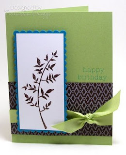
So I wasn't feeling that inspired today, but I wanted to make something, so I checked out a few recent colour challenges. First up was this one by Kristina Werner . What I like to do with colour challenges is pull out a full piece of paper in each colour and see where it takes me. When I saw these 4 together, I thought Retro, which led me to using the Retro Background Basics. I like this diamond and circle pattern and thought it would look cool stamped in white on chocolate. Next, I grabbed Stem Silhouettes. One thing I really like about silhouette images is you can pair them with almost any colour group and any type of greeting. I thought this leafy image matched the whole retro vibe nicely.

Next, I thought about doing this challenge by Dawn McVey. As I assessed the colours, I realized they would work well with the exact same layout. I kept the chocolate patterned part, used celery in place of saffron, and teal in place of tangerine. It worked really well, since the colours in this challenge were of similar brightnesses to those in the previous challenge. The only change here: I embossed the leaves. After the first card was mostly together, I thought, hmm embossing would've worked here. I already had everything adhered so I didn't want to take it apart or emboss over it (since warping would have occurred).

Supplies:
Stamps: Stem Silhouettes, Birthday Basics, Retro Background Basics
Ink: Chocolate Chip, Tangelo, Taken with Teal, Fresh Snow
Paper: Saffron, Tango, Chocolate, White, Teal, Celery
Ribbon: Celery Polytwill, Saffron Grosgrain
Accessories, etc.: Nestabilities, Pop Dots, Brown EP

Saturday, March 28, 2009

Wordy Background

When I saw the mix of words in Friends 'til the End, I knew they would make a nice background. I picked three words that went together nicely, placed them on a grid block and got to stamping. Now, all I needed was a card to put it on. I was in the mood for watercolouring, so I took the flower from the same set and got to work. I stamped it on Naturals White paper with Timber Brown Stazon. I really like using this paper as an alternate to watercolour paper. It doesn't have the ridge-y texture, but it really lets you blend colours without getting destroyed in the process (like regular cardstocks).
Supplies:
Stamps: Friends 'til the End (PTI)
Ink: Dark Chocolate, Timber Brown
Paper: More Mustard, Dark Chocolate, Spring Moss, Ripe Avocado, Naturals White, White
Accessories, etc.: Pop dots, watercolour paints, chocolate brads


Monday, March 23, 2009

A bit more Whipper Snapper

I have a few more cards to share, featuring Anna's latest sets.

The first card features some watercolouring. I didn't do it the traditional way. Instead of using a paintbrush, I used a blender pen. I couldn't find a decently pointy paintbrush for the finer details, but the blender pen worked nicely. I quite like this owl, I like how he's kind of pointing to the greeting.

For the second card, I returned to the Copics. I really love this cute, little potted flower. I coloured it in, cut it out, popped it up, added a bit of piercing and a sentiment. Then I paired that with some lined paper, and keeping with the whole stitching them, some ribbon, thread, and a button.

Supplies:
Stamps: Little Critters, Sending Happy Thoughts (by Whipper Snapper)
Ink: Tuxedo Black, Stazon Black, Rich Cocoa
Paper: PTI Bitty Dots DP, Hawaii Papaya DSP, Watercolour Paper, White, Really Rust, Creamy Caramel, New Leaf
Accessories, etc.: Watercolours, Copics, ribbon, thread, scalloped nestabilities, button

Friday, March 20, 2009

A bit of Flower Power

I decided to pull out this fabulous gel-a-tins set. I hadn't used it in a while and I was in the mood for some bold flowers. One thing that I love about solid stamps is mixing the inks right on the stamp. For this flower, I inked up the center of the stamp with Sweet Blush, then I took the Pure Poppy ink pad and only inked the edges. Because I only used the two colours, the result is a lot like the Rock 'N Roll technique. However, I do this by placing my stamp face up on the table. That way I get a lot more control of the inks. I get the colours exactly where I want them. I stamped a few leaves on Spring Moss, cut those out, then place the flower and a greeting on the oval. I added in some patterned paper and a bit of ribbon to finish it off.

Supplies:
Stamps:
Flower Power , Happy Days
Ink: Sweet Blush, Ripe Avocado, Pure Poppy, Spring Moss
Cardstock: White, Spring Moss, Ripe Avocado, Pure Poppy, Hawaii Papaya
Accessories, etc.: Twill Ribbon

Wednesday, March 18, 2009

Stamp It! Cards

Have you seen the latest issue of Stamp It! Cards? These special issues are always my favorite. They are full of gorgeous cards and awesome techniques, every one of them featuring stamping! I was lucky enough to have six cards accepted in this issue, my first multiple acceptance.

Cath, of the fun and fabulous Moxie Fab World blog, invited me and nine other designers, to create a card for a special giveaway. Each card is signed by the designer that created it and they're being offered up as a prize for you today! Check out the post over at Moxie Fab World blog and leave a comment, you will be entered to win all ten signed cards. You have until Sunday, March 22 at midnight, MST to play along. And be sure to keep an eye on the Moxie blog all week because it's Stamp It! Cards Week and they've got all kinds of fun planned. Be sure to check out the Paper Crafts blog too!

Here's my card, I cannot get enough of Friends 'Til the End, so I created a little something with that set.
I stamped the flowers with Vintage Cream pigment ink onto the cardstock vellum, then I stamped a few flowers in Melon Berry, then added a sentiment and a few buttons. Inside the card is another piece of Vintage Cream cardstock, so when the card lays flat, you get that extra matted effect.

The other designers being featured today are:

Maren Benedict
Kim Kesti
Julia Stainton
Teri Anderson
Angie Hagist
Debbie Olson
Melissa Phillips
Dawn McVey
Jen del Muro

Tuesday, March 17, 2009

Hybrid Papercrafting

I've dabbled in digiscrapping (perhaps more than dabbled, I just checked my folder, it's apparently 10GB, perhaps it's time to do some purging). I've been stamping for five solid years now. Occasionally, I'll print out a sentiment for a card, but I rarely combine the digital elements with paper ones. So when I saw that Kristina Werner had released some digital papers and elements I decided to give it a try. I also like to support fellow crafters in their new ventures.

First, I went with a zero stamping card. I printed out smaller, card-sized amounts of the patterned papers. I also used the fancy frame brush and a sentiment and placed that onto another one of the patterns before printing it out. The colours when printed were a bit reminiscent of the Loves Me paper (a long retired favorite of mine), so since I still have some coordinating ribbon I added that. The kraft dots ended up printing a bit more caramel in tone, so instead of using a kraft card base, I went with creamy caramel.
Second, I went with a bit of stamping. I printed the frames in several sizes and found that this size held this happy birthday sentiment nicely. Next, I used some more of the stripes, added some more matching Loves Me ribbon and stamped a row of cupcakes. I also brought out the Cool Caribbean, since that coordinated nicely with the printed paper. It's such a good cool!
My verdict on hybrid crafting: I liked it. It's nice to just print out some basic design elements (like the sentiments and frames), as well as papers, and pair them with the other stuff in your stash. Now I may yet put some of that 10GB of digital stuff to work!

Sunday, March 15, 2009

A bit of Whipper Snapper

I am so excited to be a featured designer for Anna's latest designs at Whipper Snapper. Some good news for you, there's a sale on Cling Mount (includes case & insert) - $19.99 each - Special through March 20th - $14.99!

I had a lot of fun with Little Critters. Anytime I see a set with different animals in it, I feel the need to stack them. I don't know why, it's just something that I think is cute with animal sets. I stamped the elephant, giraffe, and the bird and got to work colouring them in with Copics. I thought the Dream Big sentiment from Happy Thoughts seemed appropriate

For my next card, I was still on a Copics kick. I stamped and cut out 3 cupcakes, then got to work colouring those in. I added a couple layers of clear Spica on the cupcake tops and the cherries. It adds just the right amount of sparkle. I also stamped my own background paper using the Sending Happy Thoughts sentiment.


Be sure to check out the other March/April Featured Designers:
Bev Rousch
SCS Gallery: http://www.splitcoaststampers.com/go/BevMom
Blog: http://bevithia.blogspot.com/

Danielle Kennedy
SCS Gallery: http://www.splitcoaststampers.com/go/dpkennedy
Blog: http://wilddragonflydesigns.blogspot.com/

Lori Craig
SCS Gallery: http://www.splitcoaststampers.com/go/stamp_momma
Blog: http://loricraig.blogs.splitcoaststampers.com/

Shannan Teubner
SCS Gallery: http://www.splitcoaststampers.com/go/steubner
Blog: http://withfeathersandsequins.blogspot.com/

and of course Anna Wight
SCS Gallery: http://www.splitcoaststampers.com/go/sweetmissdaisy
Blog: http://sweetmissdaisy.typepad.com/

Supplies:
Card One: Stamps: Little Critters, Happy Thoughts
Ink: Tuxedo Black
Paper: Basic Grey, Pure Poppy, Spring Rain, White, Hawaii Papaya DSP
Accessories, etc.: Copics, pop dots

Card Two: Stamps: Happy Thoughts
Ink: Tuxedo Black, Close to Cocoa
Paper: Pink Pirouette, Pink Passion, Close to Cocoa, White
Accessories, etc.: Copics, pop dots, nestabilities.

Saturday, March 14, 2009

A few Saturday creations

After tidying up my desk a bit and reorganizing a few things, I felt inspired. Amazing what a clean surface can do for creativity.

First up is a card featuring Damask Designs. I was happy with the Ocean Tides, Vintage Cream, and Dark Chocolate colour combination the other day, so I decided to do that again. I added in one extra colour- Sage Shadow. It works quite well with these colours. The card is pretty basic. I did however do one thing I don't normally do... scoring as a means of decorating the card. First I masked off the side, stamped the one repeated background image there, then I scored two lines beside that, leaving enough room for a thin strip of cardstock. I really like how it turned out, I'll have to try that again some time.
Second up is a card featuring Fifth Avenue Floral. One thing I really like about line art is you can use not only for making fun backgrounds, but you can also really bring it to life with some sort of colouring medium. I stamped this flower and stem on watercolour paper, got out a few reinkers and got to work. I added some grey to really contrast with the orange and green.

Supplies:
Card One: Stamps: Damask Designs (PTI)
Cardstock: Sage Shadow, Ocean Tides, Vintage Cream, Dark Chocolate
Ink: Dark Chocolate, Ocean Tides, Vintage Cream
Accessories, etc.: Scor-It, Ribbon

Card Two: Stamps: Sincere Salutations, Fifth Avenue Floral (SU!)
Cardstock: White, Basic Grey, Tangerine Tango, Kiwi Kiss, Urban Oasis DSP
Ink: Timber Brown Stazon, Basic Grey, Kiwi Kiss, Summer Sun, Tangerine Tango
Accessories, etc.: Orange Brads, pop dots, white signo gel pen

Friday, March 13, 2009

#45

Time for another colour inspiration. This week, it's all about keeping things monochromatic with black, grey, and white.

I kept things pretty simple. I made some stamped patterned paper using black, white, and grey ink on grey cardstock. I adhered that to the card, added some 5/8'' black grosgrain and a simple knot. Next I added in my sentiment and stamped a few more flowers on the white base. Very quick, and any colours or sentiments could be used to fit any occasion.

Supplies:
Stamps: Fifth Avenue Floral, Damask Designs
Ink: True Black, Fresh Snow, Basic Grey
Cardstock: Basic Grey, White
Accessories, etc.: Black Grosgrain

Monday, March 09, 2009

Sketches

This week Starving Artistamps is a sponsor for 2 Sketches 4 You, so the design team played along with the sketch.
This sketch was pretty far from my personal style (clean and simple), but it was so much fun to go back to making something that had so many layers. When I started stamping, I was all about complex and loads of layers. These colours were inspired by the label on a body scrub I have. I really liked how bright and fun it was, so I decided a birthday card was most appropriate. I stamped the cupcake and went about colouring it (just a heads up for PTI fans, I found that Copic G14 Apple Green is a pretty good match for New Leaf). I coated the cupcake top with glue and sprinkled on the glitter. The rest of the card is pretty straight forward. I just kept adding in layers of black to really make the bright colours pop.
Supplies:
Stamps:
Simple Birthday, Fairy Tale Sentiments, Dot Background
Ink: Tuxedo Black, Taken with Teal
Cardstock: White, Black, Taken with Teal, New Leaf, Summer Sunrise, Pure Poppy
Accessories, etc.: Various Nestabilities, Copics, black brads, glitter

Saturday, March 07, 2009

A couple of one-layer cards

I decided to participate in the colour challenge at the last moment this week. I wanted something really quick, but striking. I decided to do a bit of masking and sponging. I liked the result, but I really wanted to a version with a Pink Pirouette, and I only have the reinker.

So here's card number one:, basic masking and sponging using Pretty in Pink. This version also features some nice double-faced satin ribbon.

For card number two, I started out with the same mask. I stamped the flowers first, in craft ink, then applied embossing powder. Then I sponged a very subtle shading of white. It pops out just a little. For this one, I didn't think the satin ribbon seemed right, so I grabbed this stitched pink and chocolate ribbon instead. It's kind of funny, in person, the pink one is more striking because of the subtle shading and the added texture of the embossing powder. But in photographs the white one pops out more.
Supplies:
Stamps: Friends 'Til the End (PTI), Birthday Basics
Ink: Chocolate Chip, Close to Cocoa, Pretty in Pink, Whisper White
Paper: White, Pink Pirouette
Accessories, etc.: Sponge, Embossing Powder, Ribbon

Tuesday, March 03, 2009

A couple of answers...

Regarding the previous post...
1) The watercolours used here are Twinkling H2Os, they are a solid, and they come if small tubs. They are a shimmery type of paint. I rarely work with watercolour crayons, just haven't been as happy with the results.
2) Flocking glue tips: Use a glue pen. I have both the quickie glue pen (great for fine detailing) as well as the glue that came in the Martha Stewart glitter trios (small tip and opening, easy to control and "draw" with). Work in small sections, glue a bit, sprinkle the flocking powder on liberally, grab a scrap piece of cardstock and press pretty hard on the flock with the paper. This helps to really press the powder into the glue.

Hope that helps!

Monday, March 02, 2009

Flocked Damask and Shimmery Flowers

I was in the mood to do a bit of watercolouring. I've been meaning to do something with a glow type style of painting. Since I received my PTI order today, I figured, might as well give it a go. I actually started with the glow (just a bit excited to get that done), then painted in the rest of the flower. I didn't want to take away from the watercolouring, so I just added a sentiment and a mat and put that on a Raspberry card base.

As soon as I saw the Damask Designs, I knew I wanted to try giving them some texture with flocking powder. I stamped these two images in Melon Berry, then got to work with my glue pen and powder. I thought I'd add a cute little button and a nice sentiment. Again, I didn't want to take away from all that work (and that would not have looked good anyway), so I matted the image and put that on a Melon card base.


Supplies:
Stamps: Friends 'Til the End, Damask Designs
Ink: Stazon Timber Brown, Melon Berry
Cardstock: Dark Chocolate, Raspberry Fizz, Melon Berry, Watercolour Paper, White
Accessories, etc.: Twinkling H2Os, Vintage Buttons, White Flock